| Image |
Comment |
| 10/14/2013 09:59:36 PM |
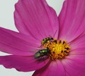
Lunch on the Flyby MarfunComment: Voted earlier coming back to comment.
Love the title pun. Great details from the texture on the petals to the latice on the fly's wings. Color and details pop of the page. I wonder if this would have been better framed if it was a rectangular composition that extended to include the full petals on the left side...still a great shot. |
 Photographer found comment helpful. Photographer found comment helpful. |
| 10/14/2013 09:56:46 PM |
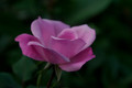
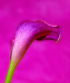
Point me at the sky...by KelliComment: Voted earlier coming back to comment.
Love the details and textures seen on the petals of the flower. Overall a nice shot but a little dark - some levels or curves can brighten this up and really make it pop visually off the page. |
| Photographer found comment helpful. |
| 10/12/2013 09:54:22 PM |
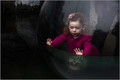
Bubble by MondComment: Voted earlier coming back to comment.
Love how the pink of the girl's sweater and hair piece just pops visually. Speaking of pops - love the water condensation on the window bubble. I find the photo very symbolic. It is a little ironic that the shape is off a bubble which is typically thought of as dainty or delicate. It is neither. This little girl gazes out at the world from her bubble all the while protected and sheltered. It is in a sense a protective bubble. |
| Photographer found comment helpful. |
| 10/12/2013 09:42:38 PM |
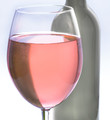
A Little Pinkby IAmEliKatzComment: Voted earlier coming back to comment.
I like the pale pink color of the wine in the glass. I also like how you positioned the dark bottle to be in the backdrop as the complimentary object to the main focus. There are times when getting up close to have the main subject fill the frame doesn't work so well. The flow of the objects are interrupted by the 'hard' cut of the close crop. Pulling back to show the wine glass and the bottle in their entirety would make it feel less chopped. I think the vertical orientation of the frame would also complement the vertical shape of glass and bottle if they were shown fully. |
| Photographer found comment helpful. |
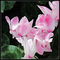
| 10/12/2013 09:28:15 PM |
Cyclamenby jomariComment: Voted earlier coming back to comment.
Love the textured 'brush stroke' lines that I can see in the petals. Seen these flowers and they are very unique in how the petals bend back. I think it would show off the unique nature of this flower more if it was taken at a lower angle rather than overhead looking down. Also the photo could do with just a touch more contrast between the light and dark areas which level and curves adjustment will take care of. |
| Photographer found comment helpful. |
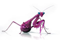
| 10/11/2013 09:31:36 AM |
Malaysian Berry Mantisby CoryComment: Voted earlier coming back to comment.
If it didn't look alien without the splash of color it totally looks alien now. Wow! That is bold and scary - the eyes look a bit metallic which I think adds to the creepy alien vibe of the piece. Lighting is great and the photo captures some great details. |
| Photographer found comment helpful. |
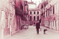
| 10/10/2013 09:29:25 AM |
His best friendby NeatComment: Voted earlier coming back to comment.
I like the mood that the muted pink tones give to this composition. It has the feel of age and comfort...like an old postcard or picture by a friend many ages ago recalling the quiet beauty of strolling the cobblestone streets in the early morning hours. |
| Photographer found comment helpful. |
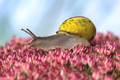
| 10/10/2013 09:21:23 AM |
It's a pink worldby Nadine_VbComment: Voted earlier coming back to comment.
Fantastic details from the flower buds to the skin texture of the snail. Lighting is perfect and the subject fills the frame. Great macro work on this - well done. |
| Photographer found comment helpful. |
| 10/10/2013 09:17:26 AM |
Pink Lilyby sfaliceComment: Voted earlier coming back to comment.
A color on color shot is very challenging to pull off. While the attempt is good it could be better if there was some better light to make the lily pop off the backdrop a bit more. If you had arranged some lighting so that the light wraps around the lily where there is distinct contrast in the highlights and shadows it would look even more three dimensional and pop off the page. I think it would also benefit with better contrasts - the background hue it too close to the pink hue of the lily. The darker hue of the lily would have contrasted better off of a lighter pink hue for greater visual pop. |
| Photographer found comment helpful. |
| 10/10/2013 09:12:51 AM |
Veiled Intentionsby emoonsComment: Voted earlier coming back to comment.
The hot pink is very bold and attention grabbing. The element that needs a little TLC is the contrasts. I think if the lines of the veiled fabric were darker and more contrasty with the pink it would really pop off the page visually. I think some levels and curves possibly could get more darker hues in the fabric to get that look. |
| Photographer found comment helpful. |
Home -
Challenges -
Community -
League -
Photos -
Cameras -
Lenses -
Learn -
Help -
Terms of Use -
Privacy -
Top ^
DPChallenge, and website content and design, Copyright © 2001-2025 Challenging Technologies, LLC.
All digital photo copyrights belong to the photographers and may not be used without permission.
Current Server Time: 08/23/2025 11:39:50 PM EDT.