| Image |
Comment |
| 04/03/2006 02:32:46 PM |
Cliche with a Twistby SunnieeComment: Lovely sharp details are present in this composition. The hues are rich and warm. Love the bubbles dancing on the surface of the lemon slice. This photo captures the subject so well that the sensation of taste is very palpable. My mouth waters at the promise of something cool and refreshing to drink. My only critique is that I wish that you captured more of the curves of the glass to compliment the curve of bottom half of the circle shaped lemaon slice. |
 Photographer found comment helpful. Photographer found comment helpful. |
| 04/03/2006 02:28:03 PM |
Spring Pailby youngnovaComment: The black background really makes the colors of the pail and the daisies pop visually. Composition of elements is good. My critiques are on some composition and some technical elements that need some improvement. First, some of the flowers in the forefront are a tad soft in detail - the edges of the petals on the flower on the far right appear in sharper focus than the one in the middle and far left - perhaps a smaller aperature would increase the depth of field and sharpness of details. Next, the hue in the daisies and the hue of the pail are very close in color so much so that they blend in together a little too well. I would have liked them to be more distict and individual in the hues. Lastly, the hues of the flowers trend more to the orange-yellow hues rather than the yellow-yellow hues most would be expecting. But by and large the reason why this falls in just the good category rather than extraordinary is that the hues of both objects are too close to each other such that the individual beauty of each does not stand out. Hmmm- maybe the addition of some green folliage (leafy foliage that would make it look more like a bouquet spilled out) would break up those same color hues. |
| Photographer found comment helpful. |
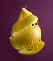
| 04/03/2006 10:43:06 AM |
Emptyby hannekeComment: I love the creative idea that you have captured here!!! The emply shell of this yellow pear is held together by yellow thread. The juicy heart of the matter is gone but the stiched up shell is presented in such a way that the viewer still can sink their teeth into this conceptual shot and 'taste' the flavor of its meaning. Wonderfully executed; the lighting is spot on and the focus is great with lots of details present in the skin of the pear. The only critique I have for this piece is that the background color does nothing to complement the subject. That dull plum purple hue is rather detracting from the main subject. A bold or vibrant hue (say green) would complement this subject better and really make it visually pop off instead of withdraw on the page. A solid black background could do that for the focal point as well but then you would not have a really rich & vibrant color from which to bounce this off of. Great job, I can see this in the top 20. |
| Photographer found comment helpful. |
| 04/03/2006 10:29:55 AM |
Peep-Ka-Bobsby TammerComment: Wonderfully creative idea!! Composition of elements is very good but technical presentation needs a bit of improvement. Lighting is one thing that could be better as that there are some distracting shadows on the fork and the peeps. Mayhap this would be eliminated by a straight on overhead shot that would throw the shadows behind/underneath the main objects (akin to what happens to your shadow at 12 noon as that the sun is directly overhead and makes the shadow 'disappear'). Illumination would be better on the peeps AND you would see more of that bold silver hue and sheen of the fork. Lastly, I think the background could have been better for this composition. The flat cream hue does nothing to make the main subjects visually 'pop' off the page - a flat bright white or a flat dark black can accomplish that. In addition the background here has lines present in it such that it is an unwanted added 'texture' that detracts from the main focus. |
| Photographer found comment helpful. |
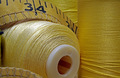
| 04/03/2006 10:21:25 AM |
Sewing in Yellowby ElaineComment: The level of sharp details in this photo are top notch. However there are some elements in the composition that need some improvement. First, love the deep rich hue seen on the spool to the right. However that deep rich hue does not continue to the spool that lays horizontal to the left. The light bounces off the thread and creates a shiny shine or glare that is a little too distracting to the overall image. Next since most of the implements/elements in this shot invoke the idea of sewing (including the title) I am surprised to find that there is not a sewing needle to be found in the composition. I think the addition of that object would strengthen the composition and better suit the title you have bestowed on the piece. |
| Photographer found comment helpful. |
| 04/03/2006 10:08:28 AM |
Balanceby danderson107Comment: Composition is simple and clean in presentation. The yellow hues in these two balancing act glasses really captures the eye's attention. Not to mention it makes the viewer do a double take and take a good long look at the liquids that seem to be defying gravitation. Lighting to illuminate the subject is very good. The only critique I have for this is that the reflection of the bottom glass on the surface is destracting and detracting attention away from the main focus which is your subject of the two balancing glasses. Either a close crop to the lip of the bottom one would eliminate that reflection or a less reflective surface that does not reflect the object's image back would greatly improve the overall composition ot this piece. |
| Photographer found comment helpful. |
| 04/03/2006 10:01:39 AM |
Two-Inch Bug!by davidus428Comment: Yellow is bright and bold but there is too much 'empty space' that adds nothing to the composition. Minimilistic it maybe but either the colors on the bug would have to really pop off of the background (which in the current state they do not) or a square crop would do better to improve the composition. If I am not mistaken, I think that this particuliar insect has a greenish/yellow cast to it's beetle shell. Bringing out/capturing that color in the beetle (and I think I have seen this bug at museums before and they have this lovely greenish/yellow sheen to them) would really make it a lovely focal point on this vibrant yellow background. |
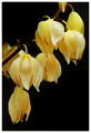
| 04/03/2006 09:52:18 AM |
And It Was All Yellowby hotpastaComment: Lovely composition that capture the soft pastel beauty of the yellow hues of this delicate flower. Love the water drops that caress the petals. The black background really makes the main subject pop off the page. Light illuminates the lovliness of the flowers perfectly. Lovely job. |
| Photographer found comment helpful. |
| 04/03/2006 09:42:53 AM |
ROXIEby ColeyComment: The model has the poise and look to certainly invoke the idea of Roxie from Chicago, but the composition needs some improvement. First their are some rosy tones present in the skin but they are getting slightly washed out her and there and I think an exposure that is less 'overexposed' would help not only bring out the rich rosy tones in skin color but also in overall hue of the colors present. For the composition you really wanted the yellow/blonde hues of the hair & the straps to the top/dress to really 'pop' for the Yellow Challenge. As it stands here those rich, bold or vibrant hues are missing - they are too washed out. The color that really pops is those red lips. The red lipstick really calls attention to itself and is the hue that is most vibrant, bold and eye-catching. Not what you wanted because it robs attention away from the yellow hues you wish to be front & center in this composition. The white background is probably not helping - a darker background such as black would help those hues really pop especially the hue tones in the blonde hair. |
| Photographer found comment helpful. |
| 04/03/2006 09:32:31 AM |
Harbour Sunrise by GIS_boyComment: Beautiful mellow hues of yellows and oranges in this seaside picture of docked boats. Overall the picture is lovely, serene and calm but I wonder if waiting would have produced a more dynamic picture that would move the composition from good to wonderful - such as a chance boat moving sailing towards the center channel or even some more dynamic clouds in the distance. I know there is only so much you can do but sometimes waiting gives unexpected and surprisingly wonderful results. As I said it is a good picture but it just needs something more to make it eye-popping. |
| Photographer found comment helpful. |
Home -
Challenges -
Community -
League -
Photos -
Cameras -
Lenses -
Learn -
Help -
Terms of Use -
Privacy -
Top ^
DPChallenge, and website content and design, Copyright © 2001-2025 Challenging Technologies, LLC.
All digital photo copyrights belong to the photographers and may not be used without permission.
Current Server Time: 08/10/2025 05:55:36 AM EDT.