| Image |
Comment |
| 10/12/2006 11:24:08 AM |
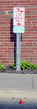
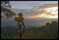
Only YOU can prevent photos like this!by sweetpeaComment: Overall the composition needs improvement. First off, your main subject, the ducky, is so small in relative proportion to the surrounding environment which makes up the photo. The ducky makes up only 2% of the photo and is lost in its environment. It gets literally gets lost amoung the street scene. You posed it next to the a sign pointing to the Fire Dept which shows me you tried to insert an element that would strengthen the connection or make a connection of a setting for this Firefigther Ducky. What was needed was to get a closer shot of your Ducky, such that it makes up 35% or more of your shot. It needs to be much more visible. And since you wanted to include another element that would nod to an environment or workplace of a firefighter something other than the sign that allowed you to get closer to your main subject would have been better. One suggestion is that you could have poised the duck next to a red fire hydrant. A close crop or zoom that has a portion of the hydrant that is still recognizable and the main subject,the ducky, dominating the scene could be a good composition. My next suggestion is do not be afraid to approach someone on location if it will help your composition. They might be more friendly than you might expect:-) Of the five different rubber duckys I saw at the store I almost purchased the Firefighter ducky (I didn't purchase the ducky for I had an idea of what I wanted when I walked into the store and stuck with my idea). Had I purchased it I would have taken it to the local fire station, told them my story, and asked if I could pose the duck on the grill of the fire engine or next to the fire hose mounted on the truck. The worst that they could say is "No" Another idea of a background assisting the composition setting is perhaps using a firefighter's helmet and posing the duck next to it. You could borrow it from someone you know has a child who has a firefighters helmet lying in the make-believe box or even purchase a inexpensive one at the halloween supply stores. Any object that can act at a backdrop to help set the scene that allows you to get close to your main subject will be a big benefit to your overall composition. The biggest problem with the photograph as it stands now is that you really need to get closer to your main subject and make it the focal point of your composition. |
 Photographer found comment helpful. Photographer found comment helpful. |
| 10/11/2006 11:36:04 PM |
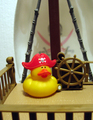
Hey Captain!by becky-leeComment: Very creative. I like all the details you put into this shot to give it a feel of a pirate ship. The Captain Duck's hat has the pirate symbol on it and in the background one can see the same symbol repeated in the sail. Next the Ducky sits next to the Captain's wheel. You have all the elements here to push the composition into an above average shot but it has some areas that need improvment. First the crop. The bottom portion that has what looks like 'bars' does nothing for the overall image - matter of fact it is distracting and draws attention away from you main focus. Cropping that out would give you a square crop that would serve to focus your viewer's attention more tightly on the main subject - the pirate duck. Focus and lighting need improvement. The hat is in really sharp focus but the beak and the body of the duck appear more soft. An aperature of 5.6 or even greater will increase the depth of field and so to the level of detail in all elements seen here (if you use an higher aperature & an ISO of 100 or lower you will also want to steady your camera with a tripod or some object to rest so that the image is not blurred from hand shake) Lighting - shadows under the beak cause the lower beak to become less visible and distictive. Perhaps bringing in another light source (or two) to shine in front or at the side would serve to lessen shadows or eliminate them. Lastly - background. Backgrounds can be an important part of the composition as well. That stuccoed white wall that can be seen in the background does not help invoke the imagery of a pirate ship sailing the seven seas. It detracts. A picture or image of a blue sky with white clouds is one suggestion for the background. An easier one would be moving the sail such that it blocks out the stucco wall and thus the viewer also gets to see more of that pirate symbol on the sail which further strengthens the composition's setting. |
| 10/11/2006 11:12:59 PM |
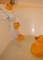
The Great Escapeby PeriwinkleFlwrsComment: This is a really cute and well thought out idea. Love how the baby ducks are using a tied towel to 'escape' their white porcelin 'prison'. You paid attention to some details as that the position of the Mommy duck looks as if she is looking on as her babies make their breakout. The biggest critique I have on this photo is that the lighting is very poor. Either tunstun lighting from bathroom fixtures or not sufficent lighting was used. Tungsten light is the kind produced by ordinary incandescent light bulbs. Typically the picture will have a yellowish-orange-brownish tint; the same result can be had if you use insufficent lighting. The problem with that is that the white of the tub gets a yellowish cast. The rubber duckys appear more orange than yellow. Because the tub is not a bright reflective white the vibrancy of the yellow tones in the duckies is lost in the dull colors of what could have been a bright white background for them to visually 'pop' off of. The question becomes how does one overcome this problem without resorting to flash which could result in harsh glare bouncing off the plastic of the ducks and the tub. One suggestion is if the bathroom has a window to let in as much natural light at possible to counteract that yellowish-orange tinge. If there is enough natural light then try without the bathroom lights. If there is no available window then possibly experiment by bringing in another type of light source that may counteract the tungstun. I am not sure but if you have the function of a white balance setting on your camera you might want to check the camera manual and see if that helps. A last suggestion is that utilizing Photoshop/Paintshop can help to remove a color cast or unflattering tinge. There are quite a few good tutorials on lighting and color cast removal here at DPC. Just one that might help is //www.dpchallenge.com/tutorial.php?TUTORIAL_ID=24 or you can check out the list //www.dpchallenge.com/tutorial.php .
Hope this critique helps. Oh, and a last helpful suggestion is that the water could have a punch of color to it to add even more visual appeal. A bathtub color pellet could change the color to a cool or even deep blue - yet another color for the yellow hue of the duckys to 'pop' off of. |
| 10/11/2006 10:39:45 PM |
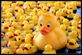
Big Mamaby glad2badadComment: I would think with THAT many duckies that the Mama duck would have a much more frazzled look to her! How she manages to keep that big smile with all the little quackers is amazing:-)Composition and lighting are good. The concept carries off very well for you have a flood of little duckies surrounding the larger ducky. A big family takes a Big Mama to handle. I was initially going to suggest that it might have been better if the baby ducks were lined up in a triangle formation with the Mama duck at the head. It would mimic how some real baby ducks 'line up' behind their mother. The problem with the suggestion is that you would have to change the angle to a slightly overhead shot to fit them all in - the angle you have here is level to the ducks and thus it draws us more readily into the scene whereas an slightly overhead shot would remove us further from the subject. Looking at the composition more I think having the baby ducks surround the mother and the angle of composition was a good choice. We get to see almost all her large brood, plus the low level shot that has us view it straight on brings us into the scene. |
| Photographer found comment helpful. |
| 10/11/2006 08:51:16 PM |
Watching the end of the world.by UNCLEBROComment: I like the composition and the concept behind this presentation. Man, as represented by a Woody, and Nature, as represented by the Rubber Ducky, both share a moment together as they watch the sunset. You pair the whimsical nature of these two objects alongside a serious contemplative moment of watching the sunset. The thing that is really lacking is that the lighting on the two subjects is poor. They really need to be better illuminated such that they visually stand out more from their surroundings. A simple light source such as a small professional light box or even a large flashlight covered with cheesecloth/white cloth to diffuse the the light shined on these two (so that there is not a harsh glare the reflects back on the surface of these objects) would illuminate them better. |
| Photographer found comment helpful. |
| 10/11/2006 08:40:59 PM |
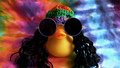
Must Have Inner Balance ... My Young Apprenticeby SherwinJamesComment: What a cute and very clever idea! I love how you have the Master Ducky sitting on the higher perch for not only is he the wise old elder but it shows his rank. The young apprentice is hard at work with exertion and concentration at he balances rather precariously on a lower perch. I have two critiques on the photo. I like the addition of the smoke/mist for it adds an air of the something 'mystical' happening - the ducky is achieving and getting in tune with his inner chi (I believe that this scenario was played out in a movie of which I cannot remember the title). But the smoke is 'distributed unevenly - the bottom of the pole that the Master rests on is not completely covered like the others. Also there the 'tongue' of smoke on the pole the apprentice balances on looks oddly shaped. I know picky, picky but I really think it would look better if it was more a uniform billowing 'blanket'. The next small critique is that the 'hat' that the apprentice ducky is wearing blends in to much with the background. Either a hat of a different shade or tone of black would make it stand out OR you could do selective editing on the hat to bring up the brightness/contrast or mayhap even gamma. All in all this is a great composition. 8 |
| Photographer found comment helpful. |
| 10/11/2006 10:21:47 AM |
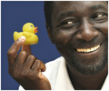
Got Ducky?by BigKComment: Love that smile on this man's face as his big hand holds a small but cute ducky! Lighting and composition are excellent in this portrait style photo with a whimsical mood. As I hightlighted before it is your model's smile that makes this shot so appealing. The smile of this adult man coupled with this small rubber duck projects such a happy feel good mood that it is hard for the viewer NOT to smile. I cannot help but smile when looking at this image. Wonderful composition and well done: 10 |
| Photographer found comment helpful. |
| 10/11/2006 10:12:01 AM |
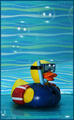
Underwater Funby escapetoozComment: I love the background and how well it plays into the theme of your ducky. The 'waves' really strengthen the composition of water play and the dress of this snorkeling ducky. All the elements are there but there are some things that need improvement for this composition to move out of the average shot and into the above average. First lighting, lighting seems to be a little flat and uneven. The front half of the ducky is illuminated such that a gleam appears on his wetsuit while the back side half of the ducky falls too much in shadow. Two lights one situated off to the right & back abit and the other one situated off to the left & in front might help with creating more even lighting. You might also try some outdoor lighting to see which would give better results - but not during the harsh hours of the day (generally 12 noon to 3 p.m.) when the light is too strong that the color tones tend to get washed out. Better lighting would also improve the visibility of the bubbles as well. Lastly, cropping/close composition can sometimes go a long way in making an image visually appealing and eye-popping. I think that the visual appeal would greatly improve if you cropped closer such that there is more focus on the duck. The rubber ducky is your main subject and should be the focus of the main attention. I think that there is a tad too much background up at the top. Cropping the top 1/3 off would help keep focus tightly on the duck AND you would still have that wonderful background & the bubbles to project the imagery of water play. |
| Photographer found comment helpful. |
| 10/11/2006 09:53:54 AM |
Fashion Duckby phayanakComment: Even a MANLY Man can have a playful side! O.K. the model is pure eye-candy for us ladies I admit but I also really like the concept you present here in this shot. I look at this handsome man with all his flexed muscles - a symbol of a strong man - and the I see this rubber ducky resting on his shoulder which symbolizes his playful, whimsical side. To me, it expresses that everyone has an inner child and some are not afraid to show it. The only thing that would help strengthen that concept/symbolism is if the model was smiling. He seems too serious. |
| Photographer found comment helpful. |
| 10/11/2006 09:29:01 AM |
Hippie Chickby TuckersmomComment: O.K. I am going to get a little off topic here but I could not help to hear some of Smash Mouths 'Walkin' on the Sun' lyrics as I looked at your composition and saw the title:
And their kids were hippie chicks all hypocrites
Because fashion is smashin' the true meaning of it
So don't delay act now supplies are running out
Allow if you're still alive six to eight years to arrive
And if you follow there may be a tomorrow
But if the offer is shun you might as well be walkin' on the sun
O.K. now I have a good song playing in my head let me get around to critiqing your photo. This is a very colorful and creative composition. Love how the background is tye-dye, further invoking the idea of the 60's. I love how you dressed your duckie - all those little added details of the round rimed glasses, the colorful hat, and the long hair really play up the idea/concept of a 'hippie chick' of the 60's. Very well done! The only critiques I have on how to improve the image is the lighting and the crop. The lighting seems a little uneven - there is more shadows on the left hand side indicating that the light source was more on the right. More even lighting would improve details on the hair, the hat, even out the tones and lessen the shadows on the duck. Lastly the crop could have been even tighter to keep a tighter focus on the duck - a square crop would give you that tight focus on your main subject without sacrificeing too much of the tye-dye background which is also intrigal to the presentation. |
| Photographer found comment helpful. |
Home -
Challenges -
Community -
League -
Photos -
Cameras -
Lenses -
Learn -
Help -
Terms of Use -
Privacy -
Top ^
DPChallenge, and website content and design, Copyright © 2001-2025 Challenging Technologies, LLC.
All digital photo copyrights belong to the photographers and may not be used without permission.
Current Server Time: 08/17/2025 12:48:28 AM EDT.