| Image |
Comment |
| 10/13/2006 09:28:55 AM |
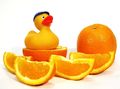
Duck a l'Orangeby BeeCeeComment: A very cute and clever idea. I like the arrangement of elements that invoke the concept of the culinary dish of Duck a'la Orange. The one element that could have improved the composition is to have had the ducky, the orange, and the orange slices arranged on a small platter. The platter would strenthen the concept of a culinary dish ready to be served. Lighting is very good but I think it could be better such that even the slight shadows could be removed. Either another light source stratigicly placed or some selective editing would/can eliminate the shadows. Overall a good composition. |
 Photographer found comment helpful. Photographer found comment helpful. |
| 10/13/2006 09:19:59 AM |
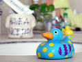
Have a Nice Day! says Duckieby kc kongComment: While the ducky is in front and (off) center there is too many elements in the background that serve to distract the eye from the main focus. The background it too busy (stuff inside the message container, toothbrush, plant, towel, soap dispenser, faucet, another ducky, etc..). Sometimes simplifying the composition down to a few key elements goes a long way in creating a strong composition. The colors and patterns on this unique ducky are interesting to look at. The duck is your main subject so you want to keep the eye's attention focused primarily on it with just a few other elements to help boost interest. The title of your piece has the Ducky imparting the message of "Have a Nice Day". The title and the ceramic container with that message tells me that it was meant to be a supporting element in your composition. However you have it regulated as one of the background elements that it gets lost in the busy background. I think that it would improve the composition greatly if you moved the container with the message up alongside the duck. A solid color or simple backdrop with as few objects or elements as possible would help keep the attention tightly focused on your main subject(s). Lastly your lighting is very good in the photo. The main subject is wonderfully illuminated and the color is bright & bold. There are no harsh shadows, no off cast tinges that color the duck or surrounding with an off tint, and no hard glare on any reflective surfaces. |
| Photographer found comment helpful. |
| 10/13/2006 08:58:11 AM |
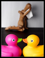
BETRAYAL - A Tale of Forbidden Love, Chapter 2by h2Comment: Only in chapter 2! Goodness, when did the betrayal of trust comes so early in a book? Very novel idea. Composition, lighting, and attention to detail are spot on. The two duckys in the foreground are in excellent focus and their colors really pop off the page on the dark background. Love how you have the weeping woody (complete with a hanky to cry into!) The Weeeping Woody is regulated to the background not just by the physical location but because he/she is not in as sharp focus we get another sutble visual clue that he/she is an odd man out in the relationship. A good idea that is executed well: 8 |
| Photographer found comment helpful. |
| 10/13/2006 08:40:31 AM |
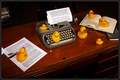
The Authorsby OdysseyF22Comment: I can hear them busy at work: Click, Clack, Quack, Ding! Next line. Click, Clack, Quack, Ding! Very cute and clever idea. Not only do you have the author(s) of the book in there you also have the Researchers (the ones on the open book) and the Editor (the one sitting on the page with the pens. I love how you included the dreaded red pen!) Composition is good. Lighting is good. I wish that some elements/some of the ducks are in more sharper focus. It is a little soft in areas. Sharpness and detail can be accomplished with a higher aperature setting of 5.6 or higher. Usually 8 is the median and 16 is the best. The higher the aperature setting will result in both foreground and background being in sharper focus. An ISO setting of 100 or less also helps with letting enough light in for a correct exposure plus it avoids noise or grainy image that one gets with a higher ISO of 400. It is advised that with a higher aperature setting that you steady the camera on a fixed object or mount it on a tripod to avoid camera shake. Lastly I think that shooting the composition at a lower angle level to the desk would bring the viewer closer to the action. The high overhead angle removes us from the scene like we are watching from a distance or afar. The lower angle would help put us into the scene like we are a part of the action going on here. Not only that but it would help with eliminating the reflections of the ducks on the highly polished desk. Overall a creative and nicely composed idea that I think is above average: 8 |
| Photographer found comment helpful. |
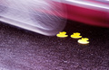
| 10/12/2006 01:05:06 PM |
Police Report: "Wooden stick like driver with no discernable features."by Jason_CrossComment: O.K. this made me chuckle and shake my head - both the title and the image. The victims of a hit and run: the rubber duckys. The suspect on the loose: A woody. I have to hand it to you this is a very creative idea where the humor is either going to hit or miss. I like the addition of motion - the car running over the ducks. It shows action in the shot in that the rubber duckys have just been run over by a moving car. But for some reason the movement in the shot appears to look like it is about to run over the ducks. It looks like it is moving towards the flattened ducks when it should be moving away. Composition needs to be tightened a bit. First off, it could be a tighter focus on the duckys - there is just a little too much of the roadway showing. While the roadway is an important element in the shot showing too much of it takes focus away from the main subject plus it is not overly attractive to look at. Cropping or zooming in on your main subject will keep the eye's attention where it needs to be. Zooming in on your main focus might also help to reduce glare/reflected light bouncing off of the wet pavement such that the last ducky is overexposed for its yellow tones fade to white. Lastly, is it a car wheel or a bike wheel that is in movement? I can't quite tell, but because I see evidence of a car in the shot (the red) I want to think it is a car - plus a the weight of a car would be much more effective in flattening rubber ducks than just a bike. If it is a car than maybe composing the shot at a slightly different angle that would include a tail light would strengthen a connection to a car. |
| Photographer found comment helpful. |
| 10/12/2006 12:06:20 PM |
Ducky Potterby DeniseBernadetteComment: This made me smile. Composition is simple, clean and very visually appealing. Love the little details that you added - the wizards hat, the wand with the shooting rays, and the smattering of stars on the blue background. Lighting on Ducky Potter is spot on and the close crop keeps the attention focused solely on this duckie. My only critique is that the wand appears to be sticking out of his ear/side of his head when it would be better if it was held in his beak. Superglue can do such wonders if one has the patience to hold the object steady for 10-20 minutes to get it to stay:-) Great composition: 9. Edit: bumping up to 10. |
| Photographer found comment helpful. |
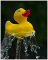
| 10/12/2006 12:05:21 PM |
Balanceby FirstyComment: Love the balance of tones and colors in this one. Lighting is spot on in this photograph. The yellow ducky really pops off that black background which makes the image really eye-catching. This is a really well done simple & minimalistic composition. Love how you effectivatly captured the cascading water that bounces off the bottom of the ducky. He really looks balanced on that spout of water. |
| Photographer found comment helpful. |
| 10/12/2006 12:04:48 PM |
Gone Quackersby JudiComment: You have a simple and clean presentation in this photo. Lighting is great as that the skin tones are wonderful and that there are no harsh shadows cast by the ducks in this photo. I like how you pair the symbolic playful nature of all these rubber ducks with that of the two girls. A childhood whimsy is the captured mood of this composition. |
| Photographer found comment helpful. |
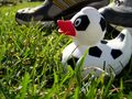
| 10/12/2006 12:03:18 PM |
Soccer Duckyby oravsky123Comment: Lighting is good and the Ducky is the central focal point of the photograph. The biggest area that needs improvment to move this shot out of the average shot and into the above average is composition. Just the Ducky posed in the grass next to some sneakers is not attention grabbing. It will not hold the viewer's attention past first glance. You need to grab and hold your viewer's attention. You need to make it more visually interesting. Including a few more elements associated with the setting you are trying to project/invoke would help strengthen the association of a soccer player on the field. Just one idea that would help add interest and strengthen connection to the setting is to have a soccer ball in the background. The person wearing the sneakers could have there foot on the ball which would introduce the idea of action - this soccer duck is 'running' along side the player either defending his team mate or trying to steal the ball. A person wearing specialized soccer shoes/cleats would also help strengthen the composition's setting of a soccer player on the field. Adding a few more elements that help invoke the setting you are trying to project to the viewer can greatly improve the visual appeal of a composition. |
| Photographer found comment helpful. |
| 10/12/2006 11:46:53 AM |
Posing Prettyby magenmarieComment: This is a very nice close-up of the Ducky - a portrait style photograph for a still life:-) Lighting and background settings are the two areas that this photograph needs improvment in. Lighting is the one of the single biggest challenges a photographer grapples with all the time. The lighting in this photo gives this ducky a blueish tinge to its white colored plastic body. That bluish cast dulls the normally vibrant white color of the duck. The color of the duck is dull and as such does not pop off the background visually. It might be because of what light source you used or a need to set the White Balance in your camera. Just one article on lighting that may help you is //www.ezine-articles-planet.com/Article/Digital-Photography--White-Balance-Demystified/27834
You could also look at some good tutorials here at DPC - one shows you step by step on how to compensate and remove color cast from your photograph //www.dpchallenge.com/tutorial.php?TUTORIAL_ID=24 . Lastly, the background you chose is a little too close in hue to the orange of the beak. The vibrancy of the color of orange is drawing the eye's attention away from the duck. Plus, it is not allowing the duck to visually pop off the background. Experimenting with other vibrant (or not as vibrant) hues that are NOT the same colors as your main subject will help your main focal point visually pop of the page - i.e. blue, yellow, red, etc.... Hope this critique helps. |
| Photographer found comment helpful. |
Home -
Challenges -
Community -
League -
Photos -
Cameras -
Lenses -
Learn -
Help -
Terms of Use -
Privacy -
Top ^
DPChallenge, and website content and design, Copyright © 2001-2025 Challenging Technologies, LLC.
All digital photo copyrights belong to the photographers and may not be used without permission.
Current Server Time: 08/16/2025 10:58:39 PM EDT.