| Image |
Comment |
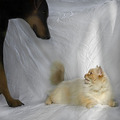
| 12/13/2006 01:04:41 PM |
This is MY studio time.by saiphfireComment: There is some great action going on in this capture as well as expression. Love the look on the lounging cat who looks up at the approaching offender -the dog. The cat really does look as if it is stating "This is MY studio time". The upraised tail is slightly blurred but that gives me the impression of it twitching in annoyance at the appearance of the dog so it plays well into the emotions and title of the photo. There are some things that could be improved to move this shot out of a good shoot to an excellent one. First off is lighting. The dog and half of the cat are in shadow. Better illumination of your two main subjects will show the viewer more details (one can barely see the eye of the dog against his black fur). Next, the background. I know it may be an absolute pain in the butt to iron, but a cloth background that is flat and unwrinkled would give the main subject's a clean and uncluttered background to pop off of visually. |
 Photographer found comment helpful. Photographer found comment helpful. |
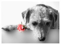
| 12/13/2006 09:16:57 AM |
Don`t forget to remember meby Gaby_GComment: The expression of the dog seems all forelorn. Lighting is spot on perfect as that we see all the lovely details of texture in the fur and the expression on the dog's face. Love the B&W desaturation that paints the dog and background in black and white while the soft pink rose "held" by the dog really pops off the page. |
| Photographer found comment helpful. |
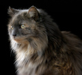
| 12/13/2006 09:13:10 AM |
Smokeyby Judith PolakoffComment: Lighting is perfect we can see all the lovely details of color, texture, and face. The clean & simple black background helps to make this cat really pop off the page visually. The picture captures the downy softness of Smokey's fur giving the viewer a sense of touch. Well done. |
| Photographer found comment helpful. |
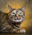
| 12/13/2006 09:04:12 AM |
Our Little Jewel - Opalby MWittComment: A clean and simple portrait wonderfully done. Love the details on the fur everything about Opal in this portrait shot is wonderfully illuminated. Your lighting is excellent. Love the lighting that creates a yellow 'halo' around the head. This adds visual appeal and keeps the eye's attention focused on the cat's face. |
| Photographer found comment helpful. |
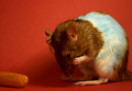
| 12/13/2006 08:58:17 AM |
Feeling Blue?by tapeworm_jimmyComment: The pose with the rat appearing to hold it's hand to the forehead like a "woe is me" really adds visual interest to the shot. Great capture of the moment that is quickly gone. Now to the other aspects of thise shot. The light source is off to the right of the rat which causes a hard shadow to fall on portions of it's face and cast a shadow on the red wall. Two light sources angled on opposite sides at a 45 degree angle would help lessen the impact of the shadows not to mention bring out the details & color on the snout that are lost in the shadows. Next there is an odd bluish tone in the white of the fur. I have heard of some rodents having a blue sheen to their coats due to the genetics so I am going to take the approach that is what I am seeing here. BUT, if the rat does not naturally have that blue sheen then you might want to fiddle with PS to see about getting it out or check the white balance of your camera. The carrot off to the left adds nothing to the camera. It serves as a distraction taking attention away from your main focus. Not to mention that the carrot looks less than appealing for it looks like it is 3 days or more old rather than fresh. I would recommend cropping the left third out of the picture entirely. A tight square focus would keep the attention on the pet rat not to mention play to the title of feeling blue because the rat is feeling "boxed in". |
| Photographer found comment helpful. |
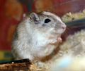
| 12/13/2006 08:44:18 AM |
Chilli The Gerbilby SteveJComment: Wow, you actually got the gerbil to stay still enough for this close-up! I know someone who has a gerbil and they are very active little critters. Love the details seen on this pet. He/she looks as if he/she is in it's cage/habitat which, unfortunately, acts as a distraction to the eye and takes focus away from the main subject. There is too much 'things' seen in the background and the foreground fares only a tad better with the slight blob of blurred bedding in the lower right hand corner. A simple and clean background (i.e. solid color or just nestled in the bedding) would help improve the picture because the gerbil would visually stand-out as the sole object of interest in the photo. |
| Photographer found comment helpful. |
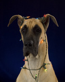
| 12/13/2006 08:36:14 AM |
Aloha's First Christmasby AnnComment: Very cute portrait. I like how the christmas lights are adorned around the dog (a Great Dane I think, not sure) like he/she is an ornament or mayhap has been playing mischief and gotten tangled in the lights. The only critique I have is that the right side of the dog's face is not as illuminated as the left side. The left eye is far more visible than the right eye. It would improve the shot greatly if we could see both of the dog's lovely eyes because in portraits that is one area where expressions are captured. |
| Photographer found comment helpful. |
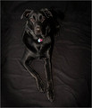
| 12/13/2006 08:29:53 AM |
Black on Blackby jwillertonComment: Love the sheen on the dog. The shine on it's black coat is what makes it stand out a bid more from its black background. One critique is that the black background really does not help the dog stand out. The dog gets almost 'blended' in with it's background when you really need it to stand out. As the main subject you want it to pop visually and be noticed immediately. You need a contrast of colors. For black the opposite contrast color is white. The overhead angle of the shot makes the picture seem a little odd - it either seems the dog is lying flat or standing on it's tip toe paw. Believe it or not the high angle seems to create a sense of great distance. Getting closer to eye level of the dog would help improve the shot because it also brings the viewer's perception at eye level and thus increases the the viewer's interest. The reason - because at eye level it draws us in such that one feels like they are there close enough to pet the dog. |
| Photographer found comment helpful. |
| 12/13/2006 08:07:17 AM |
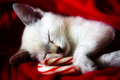
Sweet Dreamsby njsabsComment: What a sweet and adorable shot! This cute and cuddly kitten is all snuggled up with a candy cane. The picture truly does speak "Sweet Dreams"; you made an correct choice with the title. Two critiques on the shot. The whites of the kitten and the cane are an off white/cream white. A brighter white would really pop off that red - perhaps playing with color levels and/or brightness & contrast would help the colors really pop off the page. Next an smaller aperature 8 and up alongside a long shutter speed will help with the depth of field. It will help capture all the lovely details you have now but it would have all of the candy cane in sharp focus. The part of the candy cane that is closest to us is slightly out of focus. Nonetheless this is a great portrait. 8 |
| Photographer found comment helpful. |
| 12/13/2006 01:00:47 AM |
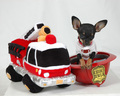
What\'s a Dalmation got that I don\'t Have??by PurpleKComment: This really brought a smile to my face! Love the creative set-up you have here and the title really highlights the humor of the shot! The dog's pose and expression is wonderful! Lighting is good but can be better with some of those shadows cast from the hat and the firetruck: two lights angled at 45 degrees on either side could help cut down on the shadows. Next I wonder why he is on a platform as that I see the edges of it near the firetruck and on the opposite side of the firehat? It is a tad distracting to the eye. It would improve the composition if it was just a flat white backdrop like the white 'wall' in the background. |
Home -
Challenges -
Community -
League -
Photos -
Cameras -
Lenses -
Learn -
Help -
Terms of Use -
Privacy -
Top ^
DPChallenge, and website content and design, Copyright © 2001-2025 Challenging Technologies, LLC.
All digital photo copyrights belong to the photographers and may not be used without permission.
Current Server Time: 08/17/2025 02:48:32 AM EDT.