| Image |
Comment |
| 02/14/2007 09:46:40 AM |
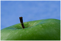
Simply Grannyby dahkotaComment: A very good close-up of a granny smith apple. A simple and clean minimalistic approach. Detail and lighting are very good. My critique is that the colors could do with a tad saturation boost. The green and blue tones appear a little flat and dull. Upping the saturation a tad should make the green of the apple really pop visually with the blue background. |
 Photographer found comment helpful. Photographer found comment helpful. |
| 02/14/2007 09:41:56 AM |
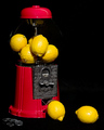
Four for a Dollarby LN13Comment: Very creative! Love how the reds and the yellow hues really pop off the black background. Very bold and vibrant. Lighting on the main subjects is good but it could be better. The outline of the glass on the gumball (or in this case, 'lemon drop') machine fades into the black background. In some spots you can't even see it. Then there is the opposite problem with the glass reflections causing odd circular patterns to be seen on the lemons inside. Hmmm, might a polarizer filter have helped on the reflections. Either a different light angle or a slight change in angle of photographing the subjects might help with getting the glass shape of the gumball machine to be more visible. Either that or some selective editing to bring up gamma or brightness/contrast levels might do the trick. Lastly, if it is 4 for a dollar you should show the 4 lemons and the dollar. The quarters lay flat and are not as visible because of position and lighting. Placing them upright leaning on each lemon would make them more visible and play into the title even more. All in all this is an above average photo it justs needs a little more to push it into the exceptional category. 7 |
| Photographer found comment helpful. |
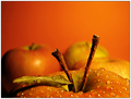
| 02/14/2007 09:03:21 AM |
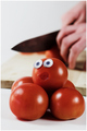
I´m next.....by TUBORGComment: The title, the created expression on the tomato, and the slicing knife in the background says it all in this very creative and humorous photo! Love how you paid attention to details to build this composition. Even the smallest detail of the fearful tomato being positioned on top of the other tomatoes adds to the idea of "I'm next" - he's at the top and next in line on the chopping block...Very literally because we see a chopping/cutting block with the action of a knife slicing into another tomato. Lighting is good on the main subjects but poor on the background objects. The knife appears as a black shape and it is only through it's shape, the cutting block, and the action of slicing that we can conclude it is a knife. Better lighting to illuminate the metal tones of the knife would strengthen the composition because the knife would be more readily recognizable. Better lighting would also help in either to eliminate the shadow that falls on the tomato being sliced or lessen it. |
| Photographer found comment helpful. |
| 02/14/2007 08:50:23 AM |
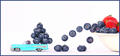
Leavin' in Styleby cheegirlComment: Very creative! I like all the details you put into this shot from the blueberries leaving in droves to the toy car that is the 'get-away' vehicle. I don't know why but everytime I see this image I hear the tune of "Blueberry Hill" - maybe it is the old classic car along with the blueberries that is invoking that song...Anyhap, the creativeness & good lighting is what is driving this composition to be above average. One little critique is that the hue of the car is strikingly light blue - almost like it is too oversaturated and when combined with the stark white backdrop that is needed to make the main elements contrast well that blue hue is almost glaring and hard on the eyes to look upon. As that this is Advanced Editing you could do selective editing by just selecting the car body and either lower the gamma or brightness/contrast levels. Aside from that this is an above average shot that is visually interesting. |
| Photographer found comment helpful. |
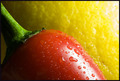
| 02/14/2007 08:40:34 AM |
Lemon Pepperby donenrightComment: Very vibrant and bold colors! The red of the pepper really pops off the yellow tones of the lemon. I like the little details we see in this photo. The beads of water on the pepper and the 'texture' of the skin of the lemon really adds visual interest to the composition. Lighting is good, but there is some distracting glare off on the top right corner of the lemon that could be toned down either from lighting position or post-process work. |
| Photographer found comment helpful. |
| 02/14/2007 08:37:13 AM |
Weight of the Worldby mpetersComment: Heh, instead of the Greek Sisyphus we have a Woody Sisyphus pushing up a 'fruity' world up a hill. I wonder what the fruit of his labor will be;-). Humor aside this is an above average composition. I like all the details you have in this photo from the carved continents on the orange globe to the Woody pausing to wipe sweat off his brow from the hard work of pushing the 'world' up a hill. Very creative work! Lighting is very good; all elements are perfectly illuminated. One small observation - I would have turned the orange world so that the continents were more of a recognizable shape - my first impression on seeing the image was of the great white space on the orange that is the Atlantic Ocean. The first look gave me the impression of a ghost before I noticed the orange is supposed to be the world. |
| Photographer found comment helpful. |
| 02/14/2007 08:17:55 AM |
A Pear Affairby voxpop78Comment: I love the concept you are tackling here. Lighting is very good. But I think the composition suffers a bit from 'bringing the viewer in too close'. I know you wanted the viewer to see the detail of the heart shape made by these pears but in doing so you don't let the pears themselves be a 'supporting' element. What I mean is that I think the viewer should see the pears that way we can further appreciate the shape that they make together. Here we are only given a portion when I think that the whole would improve the visual impact/appeal of the photo. A close cropped photo showing the two pears and the heart shape that they make together would make a stunning image. Not to mention that you would introduce us to some more shapes - that of the curvy shapes of the pears. Still this is an above average photo but showing us the whole of the supporting elements will move this into the exceptional category. 7 |
| Photographer found comment helpful. |
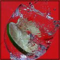
| 02/13/2007 09:09:59 AM |
Shatteredby nards656Comment: The colors really 'pop' out at you visually! Very nice capture of the lime slice making a 'splash' in this wine glass. It must have taken alot of patience and time to do so kudos to you in persistance. Focus is nice and sharp, the viewer gets a nice detailed view of all the elements in this image from the slice of the lime to the shape of the glass to the 'bubbles' in the glass. |
| Photographer found comment helpful. |
| 02/13/2007 09:04:04 AM |
Two in Oneby GiorgioComment: Hmmm, this is very similar to style of one of the current ribbon winners on the front page...nonetheless this composition is a wonderful piece of technical work and imagery. Lighting is wonderful and the color tones are nice warm reds and yellows. Love the water beads on the apple - focus & clarity is execellent and sharp so we can bite into (sorry for the pun, just had too:-) ) all the lovely details of the photo. And as an added visual uniqueness this apple has not one, but two stems! That adds to the visual interest of this composition. Nicely done this scores in the exceptional category! |
| Photographer found comment helpful. |
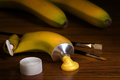
| 02/13/2007 08:55:30 AM |
Food Coloring by scalvertComment: Brilliant! Love the concept and the execution of this composition. That tube of oil paint fit in quite nicely into the skin of the banana - matter of fact it looks flawless! Love the added touch of the 'paint tube' rolled up in order to squeeze out the paint. Love all the added details that boast the visual interest of the shot - from the two additional bananas in the background to the oil brushes to the almost same hue of paint squeezed out of the tube. I was going to add that you needed to show a portion, show a canvas or even add an artist pallete but that would 'clutter' up the image unnecesarrily. Keeping it simple with just the main elements and nothing more is the best presentation. Wonderful job! |
| Photographer found comment helpful. |
Home -
Challenges -
Community -
League -
Photos -
Cameras -
Lenses -
Learn -
Help -
Terms of Use -
Privacy -
Top ^
DPChallenge, and website content and design, Copyright © 2001-2025 Challenging Technologies, LLC.
All digital photo copyrights belong to the photographers and may not be used without permission.
Current Server Time: 08/18/2025 10:31:06 AM EDT.