| Image |
Comment |
| 09/01/2007 11:12:54 PM |
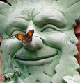
Butterfly Finds Peaceby SteveJComment: I like the square crop on this composition because it immediately focuses the eye on the main subject(s) - the butterfly and the supporting cast of the face of the green man statue. Focus is nice and sharply detailed and colors are very good. One thing that you could do to increase the visual appeal of this image is to crop it even closer so that none of the red wood background is showing. The background adds nothing to the composition overall - in fact, I think that red hue takes some attention away from the beautiful orange red hues of the butterfly. Cropping that out will insure that the only vivid splash of red/orange hues are from your main subject: the butterfly. That would make your main subject really stand out and shine. Hmmm, just a small observation, I think a butterfly resting on a smiling face has found happiness more than peace and/or a place to rest:-) |
 Photographer found comment helpful. Photographer found comment helpful. |
| 09/01/2007 10:52:48 PM |
The Tea Partyby JamesKWComment: First off I love the mood you are trying to capture here. A sweet and enduring moment between mother & daughters in a picnic perfect setting. The white dresses capture the idea of innocence and sweetness - The whole setting and your subject remind me of Gay Talbot's Tea Party painting. This is a good picture but there are several things that would improve visual appeal and place this in the above average or even exceptional category. The teapot & teacups get lost in the ruffle of the dresses. Placing them slightly higher on a small kids table would give them equal share of the themed spotlight. Next the mother's hand obscures the gesture of giving or receiving tea to/from her daughters. Making that gesture visible to the viewer is highly important for it adds human interest, visual appeal, and a way for the viewer to connect emotionally with the scene presented. By simply having the mother give/receive tea/teacup with her other hand it would make that gesture visible. All subject's have a look of concentration on their faces but none has a smile that would give us a visual cue that they are having fun. A single smile can show joy and offer another connection for the viewer to connect to the image. It took me a few seconds to figure out what the I was seeing in the foreground. A little dog sits there but he/she is very hard to see because the dog is underexposed so that one really cannot make out details on it's face. Flash fill would expose the dog correctly so that we see the details more clearly but you would have to be careful that you don't overexpose the details of your main models in the white dresses which can reflect the light back. This is just my opinion but I think the addition of the little dog does not add much to the scene. Introducing too many subjects in your photo composition can either weaken or strengthen the composition. The center stage belongs to the mother & daughters having a tea party. Adding the cute little dog I think takes some attention away from your main subjects. Lastly I think that desaturation takes away from the appeal of the photo. Desat or B/W or sepia done right can add a sense of nostalgia and times long gone. But I think that keeping the colors of rich greens against the downy white tones of the dresses would really help add to visual appeal. It would invoke/strenthen the idea of a picnic type setting for this lovely little tea party. |
| Photographer found comment helpful. |
| 09/01/2007 10:26:47 PM |
Great Expectationsby kloecktComment: Absolutely love the mood and color tones in this shot. The expectant bride silhouetted against the sunset sky and ocean is wonderful - makes me think of the old stories of the bride or wife waiting for her sailor to come home. In my opinion, the sunset adds a touch of sadness because it means another day gone without him coming home. I like this photo but I think that there is one more improvement that would move this into an exceptional category. The biggest suggestion is to have her stand up so that we see her full shilouetted form - the bottom half of her body gets lost in the rocks. It is only by her veil that we come to know that she is an expectant bride. Showing her standing there in a wedding dress with the wind blowing the veil would make the connection much more visually stronger. |
| Photographer found comment helpful. |
| 09/01/2007 10:17:23 PM |
Lighthouseby youngnovaComment: Ah Lighthouse Point! First off this is a good picture but there are several things you can do to boost the visual appeal into the above average or exceptional category. Using a higher aperature (6.1 or greater)and lower ISO (50-100) will give better details in the ripples of the waves. Second, portions of the palm trees and the top middle section of the lighthouse is too dark to make out any details - again that could be corrected with higher aperature and lower ISO but be careful with shutter settings. You might want to bracket to see which would be the best shutter speed & aperature setting combo will give you the finer details as well as a more evenly exposed shot. Lastly there needs to be more to the image than just the lighthouse to give it an extra visual boost - a boat going by or ship or mayhap this could be taken at sunset with some beautiful sky colors. Hmmmm, I don't know if the posts are still there but sometimes the pelicans roost on them. Another suggestion is if you could get into a position that has a pelican sitting on a post in the lower right portion and the lighthouse in the backdrop you could get a very beautiful shot. Focusing on the pelican and setting the aperature to an 8 with a low ISO for better detail should get you a wonderfully dynamic depth of field. |
| Photographer found comment helpful. |
| 09/01/2007 10:02:26 PM |
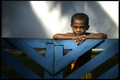
The Children of Biak Islandby ilphotoComment: Great colors, focus, and portrait of this young boy. The shadow of the palm frond on the back wall breaks up the light such that it almost give the illusion of 'beams' of light falling upon the boy. The critique I have is that bring us closer to your subject. Go in closer and really have your main subject (this child) fill up the frame. The left 1/3 of the picture is not doing much for the composition as a whole. It is the young boy that is the focus and by bringing the viewer closer to the subject you increase the visual and human interest appeal. |
| Photographer found comment helpful. |
| 09/01/2007 09:56:45 PM |
Stillby KarenNfldComment: I love the beautiful burst of yellow and turquoise blue of the boat against the weathered wood 'wall'. Colors are great and focus is sharp, but the thing that detracts from this image is the way the shot was composed or cropped. The front portion (prow) is clipped off as well as a small portion of the back end. Pulling back to get the boat fully in the shot would greatly increase the compositional appeal & place this in an above average category. |
| Photographer found comment helpful. |
| 09/01/2007 08:21:15 AM |
A Perfect Dayby sherpetComment: What really makes this shot is the mood captured. The lone bike on the dock that spans toward the horizon just sits there patiently waiting for us to hop on and take a ride. The beautiful lakeside/oceanside, the boats passing by and the clouds lazily sailing past are just some of the things we are promised on this bike ride. The dock draws our eye to the horizon and thereby we notice the lake, the clouds and the boats. Not sure why but the 'pose' of the bike (mayhap because of the off balance lean) projects a relaxed, easygoing attitude - perfect for a relaxed easy breezy day to just cycle and see the scenery. |
| Photographer found comment helpful. |
| 08/28/2007 05:07:33 PM |
|
| Photographer found comment helpful. |
| 08/26/2007 09:00:40 AM |
Pool Position by h2Comment: This is a very striking image. Love the colors and shapes in this photo. The white hues of the plate really complement and make the red shades bolder and vibrant. Love how you have a three-tiered circle shape stacked up - the white plate, the white bowl and then the red flower. These three circles are stacked within a square format photo - the square format works here because not only does it introduce another shape but it keeps the eye squarely & tightly focused on the main subjects of the photograph. Well done! |
| Photographer found comment helpful. |
| 08/23/2007 08:24:03 AM |
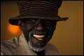
Freddy.jpgby pawdrixComment: Great portrait capture. He has this wonderful and mirthful smile - I can almost hear his laughter. Love the tones in this one - especially the warm hues of the yellow/gold backdrop. The orange spot or spotlight would normally be distracting but for some reason (and I think it has to do with the warm yellow tones of the backdrop) I think of a sun shining in the background...or the spotlight in a warm & cozy jazz club setting. |
| Photographer found comment helpful. |
Home -
Challenges -
Community -
League -
Photos -
Cameras -
Lenses -
Learn -
Help -
Terms of Use -
Privacy -
Top ^
DPChallenge, and website content and design, Copyright © 2001-2025 Challenging Technologies, LLC.
All digital photo copyrights belong to the photographers and may not be used without permission.
Current Server Time: 08/19/2025 12:28:19 AM EDT.