| Image |
Comment |
| 09/18/2007 12:24:27 PM |
Again another view! (Jpoole,7562)by hajekaComment: I did take a look at the original because your entry arose my curiosity. It is all about the angle of shooting which is how I *think* this illusion is achieved. Anyway, love how the white of your main subject realllllly pops off the deep black backdrop. Your composition just pops visually and the illusion you present to us in the composition holds the viewer's attention as we scratch our heads and think "now how did he/she do that?!":-) Lighting and level of details are great in this one. Love how you added a slightly different touch with the pencil being the the same blue tone of the push pin. Visually the color is appealing not to mention it too pops off the white backdrop it rests on. |
 Photographer found comment helpful. Photographer found comment helpful. |
| 09/18/2007 11:41:10 AM |
Rachelby Art RoflmaoComment: Hey Ken...chuckle...yes she is waaaaayyyyyy more beautiful than an artichoke (which is right before this photo composition I see;-) ) The skin tones on this portrait are wonderful! Accompanied by the soft focus she really has a lovely glow. Your B&W tones are excellent - you have a great dynamic range such that the shadows & highlights really pop. The tones are definately not flat. Your daughter has a nice and natural pose here - she is very much at ease with the camera in this composition for one can tell just by the relaxed pose of the head tilted toward the camera and that winning smile. My only critique (and a small one at that) is that you could crop out the portion just below where the tip of her hair falls to keep the focus even more squarely on her. |
| Photographer found comment helpful. |
| 09/18/2007 11:28:07 AM |
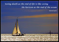
Lifeby JedusiComment: I love the blue and orange hues of the sky and the way the light really illuminates the sails such that it calls our attention to the boat instantly. I do like the play of light on the water's surface which gives it a look of liquid gold - but while studying the image I wonder if there was a way to cut down on the intensity level for it can get overbearing with one look while at another glance it fits nicely. I love the saying but I think a less thicker font (I don't know if you put this font in bold) would suit it better by getting it to be on one line. I like the caligraphic style font you used here - and it would be good to keep it in that same style (and size if you can). But I really feel that if you keep the saying to just one line with the person who said it on the next line you will make that inspirational impact with the saying without taking up up so much visual 'real estate'. Both, the picture and the saying need to compliment each other so if you can say what you want to say without taking away too much space showing the beauty of the skyline & photo then it has much more visual appeal. The picture is absolutely lovely. However I do want to point out that a different way of composing the shot might have made a greater visual impact on that inspirational quote. The quote talks about the horizon as not being the end of the ocean. The way I take the quote is that death is merely an extension of life; that they go hand in hand. And who knows what we will find once we venture in deeper waters beyond what we 'perceive' as the horizon. As you have the composition now the boat is on the far left with a great deal of ocean behind it to the right. There is nothing to sail forward too in it's 'exploration'. Would it not compliment the quote better if you had the boat in the far right hand side of the composition seemingly sailing towards the wide open expanse of ocean waters opening up before it to the left half of the frame? |
| Photographer found comment helpful. |
| 09/18/2007 10:56:18 AM |
Sunday Social Under the Willowby HipychikComment: I like the soft muted colors for it really gives this photo composition a look & feel of an old style painting. I think it is the colors but also the sweep of the 'weeping' tree branches (that are like brush strokes) that gives the impression of an oil painting. Normally I would prefer the main elements (the tree and the birds) to be in sharp as a tack focus but there is something to be said for soft focus and even blur (as I have recently learned from the impressionism challenge)that can add to the mood & feel of the capture. The soft colors and soft focus projects the feel of some soft breezes during a very warm summer day. The tree with it's sweeping branches is where the birds take a moment to rest under the cool shade the tree provides. Now I do have some small critiques in which I think that this capture could be better. The first is to include the tree in it's entirety. The top portion is chopped off. And I have to agree with another commenter's observation that the black frame just doesn't compliment the composition. Either have none at all or look for a softer tone to compliment the soft, muted colors in the composition. |
| Photographer found comment helpful. |
| 09/18/2007 10:43:42 AM |
Verrazano Bridge (other angle)by odessit40Comment: Since this is titled Verrazano Bridge (other angle) I went looking in your gallery for the other shot to do a comparision. I have to say that while Verrazano Bridge is an average shot of a bridge it has much more visual appeal than this composition (I also like the color tones of the Verrazano Bridge btw). The main reason is because it lacks a strong main focal point or element. There are just way too many elements here for the eye to look at that we get lost in a shuffle of lights & objects. Yes a portion of the bridge is there as the backdrop but in the forefront of the composition you have a main road with many lights and light trails from the cars that is pulls attention away from where I think you want the focus to be. If you wanted the portion of the Verrazano Bridge with that rising arch to be the main focal point in the composition I would recommend that you first find a higher vantage point so that you could shot at a angle looking down - say mayhap at the top of a three story building or higher (if that is posssible for it may not be) so that you could possibly zoom in and just get that portion of the bridge with very little or none at all of the street showing. I would also change the orientation of the shot to a vertical so that the arch or rise of the bridge looks like it is extending or rising up to the top middle of the photo. That would give the viewer a greater impression of it\'s height that towers over it\'s environment. If you were aiming to get just the street level with the light streams of the cars going by as your main focal point with the bridge as the backdrop I would recommend just dropping the bridge backdrop all together. Go for a ground level shot such that the light streams from the cars are at eye level to the viewer - this will increase visual impact not to mention get more of the street and the cars to fill your frame. You would also want the focus to remain on the side of the street where the light trails catch only the tail lights. Including the headlights on the opposite side of traffic lanes is adding a distracting element for those lights are much stronger in intensity and shape as opposed to the reds & yellow light trails from the less stronger lights of the taillights. Oh you could do both but because the light level intensities are different in the taillights and headlights you will have to do alot of experimenting with aperture setting and shutter speeds. Hmmm, who knows you might hit on a really excellent time exposure capture of light trails that looks science-fictionish or spacey. Hope this helps. |
| Photographer found comment helpful. |
| 09/17/2007 07:48:43 PM |
Gorillaby bdennyComment: Studying your composition, I find that the ONE thing that MOST draws & captures the eye's attention is the stare of this gorilla as he looks back out at us. That is a strength that you need to play up in your composition. As the composition stands now there is just too much background that serves to detract attention away from this strength. It is a good shot but it can be even better. Bring us closer to this primate and fill the frame with just a head shot. Bringing the viewer closer to your main subject draws our interest in and increases visual impact especially if we see those eyes staring out large & strong right back at us. I am not sure of the capabilities of your camera. But if your camera is capable to zoom in further so that this gorilla's face fills the frame then I would recommend doing so because you will get a greater visual impact. If not, zoom in as much as you can and then crop (hopefully to a size large enough to appreciate the details of the face and textures of the hair). |
| Photographer found comment helpful. |
| 09/17/2007 07:35:08 PM |
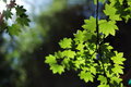
Photosyntheticby KaliComment: I really like the way the dappled light plays across the greens in the leaves of the branches. The play of light and shadows is really wonderful in this capture, but it lacks a strong main focal point or element. Yes there is the branch with the lovely green leaves on the right half of the composition BUT the there is just too large a quantity to really single one or a few of them out to take the spotlight. In addition, they are not in sharp focus for the viewer to appreciate the fine details found in the leaves. I really like how you show us the play of light on these leaves and I think by moving in and focusing on two, three or even four to show us how the light plays upon them would strengthen the composition tremendously. Not only would you give the eye a main focal point to focus on but you would also show us all the lovely textures and veins of the leaves playing in the sunlight. You could even use bokeh to great effect with the tree leaves/trees blurred in the background to serve as a natural backdrop to your main subject focal element. |
| Photographer found comment helpful. |
| 09/17/2007 04:38:25 PM |
A Flowerby jfriesenComment: Wow! This is a lovely floral shot. There is some nice, rich blue tones in the backdrop that really allows the pale golds and whites of the flowers to pop visually. I also like that there is some "texture" to the background that adds another dimension to the photo; rather than it being a flat one or two toned backdrop it has some texture to give an additional element of interest for the eye to look upon without it overshadowing the main subject. Rather the colors and the texture compliments your main focus. I was about to say that the DOF could be sharper but if you use a smaller aperture (6.3 or higher) and a ISO of 50-100 you might loose quite a bit of that bokeh effect on your backdrop. Still your main focus, being these two flowers, might benefit with being a bit more sharper in focus. Experimenting with different apertures & shutter speeds would be the way to go to find out which would give you the rich details in the flowers while keeping the shallow DOF to the background. |
| Photographer found comment helpful. |
| 09/17/2007 04:27:39 PM |
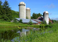
Farmby Yo_SpiffComment: I love the rich colors. I also like the way you composed the shot in which you have a low angle to the ground such that one feels like they are sitting on a picnic blanket on the other side of the river enjoying the pastoral scenery. You mentioned that you cloned out the phone wires � good job on that. For if they were included in the shot it would have ruined the whole idyllic far from a concrete jungle feel. The main critique I have on this one is that there is still a lack of sharp detail � especially on those beautiful wildflowers in the forefront which could really add some sparkle to the composition as a whole. One thing that is very limiting on most of the early P & S is that it doesn�t give one much control over aperture setting, ISO, and shutter speed. You may not have been able adjust those controls but if you ever do go back there a higher aperature (6.3 or greater) and lower ISO will yield a sharper image with more detail in both the foreground and background. |
| Photographer found comment helpful. |
| 09/17/2007 01:00:08 PM |
me_web.jpgby trnqltyComment: Whoa! Time exposure? I like the duo-tones that dominate the composition for it keeps it clean and calls the eye's attention to the main subjects. Exposure of the model (yourself) is very good - we can see all the details and especially the facial expression. Not quite too sure how the waterfall backdrop ties into your composition other than the fact that it (to me at least) initually invokes the idea that you like nature shots and you are an out-of-the box thinker in providing your audience with a new perspective/or way of looking at things:-) A quick glance at your gallery show some high calibre work and certainly some interesting compositions and angles to your photos. My only really nit about this shot is that the rock in the backdrop really shows through your hand and is a tad distracting away from the interesting action that shows you sizing up a shot with the way you cup your hands. |
| Photographer found comment helpful. |
Home -
Challenges -
Community -
League -
Photos -
Cameras -
Lenses -
Learn -
Help -
Terms of Use -
Privacy -
Top ^
DPChallenge, and website content and design, Copyright © 2001-2025 Challenging Technologies, LLC.
All digital photo copyrights belong to the photographers and may not be used without permission.
Current Server Time: 08/19/2025 01:41:11 PM EDT.