| Image |
Comment |
| 09/20/2007 01:26:10 PM |
Jacko's "Two Classics"by dannyleeComment: Nice capture on the water 'tower' and the details on that splash are superb! Love how the top portion of the splash drop mirror the checkerboard pattern. The only flaw with the composition is that the tones and contrasts are a bit flat. They could be bolder and more vibrant such that they pop off the page. Perhaps playing around with bringing up the brightness & contrast will make the tones visually pop even more. Or mayhap play around with the tones in the image pop. This thread mentions several links that provide some good info on the use and application of the S-Curve S-Curve, |
 Photographer found comment helpful. Photographer found comment helpful. |
| 09/20/2007 10:37:20 AM |
Surface Tensionby cheekymunkyComment: Wow! Look at those bold & vibrant color hues! The red really *pops* off the black and the electric blue surface lines. Speaking of lines, it is the lines and curves of the shapes seen in the composition that really captures and draws the eye in. It is very hypnotic in both the original and this emulation. Lovely details, color and lighting in this composition! Great job! |
| Photographer found comment helpful. |
| 09/20/2007 10:32:14 AM |
De Sousa's Swan Lakeby Dirt_DiverComment: Nicely done emulation of De Sousa's Swan Lake! The thing that really plays with our imagination and captures our attention is the musical wake as the swan 'swims' past. I can't be sure if the sheet music you used is from Swan Lake but I certainly hope so for that would strengthen the composition. Lighting is good but could be better for the lighting drops off drastically on the far right hand side such that the music falls into shadow. Moving the light source a few more inches away could have still cast a spotlight while illuminating the whole of the sheet music. I would have liked the forground to be in sharper focus/detail. Utilizing an aperture of 7.1 or even higher along with low ISO 50-100 and slower shutter speed (1/8 to 1/50) will greatly increase image detail along with increasing the sharpness of your Depth of Field. Lastly, I think bringing the viewer a bit more closer to the music & the paper swan would increase visual impact for you will show us more - here you have too much of the sheet music visible that we see the far right edge of the sheet and the black background beyond. Sometimes less is more, bring us closer to your main subject and let it shine. |
| Photographer found comment helpful. |
| 09/20/2007 10:20:23 AM |
Point to Point by Techoby darnokComment: Wow, great job in emulating the original. Tis a great rendition but it could be spectacular if just a few things were done. First, I think it would increase visual impact if you increase the DOF in the shot. It would show more details along the length of this pen. As it stands now the only portion in sharp detail is the point of the pen. If you notice the photo info on Techo's version he used an aperture of 8 and a low shutter speed of 1/15. By doing so, he increased his Depth of Field so that not only the foreground is in sharp detail but the background is too. Next I think that spreading the pages out more so they are not clumped in bunches adds more clean lines to the photo that will make it more visually appealing. |
| Photographer found comment helpful. |
| 09/20/2007 10:10:20 AM |
Librodo's Eye for Coloursby VitaminBComment: Wow, nice color variation on your emulation! I like how you pretty much tried to kept to the original in variating the pencil positions. One will be high then next low then one high and the next low. You kept a pattern going a bit but then you stopped with adding two pencils between the higher ones (as seen on the far right hand side). Not breaking a pattern of repetition is important for it keeps the composition a cohesive whole. Breaking the pattern breaks the chain and makes the imagery a bit disjointed. The overhead looking down angle while good at showing us this radiating circle it doesn't add any additional visual interest. Angle can add interest. Shooting at a slightly lower orientation and at a 30 -60 degree angle can add some visual interest as well as showing this radiating color wheel of pencils. |
| Photographer found comment helpful. |
| 09/20/2007 10:00:42 AM |
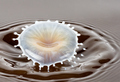
Tribute to IreneMby freakin_hilariousComment: While the splash is not a clean vertical mushroom shape like it is in IreneM original it is still a spectacular capture. Love the soft colors of the milk as it blends into with the coffee in 'hatlike' splash shape. The way the colors blend and fold in that hatlike portion projects two more senses: that of touch with those soft tones and the smooth caramel texture seen & that of taste for the creamy mix of color looks so smooth we can almost taste it. My only critiques is that I wish that it had the same sharp detail on those small droplets fanning out from the main splash & that the color of the coffee was a richer brown. The richer brown tone can easily be achieved with either adjusting the Brightness/Contrast or adjusting the color balance. The sharpness on those smaller drops - well that is just sheer luck and a ton of patience. Easier said than done for in a recent thread IreneM said she easily went through 4,000 photos in a weekend and ditched them all for they weren't good. So kudos to you for having the time and patience to capture just this one. |
| Photographer found comment helpful. |
| 09/20/2007 09:43:34 AM |
She left the note again..by NerveComment: Nice lighting, sharp details and good color tones on your emulation of the original. I really don't have much to add but I do have one suggestion on one element of the photo. Adjusting your lighting such that you catch a gleam in the diamond of the ring would increase visual interest for it would call more attention to that ring - not to mention add a subtely interesting ironic juxtaposition of spotlighting the beauty of the sparkling diamond paired with this negative message in the keyboard. Also the ring would look a bit more visually appealing if the surface was not so tarnished - although it does add a bit to the composition for you could say it is a subtle nod that this relationship has grown tarnished. Hmmm, boy I really didn't have that much to say as I look back;-) |
| Photographer found comment helpful. |
| 09/20/2007 09:20:12 AM |
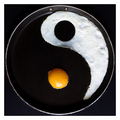
The philosophical thought of Scalvert - from Dichotomy by WindtaleComment: This is a good emulation of Scalvert's composition. Colors are good and focus is nice and sharp. As difficult as this is too do, I think that there is some room for improvement. The one flaw that really detracts from the visual beauty of the image is the lack of sharpness on your shapes. Scalvert is a perfectionist when it comes to making it look just right - and I know he went to extreme levels with a mold then exacto knife and all. The shape of the egg yolk and the egg whites in this composition lack the sharpness and clean lines of the shapes they are originally emulating (the yin & yang symbol). I don't know if you have the necessary time, tools and patience that the original warrented but it would greatly improve the visual impact if those basic shapes if you could have nice clean sharp lines. Don't get me wrong it is a good photo BUT it could be better. The other thing I think that would strenthen the visual impact is that the inside of the pan and some of the pan handle showing in the frame. The original shows some details of the inside of the pan, more definition of the shape of the pan and a portion of the pan handle. Showing us the details of the pan heightens the impact visually that this yin & yang imagery is appearing in an every day cooking item. In your composition the only 'visible' visual clue that we have showing us that this is indeed a pan is the outside rim and the two metal rivets at the top - most of everything else is black. The black of the pan needs to be a different color tone than the black background it is set against for without that difference in tone it just blends too much into that background color. Don't get me wrong this is a good photo BUT it could be better *7*. |
| Photographer found comment helpful. |
| 09/20/2007 09:01:45 AM |
Bille II .. or IIIby ralphComment: Very nice emulation on the original - love how clear and crisp the details are in the reflected pattern on the glass ball. The repeating and reflected checkered pattern is almost hypnotic. Composition is visually interesting and it holds our attention. My only critique is that that some of the color tones, especially as you travel to the background, appears to be a dirty grey/with a touch of red/pink tone. I recently found out that adjusting the white balance on the camera can help avoid some odd color casts from the light sources that our eye does not see. Adjust White Balance and see if that helps. The other thing you can do in Photoshop or Paintshop is to play with the color balance bar either adjusting it's light 'temperatures' from warm orange incandesant bulb to cooler blue shades of sunlight. There is also a box you can check to remove color cast. The composition might also benefit from a brightness/Contrast adjustment to make the contrasts visually pop more. |
| 09/20/2007 08:50:10 AM |
Two Classics by Jackoby IreneMComment: Wow, nice details on this capture. Love the 'tower' created from the drop - and the top portions mirror the checkerboard pattern with sharp clarity. Great job on emulating the original. My only critique is that the black and white tones don't appear as crisp in tone that they could be...contrast appears a tad flat. Perhaps playing around with bringing up the brightness & contrast will make the tones visually pop even more. |
| Photographer found comment helpful. |
Home -
Challenges -
Community -
League -
Photos -
Cameras -
Lenses -
Learn -
Help -
Terms of Use -
Privacy -
Top ^
DPChallenge, and website content and design, Copyright © 2001-2025 Challenging Technologies, LLC.
All digital photo copyrights belong to the photographers and may not be used without permission.
Current Server Time: 08/19/2025 07:07:28 AM EDT.