| Image |
Comment |
| 11/12/2007 08:55:18 PM |
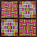
Liquorice All Sortsby sherpetComment: Wow, this is a very interesting composition of candy confections. First off that captures and holds the eye's attention is the colors and the patterns. The colors and bold and vibrant. The arrangement of the colors and their stripes and shapes creates a compositional piece that is both abstract study in shapes and psychedelic. You effectively arranged the colors and patterns of the candy into attention catching composition. And it is not just the patterns of the 4 squares but I noticed you paid specific attention to matching the orientation of the stripes of each side of the squares to create symmetry. On my monitor I can barely see the licorice borders. I am on the fence with whether it would be a good thing for the texture of the twisted patterns on the licorice might clash with the straight edge patterns that is the majority of the composition. Yet, it might add an interesting twist (no pun intended what so ever) to add yet another pattern to the mix. |
 Photographer found comment helpful. Photographer found comment helpful. |
| 11/12/2007 08:37:17 PM |
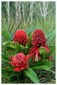
Waratahby sherpetComment: O.K. I have never seen this type of flower but I still find it beautiful for it's beautiful red hues and it's exotic look. BTW to my monitor the colors of red and green are bold and vibrant and don't give the appearance of being overprocessed. While I love the hues and the shapes of this floral I am left wanting more. There is just too much surrounding landscape that takes the direct focus off this unusual & beautiful plant. Draw your viewer closer so us all the beauty and intricate nature of this plant by either zooming in closer or cropping closer (a square crop would look rather nice and keep the focus on the Waratah). Bringing the viewer closer to the flower will also show us more detail of the 'texture' that we only get a glimse of from this stand-off position. Seeing how the petals curve and loop would go a long way with increasing dramatic impact. |
| Photographer found comment helpful. |
| 11/10/2007 10:09:59 PM |
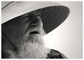
The Old Man & the Seaby BradComment: I am not familiar with either versions of the movie so I am just going to give you the benefit of the doubt and just judge this on the composition & technicals (plus I couldn't find any photo matches on Google:-) but that does not mean it does not exist just that I cannot make a good comparison) Let's see lighting is very good and it illuminates your subject very nicely. We see many sharp details from the individual hairs in his beard to the crow's feet around his eyes. His eyes - now there is where I would have liked to see more off. Yes, he has the squint that many fisherman have from avoiding taking in too much light glinting off the surface of the water, but I still think a bit more of the whites of his eyes along with more of the pupils visible would create more visual impact. Eyes are the window to the soul. The B&W tones are good but could be even better if there was a stronger contrast between the highlights & shadows. Bumping up contrast and playing with the Highlights/Midtone/Shadow levels in PP would give this a greater and more dynamic range of tones. |
| Photographer found comment helpful. |
| 11/10/2007 09:56:00 PM |
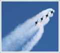
Top Gunby NobodyComment: Cue Music:
Revvin' up your engine
Listen to her howlin' roar
Metal under tension
Beggin' you to touch and go
Highway to the Danger Zone
I have not seen this movie in ages but yet I instantly made a connection with your photo to the movie and I hear Kenny Loggin's Danger Zone playing in my mind as you set the scene. Lighting is excellent. Compositionally the photo is interesting for the main elements (the smoke and the jets) are not centered but appear at a diagonal to the rectangular format. Not a big fan of the border for I think it detracts a bit from the action happening in the scene - a clean 1 pixel wide white and then 1 pixel black would be enough to frame it without detracting. I don't know if the circumstances were possible but it would have been absolutely visually stunning if you managed to capture the the flames or engine burn from the back of the jet engines. Nonetheless a good capture. Well done. |
| Photographer found comment helpful. |
| 11/10/2007 09:41:29 PM |
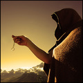
The Lord of the rings - One ring to rule them allby WindtaleComment: "It is a strange fate we should suffer so much fear and doubt� over so small a thing. Such a little thing," states Boromir. First off, kudos to you for tackling such a visually stunning movie. Any scene would be very difficult to tackle (I thought of several myself but quickly wrote them off as not possible). Yet you rose to the challenge and created a fairly good rendition of the scene. While the composition has several elements that differ from the movie scene your emulation is still recognizable as that scene where Boromir picks up the ring after Frodo falls in the snowy mountains. I do like that you have captured the snowy mountains to act as the backdrop in your scene re-creation. However I think the lighting and tonal color are detracting from the visual impact of the photo. The gold/yellow tones are typically warm tones - it goes against the feel of the environment setting in the movie. The regular colors and the very snowy backdrop convey a feeling of cold and chill as they travel through the harsh, and cold terrain. The warm gold tones conflict directly with conveying that harsh & cold terrain in which the Fellowship travels. Not only that but the gold/yellow tones take the focus off the main element in the shot: The Ring. It is the Ring whose deceptive gold tones that should be the sole dominate gold color of the scene. The pose of the model as 'he' holds up the ring is a good emulation of the movie scene but the light falls a bit too harshly on the chest portion of the cloak and it then falls into shadow as the arm holding the Ring up has it's shadow cast. A bit more even lighting to illuminate Boromir so that there are no blown highlights or deep shadows to distract would improve the visual of the composition. Admittingly it would be better if we saw Boromir's face, but he (or she) may not have enough of the same looks as the actor, Sean Bean. Nonetheless, if your model bore enough of a similiar resemblance (hair & beard) to the actor the facial expression could carry the day. Now the Ring. I love how you captured a nice gleam bouncing off of it. It calls attention to it and gives it a little more visual interest. The other critique I have is that in both the movie and the books the Ring is described as being a heavy burden (both physically if you remember when Bilbo drops it before leaving Bag End it has a very audible THUMP which was done on purpose & spiritually). Admittingly, the devil is in the details but I feel it would be visually better if the Ring does not appear to be blowing in the wind as seen by the angle is hangs. A straight line angle that is 90 degrees to the ground would show subtly how 'so small a thing' is so heavy and holds much power. |
| Photographer found comment helpful. |
| 11/10/2007 09:06:32 PM |
300by IvoryComment: I must admit I have not yet seen the film. What I have seen are the trailers and some behind the scenes & how it's done of the movie. So I have to say from what I have seen, you have nailed the gritty feel of the movie in both the graininess and the color scheme. Those red capes really lept off of the screen in the movie scenes I have seen. The reds in your composition also leaps off the screen and makes the same connection to blood and war as the movie does. Attention to detail is also good - the red cape as well as the crested helmet. Admitingly, a spear and shield would strengthen the visual connection to the film even more but sometimes you work with what you have. I do have just two critiques on how the composition could be improved. First the expression of the mouth of your model could be much more fierce. I feel that the expression of the mouth just needs to show more violence - like he is about to tear out your throat with just his teeth if need be. Lastly, I wish that the eyes were visible in the shot. They are hidden in the shadow of the helmet. The whites of his eyes could/would also go a long way with communicating the heat of battle. A ferocious expression in both eyes and mouth would create even more visual impact and create an even stronger connection to the movie. |
| Photographer found comment helpful. |
| 11/10/2007 08:41:11 PM |
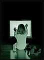
They're heeere! (Poltergeist) by DrAchooComment: That saying "They're heeerrreeee!" just helps to set the stage with the creep out factor of this iconic movie. The lighting is good in that the greenish cast is in line with the scene in the movie. It adds to the errie and creepy mood...a greenish ghostly light emulating from the common T.V. Pose of your model is an effective emulation of the little girl, Carol Ann, in the movie. I like how you paid attention to details in the elements of the composition. The girl is wearing a simular style P.J.'s and you even have a stuffed animal in the same position as it is in the film. The only deviations are the type of the T.V. (can't be helped as that the style and technology has advanced in the decades since the film was made), the hair of the little girl is not straight like the actress in the movie's was (really, not a detraction), and the teddy bear is not a light colored one but rather a dark colored one (a light hued one would work better for it would stand out from the shadows better). Is the composition recognizable from the movie it emulates? The answer is yes. Would is be recognizable without title benefit? Yes, I firmly believe it would. Lighting is good, composition is excellent, and details are great. Good job! |
| Photographer found comment helpful. |
| 11/10/2007 08:29:31 PM |
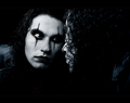
The Crow - City of Angelsby AlexSaberiComment: Have not seen this movie in years so I am not as familiar with the scene set-up. Is the composition recognizable from the movie it emulates? Yes. Would is be recognizable without title benefit? Yes, I believe it would. Lighting is absolutely great illuminating your subject perfectly. Composition is very interesting for we see the individual looking at himself in the mirror and we see the reflected image back. It is if we are discovering this 'face' at the same time as the Crow. Colors in the scene are very good. Dark colors with the white of the Crow's face keeping in the tones and dark mood represented in the film. Details are nice and sharp. Good capture - coming back to bump up to 9. |
| Photographer found comment helpful. |
| 11/10/2007 08:15:26 PM |
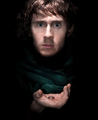
The Lord of the Ringsby breadfan35Comment: Your scene selection is very much in the flavor of the Lord of the Rings movies by Peter Jackson. I really like how your lighting just illuminates the face of 'Frodo' and the open hand holding the one ring. That spotlight light illuminates what needs to highlighted. Everything else fades into the darkness...or can it be said the 'Frodo' is emerging from the darkness that threatens to overtake him...hmmmm. While one of my most highest rated photos in the challenge, I still have one critique. It's a small one admittingly but one that would possibly improve the visual impact. Lighting is the category the critique falls into. A little more lighting to illuminate the hair (mayhap it shows up that way on your monitor as that not all monitors are calibrated the same...much to many people's annoyance including my own:-) ). And with perhaps just a slightly different position of the light or a another small light would have better catch lights illuminating the eyes. The catch lights here are right in the center of the pupils and are not AS flattering as those not dead center. Nonetheless and excellent capture. Good job! |
| Photographer found comment helpful. |
| 11/10/2007 07:56:18 PM |
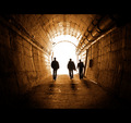
28 Weeks Laterby GiorgioComment: I have never seen the movie, so I am not familiar with the scene...but that is where Google can sometimes step in to help make the comparision:-) I like how you presented the composition in a letterbox format to give it a movie theater feel. Lighting is great and matches the scene represented. There are some differences but not so much. The photo match I found on Google shows the characters running. Here in your composition they appear to be walking. I get the sense of urgency in the Google photo scene but I do not get it here. Whether that impacts hugely on impression of those who have seen the movie I don't know. So I stick with what I see and what I see is a technically flawless and compositionally appealing capture. Lighting, detail, and composition are fabulous! Well done! |
| Photographer found comment helpful. |
Home -
Challenges -
Community -
League -
Photos -
Cameras -
Lenses -
Learn -
Help -
Terms of Use -
Privacy -
Top ^
DPChallenge, and website content and design, Copyright © 2001-2025 Challenging Technologies, LLC.
All digital photo copyrights belong to the photographers and may not be used without permission.
Current Server Time: 08/19/2025 06:45:07 PM EDT.