| Image |
Comment |
| 07/21/2008 10:26:34 PM |
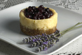
Miniature Blueberry Cheesecakeby tryingtostayinfocusComment: Simple and clean in presentation. I really like how you composed your element in this composition but there are a few areas that need improvement before this above average shot moves into the stellar category. First to tackle is lighting. Better lighting to show off the richness of the blueberries topping this treat not to mention rid the deep shadows thrown off to the left of the subjects. A good portion of the cheesecake dwells too much in the shadows. Bring it into the light so we can really taste it. Two lights each set on other side at 45 degree angles would eliminate deep shadows. Then to really add some frontal lighting without creating harsh shadows or lighting use flash to fill in. I found that placing a simple tissue paper around the flash diffuses the light and still gives some wonderful frontal lighting without the harsh light or reflections. And be careful of angle in which you shoot such that the flash does not show a visible shadow behind the cheesecake. It can and probably will cast a shadow just as long as it is not seen on the 'film'/take. Next unless the shot is High Key you really want your main subject to pop visually off the background. For that you need greater contrast. A white plate set on a white lace tablecloth is not going to have great contrast. A white plate set on a deep, dark wood or maybe black tabletop/countertop WILL pop visually. Lastly sometimes introducing shapes within shapes can subtly increase the visual appeal with the viewer without them not knowing quite why. By that I mean you have a square plate here - so use it to increase visual interest. Keep the plate and angle of the shot the way it is BUT have it such that you capture the WHOLE of the plate. Then come in and crop the photo to a square format with the plate taking on the look of a diamond in the composition. A square within a square. |
 Photographer found comment helpful. Photographer found comment helpful. |
| 07/21/2008 10:03:22 PM |
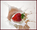
Strawberries and Cream by AndyMac24Comment: Great job on catching an interesting splash AND keeping a real sharp focus on the strawberry so that we see all the lovely details. I tried this same thing myself several weeks ago so I have an appreciation for anyone who does better than I (could not get a good splash combined with the good view of the strawberry in sharp detail). Plus I would never do this again since it created such a mess on the lights (nothing like burning milk yuck:-) ) So kudos to you for also putting up with a heck of a mess - unless you got really lucky and got this within the first 10 shots. Now onto more of the critique. The color of the strawberry is a wonderful vibrant red and you caught it wonderfully at the moment of splash. Nice stop action here as well as sharp details. The areas that really pull this down is mainly in the color cast of the milk. It has a pinkish cast to it in some places. That could be removed or corrected in one of three ways. First way is to adjust your white balance to read the milk as a true white. Second is to play with RGB levels - a slight adjustment on the red should tone down the pinkish cast but be careful not to rob too much color from the strawberry. Third, fresh milk. By that I mean I noticed that after a significant number of drops of the strawberry into the milk it took on a pinkish tone from a bruised strawberry. Once that happens you need to fill up with a fresh batch - truly the Strawberries & Cream shot is a messy and costly trial. Lastly, the other area that is a weakness in the shadows cast from the splash. Now it is a catch-22 I know. For at the overhead angle you caught a wonderful splash as well as the wonderfully red & detailed strawberry. But the drawback was the distracting and unflattering shadow. The only way to eliminate that is by changing angle to a side view. And THAT would require greater patience and luck in catching the right moment of impact while still showing a good deal of the strawberry in sharp focus. Not an easy thing. Still an above average shot but with a little more work this could have easily been in the stellar category. |
| Photographer found comment helpful. |
| 07/21/2008 09:47:42 PM |
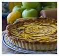
Tarte aux Pommes Citroneeby pawdrixComment: Love the lighting. The composition of elements, colors, choice of elements and lighting all combine to create a feel that you are in a European bistro/cafe ready to enjoy a bite of this tarte and mayhap some tea. The detail is what makes this - as I mentioned your choice of elements goes into the 'feel' of a place as well as looking upon this yummy treat. The plate and pottery in the background with the Old World European textile patterns really helps elevate the feel of being in a cafe. Love the colors and the swirl pattern of this Tarte for it also draws the eye in. Lovely job - coming back to bump up to a 9. |
| Photographer found comment helpful. |
| 07/17/2008 11:29:50 PM |
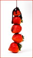
Chocolate Covered Strawberries by toddheadComment: The Tower of chocolate drenched Strawberries! Nice job on the lighting and love the sharp details on this one! The bright & bold reds of the strawberries really pop off nicely off the white backdrop. I also like the sheen that can be seen off the deep dark chocolate that is being poured over them. Years ago I found it challenging to photograph dark liquid chocolate for if you don't capture a sheen or an underlying hue of rich browns then it looks rather unappetizing. I can see both a sheen and some underlying tones of dark brown which greatly helps make the image more mouth-watering. Now on to two critiques that would help improve the visual impact of the photo. The arrangement of the strawberries in the tower has no real pattern such that they appear thrown together in a lopsided fashion. Arranging them in a pattern could help make the image even more appealing for the eye to look upon. For instance if they were arranged with their bases at the bottom with the tip facing up to met the next one at the base with the tip pointing up and so on. It would be a repeating pattern one which the eye could recognize and find order and appeal in it. Not to mention the top strawberry would have the tip pointing up such that the chocolate dripping down off of it would look similar to that of a snow capped mountain. Next I am none to sure about the choice of the red border - I feel that a border that is the same color as your main subject tends to draw away focus off of your main subject. A simple unassuming color to frame the photo would be more complimentry and not draw attention away. |
| Photographer found comment helpful. |
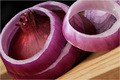
| 07/17/2008 11:16:37 AM |
Onion Ringsby MelethiaComment: Love how you placed the subject of your composition on the diagonal for adds interest to the eye. Love the reddish purple hues that just pop off the page - and it pops nicely off the surface of the wood cutting board. Lighting is excellent for it illuminates the red onions perfectly. Love the details that we can see in this photo. Focus is wonderful. Good job on this one 8. |
| Photographer found comment helpful. |
| 07/17/2008 11:15:47 AM |
Bruschetta della Casaby JammurComment: Lighting on the main subject is wonderful. Composition of elements is very appealing to the eye. And the food - well it looks REALLY good to eat. Again you did an excellent job of lighting your subject as that I have recently learned that food photography calls for really good lighting and composition to make the food look mouthwatering. Great job 9.Nope bumping to 10. Coming back to this - this looks like it is straight out of a magazine or cookbook. Stellar job. |
| Photographer found comment helpful. |
| 07/17/2008 11:03:22 AM |
Chicken Salad Sandwichby Nathanael_GComment: Nice simple color background scene. Lighting is good. Compositional angle is on the diagonal which adds tremendous visual interest in this sandwich dish. Lighting is wonderful on the sandwich slice in the foreground but it fails to light up the darker greens on the sandwich in the background. Throw some more light evenly on the scene and that lettuce on the sandwich in the backdrop could look as crisp and crunchy as the lettuce on the sandwich slice in the forefront. A greater depth of field to increase detail on the slice in the background would increase visual interest in the scene because not only would the viewer have one crunchy, crispy delicious sandwich slice to feast on but two. This is an above average image but has potential to move into the exceptional category. |
| Photographer found comment helpful. |
| 07/17/2008 10:25:41 AM |
Tomato Salad with Mozzarella and Basilby HeiSchComment: Wow, nice deep red color and sheen on those tomatoes. The red color immediately draws the eye in. I like the composition of the reds of the tomatoes to the white of the mozzarella and the greens of the basil. The reflective surface of the 'table' adds a nice clean & minimal polished look to the composition. The knife is another element that adds strength to the composition for it solidifies the imagery of food preparation and working in the kitchen. But then the composition suffers because of the additional elements the help clutter the scene and detract from what has the potential to be a clean & polished food photo. Don't get me wrong it is an above average photo but it has/had the potential to be in the exceptional category. The yellow background is not at all complimentary to the clean and polished look of the reflective surface of the table - not to mention it 'overpowers' the power color of this scene which is the red of your tomatoes. The addition of the salt & pepper shakers in the backdrop just gives the eye too many elements to look at. The star attractions, your main subjects, of the tomatoes, basil, and mozzarella balls should dominate the scene but here they get slightly lost amoung too many elements. |
| Photographer found comment helpful. |
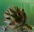
| 07/17/2008 10:09:59 AM |
Simmer 'til Doneby rjksteschComment: Love the splash coming off this artichoke. The green subject on a green background is good - especially with invoking the idea of refreshing to the taste & sight senses and the firm thought of good fresh produce. You have some good details and sharp focus on the artichoke. The image is slightly above average but has the potential to move into the higher scoring territory. The biggest thing holding this back is lighting. There are a great many portions of this vegetable that are in shadow. If frontal lighting was evenly distributed across the artichoke (boy I hope that is what this is for it does look like it) then the viewer could visually appreciate the details & textures of this vegetable even more. |
| Photographer found comment helpful. |
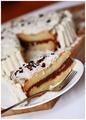
| 07/17/2008 09:59:30 AM |
Vanilla & Chocolate Layered Cheesecake by PuttyKatComment: I really like the angle you shot this at for it adds visual interest to this cake shot. Colors are good and lighting is as well. I know the main focus is primarily the slice of cheesecake, but I think that you could have increased the DOF to include sharp detail of the cake in the background. Having both yummy elements in sharp focus would not have hurt this composition - I feel it would have helped it more for it would give the eye even more to feast on. There are two elements here that hold back this image from moving out of the above average category and into the exceptional category. Capture all of the plate and fork in their entirety - as well as the full shape of the cake in the backdrop. The reason is an echoing of shapes to create visual interest. What I mean by that is the circle shape of the plate would automatically draw the eye to the circle shape of the delicious cake in the background. Second, I am just not so sure that the cutting block was a good element to break up the white of the table, plate and cake. Without it, the image would have a cleaner more minimalistic look such that the cake and only the cake is the main subject our eyes will see. Still a good photo bumping up to a 7. |
| Photographer found comment helpful. |
Home -
Challenges -
Community -
League -
Photos -
Cameras -
Lenses -
Learn -
Help -
Terms of Use -
Privacy -
Top ^
DPChallenge, and website content and design, Copyright © 2001-2025 Challenging Technologies, LLC.
All digital photo copyrights belong to the photographers and may not be used without permission.
Current Server Time: 08/20/2025 02:55:46 AM EDT.