|
|
|
Showing 311 - 320 of ~931 |
| Image |
Comment |
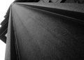
| 05/26/2007 05:29:33 PM | Straight to the Topby bvyComment: Hello from the Critique club, my name is Jon Rowe, and i will be looking at your image this evening :)
Composition/Lighting : i love the film grain look to this. i gave you a 6 on this, but you did end up getting a fairly good score. composition-wise, i think that the vanishing point is positioned too high on the image. the main focus is in the middle of the abstract object, and that is where the eye wants to stay and focus on. the left side exiting the photo is also somewhat distracting, which is a few reasons why the sub-6 voters voted as they did.
Challenge : It most definitely fits the challenge. there is really not "wow" factor though, for the viewer wonders what it is, and then is through with it. No disrespect meant whatsoever. i did not enter this challenge for it really seemed to be a difficult one, so i commend you for entering and trying. you did a great job. 5.5 is not a bad score at all, and i would be proud of it.
Conclusion : Very nice job. You found a very interesting vanishing point and presented it well. This is a great addition to your portfolio. Only nitpick would be as stated, messing around with the composition here and there, and maybe a little contrast boost throughout.
Keep on shootin!
Good luck on your future challenges:)
-Jon Rowe |  Photographer found comment helpful. Photographer found comment helpful. |
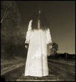
| 05/26/2007 05:23:06 PM | A Vanishing Point A Vanishing Subjectby ColeyComment: Hello from the Critique club, my name is Jon Rowe, and i will be looking at your image this evening :)
Composition/Lighting : this is a great example of when a centrally composed subject works. very spooky. i think this is very well done. i believe the reason for the 5s is two-fold. i gave it a 7 for i loved it, but thinking on behalf of the rest of the DPC crowd, the lighting left a lack of detail in the fore/background and in the subject itself. also, i think the placement of the model makes this look too staged. the actual "vanishing" of the subject and of the railroad tracks seem to possibly leave the model missplaced in my opinion. if she was placed further back down the tracks, with the look of walking towards the camera/viewer, i believe this might show off the end of the tracks (vanishing point #1) and the model (vanishing point #2). i do like what you did here, and think it deserved a higher score, but if i had to nit-pick, that would be my opinion.
Challenge : this definitely meets the challenge. i like the look of the tracks, and the seeing through the subject to see the back vanishing point. very clever, and unfortunately i believe a number of those 5s didn't take the chance to notice that the girl was not the only thing vanishing in this fine poetic image.
Conclusion : very well done, i love your work. i have admired quite a few of your shots for some time now and find it a privilege to critique one of your entries. keep up the good work. great image here, and not that bad of a placement at all. even got a few favorites out of it, that always helps :D
Keep on shootin!
Good luck on your future challenges:)
-Jon Rowe | | Photographer found comment helpful. |
| 05/26/2007 05:14:43 PM | Morning at the officeby dodeeComment: Hello from the Critique club, my name is Jon Rowe, and i will be looking at your image this evening :) Please know this is just my opinions, and my aim is to not tear the photo apart, but to offer constructive criticism as a critique of your image.
Composition/Lighting : The lighting in this was what you were given, so let me focus on the composition. I'm guessing that the vanishing point you were trying to show in this image was the lines on the side of the building going back. From a "creative standpoint", i probably would have cropped half the width of the building off of the right side of the image, that way a 2/3 x 1/3 crop (rule of thirds) would show off the building itself, and have the right side to show the "world outside" to add a little depth. the way it is now, there's more background city than there is building, and the building is your focal point. Reading your image description, you say that the city seems to run on forever, but the only leading lines to the "vanishing point" i see are the building. The image, during voting, needs to speak for itself rather than the description. you did a fine job, honestly. i truly think a different crop would have done wonders for this.
Challenge : i believe the reason for the 4 votes in this is due to the viewers inability to immediately find the vanishing points. as i stated earlier, the image must speak for itself, and in this one there unfortunately are not any obvious vanishing point lines. i commend you for trying, this was a tough challenge and i could not even think of an idea to enter, so i sat out.
Conclusion : in conclusion, i would say that this is probably about where i would expect it to end up as far as from a voting standpoint. i gave it a 5 while voting, but that does not say that it is a bad image at all. keep that camera handy, keep shooting, and continue improving. this is not a bad photo by any means. you did well!
Keep on shootin!
Good luck on your future challenges:)
-Jon Rowe |
| 05/26/2007 05:02:01 PM | Awakeningby suitenessComment: Hello from the Critique club, my name is Jon Rowe, and i will be looking at your image this evening :)
Composition/Lighting : i think the composition really works here. the bulb and the pad on the left are positioned well on th horizontal third line, and i love the DOF you used here.
Challenge : I think this met the challenge nicely. you should be proud of this, especially for it to be a first challenge entry. you even received two favorites, something some take months to achieve. GREAT JOB!
Conclusion : i really like this. i think the only thing that i could give my opinion on where i would change this is to possible increase the contrast a little to make the bulb stand out a little more, and maybe a TAD sharping overall. with this being your first entry, i'm sure to see more quality work coming from you. great job, and keep up the great work.
Keep on shootin!
Good luck on your future challenges:)
-Jon Rowe | | Photographer found comment helpful. |
| 05/24/2007 09:26:24 PM | | | Photographer found comment helpful. |
| 05/24/2007 09:24:14 PM | |
| 05/24/2007 09:22:18 PM | Shapelyby BrinComment: great shot, should do fairly well in this, top ten maybe? great job | | Photographer found comment helpful. |
| 05/24/2007 09:20:52 PM | |
| 05/24/2007 09:18:10 PM | Aqua faceby william88Comment: oh wow, this should definitely ribbon...i'm eager to see how this was done and what it is :D
great job, ten | | Photographer found comment helpful. |
| 05/24/2007 09:16:49 PM | |
|
Showing 311 - 320 of ~931 |
Home -
Challenges -
Community -
League -
Photos -
Cameras -
Lenses -
Learn -
Help -
Terms of Use -
Privacy -
Top ^
DPChallenge, and website content and design, Copyright © 2001-2025 Challenging Technologies, LLC.
All digital photo copyrights belong to the photographers and may not be used without permission.
Current Server Time: 08/05/2025 10:00:27 AM EDT.
|