| Image |
Comment |
| 10/10/2005 08:27:07 AM |
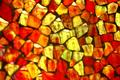
Pensive reflectionby dmmontyComment: The complementary colour for red is green and for yellow is blue-violet. Your photo does not demonstrate complementary colour contrast. Nevertheless it is an interesting abstract arrangement of bright colours and interesting textures. |
| 10/10/2005 08:25:13 AM |
Mountain Roseby fiveriversComment: Great shot of the temple, but your main complementary colours of the red bricks and the green foliage are diluted with the yellow/violet colours on the roofline and the blue/orange in the windows. You could have cropped tighter to the building to show just red and green to demonstrate the complementary colour contrast. |
| 10/10/2005 08:22:39 AM |
Flareby fotodudeComment: Fine abstract arrangement of leaves, but you needed to show more red and not yellow to demonstrate complementary colour contrast. |
 Photographer found comment helpful. Photographer found comment helpful. |
| 10/10/2005 08:21:42 AM |
Yellow & Greenby DottieDComment: Yellow and green are not complementary colours... your model should have worn a red coloured shirt to provide complementary colour contrast in this nice portrait. |
| 10/10/2005 08:20:17 AM |
Mighty Armby indy79Comment: Very nice shot of the crane, but you could have shot at a different angle and/or cropped a bit tighter to emphasize the orange-yellow complementary colour contrast on the equipment. |
| Photographer found comment helpful. |
| 10/10/2005 08:18:11 AM |
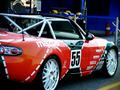
ZOOM! ZOOM!ZOOM!by figmentComment: Your car should have been more yellow than red to demonstrate complementary colour contrast against the colours in the background. |
| 10/10/2005 08:17:12 AM |
Neopolitan Linesby jseyerleComment: You need to have added a range of blue tones ranging from indigo to cyan in order to demonstrate complementary colour contrast in this photo. Nice textures in the surface, though! |
| 10/10/2005 08:14:46 AM |
the simple thingsby irish_eyesComment: Too many colours here to show complementary colour contrast. You could have separated out your red toned crayons, for example and your green toned crayons and shot against a white background for a better demonstration of the complementary pair. |
| 10/10/2005 08:13:08 AM |
Orange Scooterby jdughiComment: The orange and yellow of the scooter need to have a blue or blue-violet colour to provide complementary contrast. |
| 10/10/2005 08:12:12 AM |
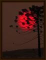
Unreal Sunsetby rodrigoComment: The red of the sun is brilliant, but the rest of the image appears brown rather than a green that would demonstrate a complementary contrast in this picture. |
| Photographer found comment helpful. |
Home -
Challenges -
Community -
League -
Photos -
Cameras -
Lenses -
Learn -
Help -
Terms of Use -
Privacy -
Top ^
DPChallenge, and website content and design, Copyright © 2001-2025 Challenging Technologies, LLC.
All digital photo copyrights belong to the photographers and may not be used without permission.
Current Server Time: 08/03/2025 10:42:49 AM EDT.