|
|
|
Showing 151 - 160 of ~1080 |
| Image |
Comment |
| 03/09/2006 03:09:51 PM | |  Photographer found comment helpful. Photographer found comment helpful. |
| 03/09/2006 03:07:50 PM | | | Photographer found comment helpful. |
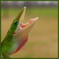
| 03/09/2006 03:02:44 PM | Hear Me Roarby swallaceComment: great capture, minor (VERY) critique, background and lizard are too close in coloration IMO | | Photographer found comment helpful. |
| 03/09/2006 02:59:44 PM | | | Photographer found comment helpful. |
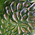
| 02/13/2006 12:25:05 PM | No liquid allowed, Abstract in Purple and Greensby olddjComment: Tis actually a bit older than most carnival, it is a blown molded piece of art glass, with NO sharp corners on it at ALL, so focus is a bit soft, on purpose, but it is not really blurry or oof much at all. Matters not, I knew when I entered it that many may think it oof, was my choice, and although I wish score was higher, it is not going to bother me too much. Thanks for the comments, and the encouragement, both are very welcomed!
Jacque |
| 02/09/2006 12:50:42 AM | ME? REALLY? You want to photograph ME?by olddjComment: Thanks for the comments, they are always appreciated. I tend to agree with philup about this one, I still think it is an excellent photo, but understood going in that a tree stork is NOT a beautiful, colorful bird and that would damper the votes to a certain extent. This is a young tree stork btw, and I really did see that title in this photo, the instant I looked at it on a puter! LOL The storks are fairly rare now, and I find that too bad, because I DO see beauty in them, and even intelligence in their eyes.
Jacque |
| 02/07/2006 09:58:09 AM | Emmaby MelethiaComment: We are owned by a sealpoint too, (along with three dogs and a black cat too, all female OUCH!), understand the problems with taking photos of them, but I know that you will take better overall photos of your cat. Obviously you know the background is not the best, so will not mention that again! This is not a bad photo in any form, but to me there seems to be lots of room for improvement, and remember, this is MY opinion only. First, the lower left part of the cat (in the photo, right side of cat), the shadow of the cat, the cat and the background all seem to blend together. Secondly, from a viewers standpoint, the cat is looking OUT of the photo, leading the viewer to wonder what she is looking at, rather than concentrating on the actual photo. That pose is also not as attractive overall as a straight on or profile shot USUALLY! You also seem to have lost a little sharpness/focus on the cats right eye - left one in photo, not badly, but I did notice that. Overall did a good job on the fur, at least in my opinion, and as I was entered in this challenge, I chose not to vote on it, but would probably of scored this a five, because it was not bad in any sense, but could of been so much better IMO.
Jacque | | Photographer found comment helpful. |
| 02/07/2006 09:47:46 AM | Abandoned Long Agoby MelethiaComment: Picked out one of your least commented on photos to try my critique on, so - Think the subject is good, composition comes across as just a LITTLE hard on the eyes, not terrible, but not optimum. To me the first thing I noticed about the actual photo was you cut of the end, making it almost like an incomplete story. I did not vote on this challenge, but had I, truthfully would be in the majority of others, either 4 or 5, depending on MY mood, and that does make a difference with everyone, unfortunatly! Also, not a critique but an opinion, I prefer color almost every time, as I find do most of the dcp'ers, but you have to be true to yourself first, so I try NOT to downgrade images done in sepia, b and w or other mono or duo tones.
Jacque | | Photographer found comment helpful. |
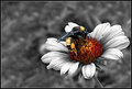
| 02/07/2006 12:54:42 AM | Symbiosisby yankoComment: I too like this photo very much, but IMO, the black "halo" around some of the petals is very distracting. I once had luck with getting rid of that by cloning it out, took lots of time, but may be worth it!
Jacque | | Photographer found comment helpful. |
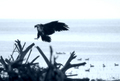
| 02/06/2006 01:52:17 PM | Returning from the huntby jbsmithanaComment: I did not get to vote on this, but I probably would have scored it a five, the blue is okay IMO, the foreground blurring is bad, and the eagle itself lacks detail to me, so much so I actually thought it was coming straighter in when I first looked at it and its head was just to the left of the white feathers on its chest. Had to take a few seconds to see where my eyes betrayed me. Agree cropping it down a bit more would have helped it IMO, maybe JUST to the left of his talons, maybe just show the tip of the log he looks like he is trying to land on? Maybe a bit off the bottom and right side too? Have to play with it to see what works best but I do believe bear was correct in saying it is too close to center for this challenge. Hope these comments help!!
Jacque | | Photographer found comment helpful. |
|
Showing 151 - 160 of ~1080 |
Home -
Challenges -
Community -
League -
Photos -
Cameras -
Lenses -
Learn -
Help -
Terms of Use -
Privacy -
Top ^
DPChallenge, and website content and design, Copyright © 2001-2025 Challenging Technologies, LLC.
All digital photo copyrights belong to the photographers and may not be used without permission.
Current Server Time: 08/24/2025 03:01:59 AM EDT.
|