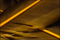
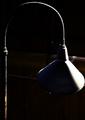
(Out)sourcing - Burned out light lit by another lightby
tmhallingComment: ::: Critique Club :::
Greetings from the Critique Club.
- First Impression - the most important one:
My first impression on seeing this photo was a bit of a "what is it" reaction. This can be a good thing if the image itself is compelling enough to hold the viewer's interest, forcing them to spend more time examining the picture. It has a very industrial, grungy kind of feel, which is an appropriate interpretation of the challenge. You didn't leave any photographer comments, so I don't know what kind of a reaction you were going for, or what your motiviation was.
- Composition:
The initial focal point is the shade of the lamp, which is nicely off centered. From the shade, the line of the lamp draws your eye up to the top, around and back down to the bottom, where there's some interesting texture in the lamp to look at. When you're done there the eye naturally flows back up and around to the shade. At this point my eyes get hung up on the brown area of the background... "what is that back there," I ask myself. Unable to figure out what it is, I go back over the top following the lines of the lamp again, but I leave a little more frustrated by the undistinct object in the background. At this point I feel like I've seen about all I can see here.
- Subject:
The subject itself is a rather clever one. Photograph a single light source, being lit by another single light source, and as far as lamps go, I imagine this one is about as interesting as it could be. The shot is imaginative and simple, which is a good thing. However, I wish for a few things on this photo. I wish for more definition of the bottom left part of the lamp. I think there's some interesting texture there, and I'd like to be able to see some more of it. Also, I don't like the brown object in the background. The feel here is industrial and dark, but the brown object brings some warmth back into the photo. I feel, based on the composition and lighting that the lamp is in an old abandoned warehouse somewhere, which is at odds with the clean and new looking object in the background. You also could have gone with a more home and warm feel, using incandecent light to illuminate your subject, giving the feel of a study or library.
- Technical (Colour and light):
I assume that the high ISO setting was to compensate for a week light source (dimly) illuminating the scene. I'm suprised at the lack of noise in the photo based on that ISO. I wonder why you didn't use a tripod and a slower exposure to make up for the light, which would have allowed you to lower the ISO some. I agree with the commenters that the whole image looks soft... my eyes want the lamp shade itself, as the main focal point, to be in focus.
This is a very high contrast image. There's black. There's (overexposed) white. There's very little in between. I'm not sure if I like that or not, but I think the photo could have been improved if you changed perspective to the right a little bit, and maybe reduced exposure a little bit to allow for some detail in the lampshade. Between the soft focus and the overexposure it's very close to just being an overexposed white blob. Again, I bet there's some detail in the texture of the lampshade that would be interesting to explore.
- To get a Ribbon?:
I looked at your portfolio and I see that you have several other "dark" photos, so this seems to be (at least part of) your style. That's fine, and there are some really good "dark" photos here, but for this particular subject, for this particular challenge, I don't think it works, at least not to the extent that you did it.
I agree with the other comments on your photo, It's a good idea, but it just seems like it's lacking...something. Try different perspectives, sharpen up the focus on a point (like the lampshade), and clean up the background. Finally, I agree with the commenter that the title is a bit
too discriptive. I would have left it at "(Out)sourcing" and let the viewer figure out the rest of it. I wouldn't have taken a point away for that, but if there had been a tie, a simpler title would have gotten you the extra point.
I hope you found this critique helpful, and I would be interested in any feedback you are willing to give me. I am interested in improving my critique skills, and would appreciate your comments about my critique, good or bad. Good luck in your future entries!
---Livitup
Message edited by author 2005-11-28 13:46:15.