| Image |
Comment |
| 05/08/2007 09:04:01 AM |
|
 Photographer found comment helpful. Photographer found comment helpful. |
| 05/08/2007 08:31:03 AM |
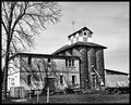
Memoriesby HipychikComment: Neat shot, and even though some of the whites are blown out, this makes it look intentionally harsh, rather than overexposed. The building does seem to be leaning back or to the left a bit, but overall the tones and the textures make this a really nice image. |
| Photographer found comment helpful. |
| 05/08/2007 08:24:09 AM |
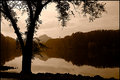
Black and White - Day 8by alexjackComment: The toning here is really nice, and gives a unique appearance to the shot, different than any other choice you could have made. The subtle appearance of the clouds in the sky along with the golden tones along the treeline make this shot flow really nicely. |
| Photographer found comment helpful. |
| 05/08/2007 04:46:22 AM |
Day 5 - the Candleby dreamyComment: I like what you've got here, and I think b&w is perfect for this kind of low-key shot. You might think about cropping it a bit (maybe off of the right a tad) to bring the subject in line with the right third, but that might give you a square image (some people don't like that; I don't mind if it fits); you could also crop from the left, but you lost the arm which is a nice compositional element. It is also just a touch soft in the face, though I think a light sharpening might be enough to really give us sharp focus on the eyes. This is a good example of saving an existing color image that you didn't like and making it work in B&W. Nicely done. |
| Photographer found comment helpful. |
| 05/08/2007 04:27:07 AM |
Fires of industryby jackal9Comment: The tonal range here is muted, but I think it works for the subject matter. A tighter crop might help, but for me the composition as is works well. |
| Photographer found comment helpful. |
| 05/07/2007 11:46:32 PM |
courthouse stepsby krnodilComment: Nicely shot and processed; I like the b&w conversion you chose (so many options in Alien Skin). The range of tones is nice, and the lines give the image some gentle movement from top to bottom. |
| Photographer found comment helpful. |
| 05/07/2007 11:42:34 PM |
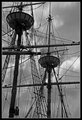
Day 7 - Mayflower II Riggingby CapeSailComment: A complex but interesting shot for me; I like the choice to darken the sky, and don't think it takes too much from the rigging and it makes the shot more dramatic (I still see quite a bit of detail in the rigging). |
| Photographer found comment helpful. |
| 05/07/2007 08:36:19 AM |
B&W - Day 7by mkComment: Those flowers are watching me, no matter where I go in the room. Just kidding. Interesting approach to these; I'm having trouble finding a point to "focus" on, as the focus seems to be on the pedals to the right. I like the capturing of the light and shadows here, and the way they play across the flowers. |
| Photographer found comment helpful. |
| 05/07/2007 08:34:06 AM |
Americanaby noranekoComment: The tones here work for me. It struck me as a mid-day shot, and as things actually happen during mid-day (gasp), we should be able to represent them that way, shouldn't we? My only nit-pick is the flag across the woman's face, which I find distracting. I think you've processed it well, and I like the overall appearance a lot. |
| Photographer found comment helpful. |
| 05/07/2007 08:30:44 AM |
Wheelsby RetroesqueComment: This does work well as a B&W, though I'm guessing the color is not as bad as you think. I like that the frame walking woman is cut off, it adds something to the story for me - something about her coming down and being in the wheels lane. This looks kind of gritty to me, especially at the top, and I think that really adds to it (and is maybe why I like walking woman being cut off). Nicely done. |
| Photographer found comment helpful. |
Home -
Challenges -
Community -
League -
Photos -
Cameras -
Lenses -
Learn -
Help -
Terms of Use -
Privacy -
Top ^
DPChallenge, and website content and design, Copyright © 2001-2025 Challenging Technologies, LLC.
All digital photo copyrights belong to the photographers and may not be used without permission.
Current Server Time: 07/20/2025 10:32:09 PM EDT.