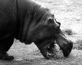
DPChallenge: A Digital Photography Contest You are not logged in. (log in or register
 
Browse Settings
Currently viewing:
Registered UserKiwiShotz

Show comments:

Per page:

Order:

Comments:


Comments Made by KiwiShotz
Pages:   ... ... [279]
Showing 451 - 460 of ~2789
Image Comment
Fall
03/01/2006 12:11:47 AM
Fall1st Place
by arnit

Comment:
Well done, this is a great image. I know English isn't your first language but I do feel strongly about photographers sharing the story of how they got their picture. That is the basis for the strong community feeling of DPC. To always refuse to share with others looks like you are here just to take votes and not give anything back. You don't even feel committed enough to the community to share you shutter and aperture settings. There, I feel better now.

Message edited by author 2006-03-01 00:18:11.
Gluttony
02/27/2006 10:11:57 PM
Gluttony
by dugpark

Comment:
::: Critique Club :::
Hi Doug, this is the in-depth critique you asked for from one of the CC members, I'm delighted I drew it. Your 4th best result too.

First Impression - the most important one:
It made me laugh. Hippos just look the part of gluttons. I wasn't overwhelmed or wowed by it but I scored it as a good average image but not a remarkable one.

Composition:
The cropping and positioning look right but for some reason the overall effect is underwhelming. Composition could help here I believe. Because the eye enters an image bottom-left and exits top-right(like we read), the compositions that appeal subconciously are those that allow the eye to enter and stop it from leaving.

One of your commenters said that she couldn't settle on what to look at. Another felt uncomfortable about the exposed area top-right. A third didn't like the underexposed area bottom-left. See the pattern? Something in the composition was working against you.

I suggest that it might have been maddeningly easy to address too. Try flipping it left-right. When you do that, there is a bright open area for the eye to enter (just where the eye expects it to be). The eye then can travel up the "leading line" (bottom-left to top-right) of the forehead onto the fat rolls of the neck - which is the major point of your image. The almost solid dark area of the shoulder then prevents the eye from leaving the image. All in all, a perfect composition which would probably negate those three composition related comments and maybe got you an extra point from each of them.

I know this al sounds like mumbo jumbo but it's not. It's well researched in the art history world and it works.

Subject:
Perfect for illustrating your message:) It's on challenge, it's funny and it's simply portrayed.

Technical (Colour, focus, and light):
Good focus and despite the two comments about the exposure in opposite corners, it looks like you just about got it right. The top right isn't 'blown' too much and you've managed to hold the detail in the almost black shoulder. I would agree with the commenter who suggested perhaps a little less contrast and you've had addressed both issues. I sympathise, sometimes you're stared at it for so damn long, you can't view it objectively any more.

I'm interested in why you went to black and white. I have seen a lot of B&W lately on DPC and somethimes it just doesn't look like the best treatment of the subject. Such a reaction is hugely subjective, perhaps even heretic, without having seen the coloured original. In this case, It doesn't appear that mono has added to the impact. It may have detracted from it - but that's not really a terribly fair comment because you saw it and worked it for a valid reason.

I'm really interested in your camera settings and the reason for them. Were they a left over from a night shoot or a purposeful setup. ISO800 is fast stuff which is of course prone to noise although I can't see any on this monitor - he wasn't moving that fast was he? Perhaps you were in his enclosure and the one moving fast?

To grow its vote?:
Some suggestions to try in the privacy of your own home (delivered in a plain brown wrapper). Flip it, lower contrast and possibly colour - over to you.

Summary:
Good image and one that I think did have some basic areas that would have seen it doing even better than 60% (which is pretty good for a start)

Brett
Country Livin Baby
02/18/2006 06:15:20 AM
Country Livin Baby
by BaldurT

Comment:
Gross!
Photographer found comment helpful.
WHERE'S THE DAMN PAPER !?!?!
02/18/2006 06:14:56 AM
WHERE'S THE DAMN PAPER !?!?!
by TooCool

Comment:
Now THATS country life! Very good composition too. It's a little too over-sharpened for my liking but a good entry nevertheless.
Photographer found comment helpful.
Mera Pind. Mere Khet. (My Village. My Farms)
02/17/2006 11:25:03 PM
Mera Pind. Mere Khet. (My Village. My Farms)
by Tej

Comment:
This is a perfect illustration of what this challenge is all about. The style and form of life in the country. In voting I believe you matyy be suffering from your composition not quite making the most of the subject. We need to get interested in the subject but it's a bit too far away to see any detail. We like to be wowed by the image and the centre position of it isn't the best placing. Use the Rule of Thirds if you can.
Photographer found comment helpful.
Rural Citrus
02/17/2006 11:21:45 PM
Rural Citrus
by kama0529

Comment:
The problem you have with this is that the auto-focus has picked the leaves instead of the fruit. In voting, that is going to cost you a couple of voting points. Then it is also likely that since these could be in a city garden or a rooftop apartment garden, you're going to loose points for the image not being able to prove that it's in th country. Then there will also be those who don't feel that fruit show 'life'. So it's an uphill battle and this is a tough school.
Country Morning View
02/17/2006 11:07:13 PM
Country Morning View
by bcoble

Comment:
I just love the light and feeling of this. Also impressed with the crispness of the contrail and whispy gold clouds. In voting, I don't feel it's strong on being 'country life' although it is in the country, the life part isn't strong enough to score well against the competition.
Photographer found comment helpful.
Nothing but dirt roads...
02/17/2006 10:56:33 PM
Nothing but dirt roads...
by CEJ

Comment:
Yup, that makes it fairly country. Nce statement made too. In voting, not a remarkable shot, just a competent one.
Photographer found comment helpful.
Hay there!
02/17/2006 10:55:29 PM
Hay there!
by tinky2

Comment:
Good clarity and light here. Nice sharp subjects too. In scoring, it's not a remarkable shot but it is well crafted.
Photographer found comment helpful.
Faith ...
02/17/2006 10:44:17 PM
Faith ...
by kari1

Comment:
This si the sort of photo I wish I could take. Ever since Mother challeng I've been wanting this effect but I really didn't think I could get it right so I chickened out and didn't try.
Photographer found comment helpful.
Pages:   ... ... [279]
Showing 451 - 460 of ~2789


Home - Challenges - Community - League - Photos - Cameras - Lenses - Learn - Help - Terms of Use - Privacy - Top ^
DPChallenge, and website content and design, Copyright © 2001-2025 Challenging Technologies, LLC.
All digital photo copyrights belong to the photographers and may not be used without permission.
Current Server Time: 08/27/2025 07:14:24 PM EDT.