DPChallenge: A Digital Photography Contest You are not logged in. (log in or register
 
Browse Settings
Currently viewing:
Registered UserKiwiShotz

Show comments:

Per page:

Order:

Comments:


Comments Made by KiwiShotz
Pages:   ... ... [279]
Showing 91 - 100 of ~2789
Image Comment
Wheat Shocks
07/03/2006 01:45:58 AM
Wheat Shocks
by Artphotogster

Comment:
The complementaruy colours just rock
Photographer found comment helpful.
1860s Cattle Drive Cook
07/03/2006 01:45:30 AM
1860s Cattle Drive Cook
by Balko

Comment:
Love the period piece
Photographer found comment helpful.
The White House
07/03/2006 01:44:40 AM
The White House
by indy79

Comment:
Great setting
Photographer found comment helpful.
Happy 4th or would that be Second? :)
07/03/2006 01:43:40 AM
Happy 4th or would that be Second? :)
by MPRPRO

Comment:
Wow, so clear and still able to see the detaIL
Photographer found comment helpful.
A New Begining
07/03/2006 01:42:32 AM
A New Begining
by geckogal

Comment:
Love the hatching and the still useless wings
Photographer found comment helpful.
Perpetual Motion Stopped for 1/80 sec.
07/03/2006 01:40:10 AM
Perpetual Motion Stopped for 1/80 sec.
by Ken

Comment:
Lovely, nice capture.
Photographer found comment helpful.
Into the Wind
07/03/2006 01:39:29 AM
Into the Wind
by Mal37

Comment:
cool motion stop
Photographer found comment helpful.
Palm Dreams
06/30/2006 05:06:04 AM
Palm Dreams2nd Place
by DanielCzaja

Comment:
WOW, I'm looking at the colour one, that's worth a ribbon as well

Brett
Shadows of WHY!
06/24/2006 05:51:46 AM
Shadows of WHY!
by Judi

Comment:
::: Critique Club :::
Heya Judi, this is going to be fun

First Impression - the most important one:
My first impression when it opened was of the green road. Is that dumb? I don't know but the complimentary colours of the 'green' road and the purple sky was quite captivating and I think important to the image.

Subject:
I think I agree with most of the commenters where the shadow is a significant part of the image but not a major part - as perhaps it should be to get the best out of the challenge. Having said that, I was still drawn to its presence before I even looked to see what challenge the image was from. So something about it worked, maybe the caption did it.

The model's pose and the mood of the whole pic is I think exactly what you wanted to convey. It's such an unusual scene that frustration and what-the-hell comes through loud and strong. The dog is a gem. The contrast between the guy's anguish and the dog's relaxed and carefree presence just tops it all off.

Composition:
I have a pet hate for crooked images if it doesn't look like it is a deliberate contribution to the art. This doesn't, it kind of looks like sloppy work. I know you don't do sloppy, but that's the impression to the untutored eye and I would have scored it 5 because of it. I'm also wondering how much more impact there would have been with a little more vertical thirds use.

OK that's the niggly bits out of the way, now lets get to the good stuff. I LOVE the sky and how it completely dominates the 'small insignificant man'. It is the large and overbearing sky that gives it the drama and the feeling of it all being too much for the guy in the street. Anything less and it just would not have worked, so you did good:)

Technical (Colour, focus, and light):
The short rather than long shadow has cost you points for sure. I guess when your source of light is a street light, there's not a lot you can do about that. Am I right in guessing that there's a strobe for the model in that 15secs? The detail on the model is pretty sharp, it doesn't look possible for anyone to stay that still for that long. I was trying to find its shadow and can't so i went back to thinking "no strobe"? I'm not sure that you could have introduced an additional lower light source without ending up with confused shadows and a bad result.

To grow its vote?:
Well I guess you got a bit of DNMC reaction. I bet you're frustrated now that "Desolation" hadn't come up instead. As I said, I would have given it an "average" because of the tilt, maybe others did too.

Summary:
This baby has a lot of impact and is a fine photograph. It didn't please the DPCers - so what? Interesting and thoughtful image.

Brett
Photographer found comment helpful.
The Leaf Texture
06/18/2006 01:41:59 AM
The Leaf Texture
by DAWAR

Comment:
::: Critique Club :::
Hi, this is the in-depth critique you asked for from one of the CC members.

First Impression - the most important one:
I am totally captivated by this image. The different shapes and textures just drew me immediately into the image.
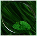
Subject:
This is an inspired choice of items to combine. Right on the Green Challenge, the different shapes of linear grass, round magnifier and the irregular leaf just combine to make this a dynamic subject. Not just green but interesting green. The strong differences between the glass and the plants can never be discounted in the way they make this image so attractive.

I'll tell you what I saw when I studied it, I think this mught surprise you. I saw an concave glass dish lying down bottom-right to top-left with the leaf craddled in it - and I loved it. When I read that the magnifier was standing on it's edge, I didn't believe it, my eyes wee locked into a different perspective. Much like one of those visual puzzles.

Composition:
Even though my perception was completely wrong, the composition still works as well for me as it has for your commenters. It is simply stunningly clever. The laeding lines of the grass ties the whole image together, it provides a sound and attractive base to the elements on top. whilst you have the magnifier full frame, you have the leaf right on the bottom right thirds intersection and that's one of the things that gives it the impact it has.

Technical (Colour, focus, and light):
The light catching the edge of the magnifier at the bottom left corner really keeps drawing me in. It's so smooth ansd so perfectly symetrical when all the other elements are 'soft' just makes it stand out and add to the impact.

The variances in focus I find really appealing here. It's not a DOF issue at all but the deliberate-looking changes in the grass when seen clean rather than through the glass. That the grass is mor out of focus in the glass then enhances the absolute sharopness of the leaf. Again it is a matter of contrasts that gives it a lift.

The lighting is just about right. I was looking at ways to have even more impact and was trying to imagine different lighting. However each change also adds problems so I think this has done really well. The mood created by the light is so important to the colour richness and density of the image that the risks of changing anything may be too high.

To grow its vote?:
This is so technically good that the only thing you can improve is the wow-factor. The interest-factor already exceeds most of the rest of the challegers. 92% is a very fine score and is hard to improve on. If you were to mess with it, the lighting is the only possibility and that would be to introduce more glow by some means. By that I mean some contrsting highhlights such as would be possible in Advanced Editing or by introducing light from underneath.

Summary:
6.2 is a great score and I have to say, this is one of the most innovative and though-provoking images in the Green Challenge. I only suggest additional lighting reluctantly because really its a damn fine image and worth a top 20 place at the very least.

Brett
Pages:   ... ... [279]
Showing 91 - 100 of ~2789


Home - Challenges - Community - League - Photos - Cameras - Lenses - Learn - Help - Terms of Use - Privacy - Top ^
DPChallenge, and website content and design, Copyright © 2001-2025 Challenging Technologies, LLC.
All digital photo copyrights belong to the photographers and may not be used without permission.
Current Server Time: 08/25/2025 11:22:27 PM EDT.