| Image |
Comment |
| 03/01/2004 06:48:08 PM |
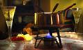
Fondue For Twoby LVEComment: Good concept but there are a few things you could have done to make the image better. The image is too busy/too many distractions - your subject is lost in the mix. A plain background and a tighter crop would fix this. Your focus is also a little soft on your subject. |
 Photographer found comment helpful. Photographer found comment helpful. |
| 03/01/2004 06:41:15 PM |
|
| Photographer found comment helpful. |
| 03/01/2004 06:35:41 PM |
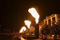
Fire Worksby dinnComment: Your composition is good but the fire is too blown out. Maybe if you had spot metered on the fire in Av mode it might not have been so bright; this could have brought out more colour/contrast within the flames I believe. |
| Photographer found comment helpful. |
| 03/01/2004 06:27:32 PM |
three ghostsby jbruno1397Comment: The double exposure is a neat trick but I'm sorry to say that the noise (intentional or not) takes away from your image. |
| 03/01/2004 09:56:05 AM |
Dimeby JackoComment: Great macro. I think you would have done better shooting an American dime.......with exchange rate and all. |
| Photographer found comment helpful. |
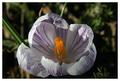
| 02/29/2004 07:19:29 AM |
Just A flowerby tragicharpyComment: I like you use of DOF. I also think that your colours are good. Shadows are your worst enemy in this shot. Shooting at a different time of day or using flash fill may have improved it. 6 |
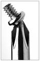
| 02/29/2004 07:10:24 AM |
A Screw Looseby buzzrockComment: Decent macro shot. I like the tilt of the screw - compositionally, it is eye catching. B & W works well for this shot. |
| Photographer found comment helpful. |
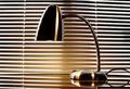
| 02/23/2004 09:41:08 AM |
Desk Lampby dustin03Comment: Mundane no doubt. Compostionally, I find that the mini blinds are very distracting. A plain black background or a backlit white background would have worked better in my opinion. |
| Photographer found comment helpful. |
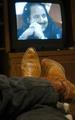
| 02/23/2004 09:33:59 AM |
Just another night in front of the boob tubeby ArmadilloComment: Relaxing in front of the tube is certainly mundane. It's not easy to properly light or expose this type of interior scene; the light from the TV itself is probably playing havoc with the white ballance. Compositionally, if the TV was a little further away it might help. Maybe if you used less light you could have created an interesting silouette of your boots which might be less distracting. |
| 02/23/2004 09:21:34 AM |
Cheap Shirts & Tiesby faidoiComment: Very creative way of making the mundane stand out. Great lighting. Very well ballanced composition. I'm wondering if less shallow DOF would be better (I find it a tiny bit distracting here). Otherwise my highest vote cast. |
| Photographer found comment helpful. |
Home -
Challenges -
Community -
League -
Photos -
Cameras -
Lenses -
Learn -
Help -
Terms of Use -
Privacy -
Top ^
DPChallenge, and website content and design, Copyright © 2001-2025 Challenging Technologies, LLC.
All digital photo copyrights belong to the photographers and may not be used without permission.
Current Server Time: 08/07/2025 08:10:49 AM EDT.