| Image |
Comment |
| 03/28/2004 07:53:33 AM |
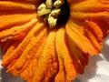
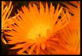
Daffodil Orangeby channeledComment: Looks like you took this in the middle of the day in very bright sunlight. Taken under overcast conditions or at a different time of day can make a dramatic difference. Shadows will be less strong and colours will be more vibrant and less blown out. Also I notice that the left of your image is out of focus, while the right is relatively sharp - it doesn't look intentional - maybe blurred due to camera shake or recomposed after focusing on the right? If you wanted to use a shallow DOF to emphasize a particular part of the flower you might try shooting at a different angle. Hope this was helpful. :) |
| 03/25/2004 12:22:54 PM |
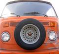
Magic Busby jhart71Comment: Classic van dude(dudette). Your compositon could have been less symetrical. I think that would have made it more interesting. The glare on the windshield is very distracting and you have colour cast. This is easily fixed in an image editor: In levels select black, gray, and white points with eye dropper tool - fool with it til you get a good ballance - then unsharp mask 125%, radius 0.3, threshold 1 - I tried it and it works very well. Contact me after the challenge and I'll send you the editted copy if you like. |
 Photographer found comment helpful. Photographer found comment helpful. |
| 03/25/2004 12:08:35 PM |
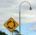
The Signby MazerComment: Well it falls witin the range of colours listed in the challenge outline so I can't fault you for that but I bet others will. Interesting composition but I think it would have been moreso if you had used a shallower DOF to emphasize the sign. Then again not everyone can do that in this type of situation - depends on your equipment to a certain degree I guess. |
| Photographer found comment helpful. |
| 03/25/2004 11:20:02 AM |
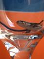
Potrait of a Skinkby KentuckyGalComment: I think this would have worked better if the orange was a little more vivid, maybe by saturating more or playing with levels (using the white point and black point eye droppers you can remove some of the colour cast and make it more vivid, also USM 125%, radius 0.3, threshold 1 - I tried it - makes the image 100% better) Contact me after the challenge and I'll send the editted copy if you like. |
| Photographer found comment helpful. |
| 03/25/2004 11:06:49 AM |
.:spring breaks:.by elpyComment: Your focus is soft where the eye is drawn, which in this case is the center of the main flower. This detracts from the image. You could have done one of two compositionally to make this better: 1. set you focus on the center of the flower 2. Recompose/crop so that the "in focus" petals are in the center of the shot. |
| Photographer found comment helpful. |
| 03/25/2004 10:59:38 AM |
shop cartby aberantComment: Image seems noisy but maybe that was intentional. I think a cleaner image with a little more saturation would have worked better. The bright spot (reflection of the sun I assume) is very distracting. Taken from a different angle or a different time in the day would have worked better. The abstract nature of the composition is interesting; it makes you work to figure out how the image was captured - that's a good quality. |
| 03/25/2004 09:29:34 AM |
Carrotsby rj324Comment: I think if you had lightened your BG in Levels using the white point eye dropper then gone to curves to take out some of the shine in the carrot it would have been better. (I tried it - makes 100% improvement) |
| Photographer found comment helpful. |
| 03/25/2004 09:20:21 AM |
Impact of Orangeby jas0420Comment: Beautiful take on the 'drop' shot. The gradation of your BG from bottom to top is nice and even. The metal and orange also work well together. Good capture. |
| Photographer found comment helpful. |
| 03/25/2004 09:16:53 AM |
|
| Photographer found comment helpful. |
| 03/25/2004 09:14:54 AM |
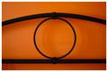
Oby MikeOComment: A lot of people here aren't fond of symetry in photographs but I think in this case it adds to the beauty of the shot. I love the rich tone of the shot and the soft shadows as well. |
| Photographer found comment helpful. |
Home -
Challenges -
Community -
League -
Photos -
Cameras -
Lenses -
Learn -
Help -
Terms of Use -
Privacy -
Top ^
DPChallenge, and website content and design, Copyright © 2001-2025 Challenging Technologies, LLC.
All digital photo copyrights belong to the photographers and may not be used without permission.
Current Server Time: 08/09/2025 08:32:18 PM EDT.