| Image |
Comment |
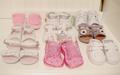
| 08/31/2005 12:35:50 PM |
Addiction Infancyby krafty1Comment: The composition is fairly bland. The slightly military effect of the uniform lines doesn't seem to be as strong as it could be, maybe if all the shoes were white and you picked out one 'odd' pink pair with a short DOF perhaps?. the focus isn't sharp enough, the wall to the right of the shot doesn't serve any purpose, the shot could have been taken a bit to the left. I don't see how 9 pairs of shoes is an addiction also. It's hardly Imelda Marcos. The shoes are quite dinky and sweet, another idea... maybe a macro shot focusing on some of the cute details would have been more effective? |
 Photographer found comment helpful. Photographer found comment helpful. |
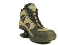
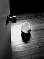
| 08/31/2005 12:24:14 PM |
New Scienceby Prime_TimeComment: Poor composition with far too much space to the left, and the "technology" which is supposed to be the focus of the shot is being hidden/buried behind the boot. If a spring on a boot is the theme I think an action/moving shot indicating bouncing would have been stronger. |
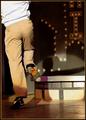
| 08/31/2005 12:20:47 PM |
Tap Dancin'by rjksteschComment: This picture could have been cropped right down to quarter it's current size; ie: the bottom left hand corner. As it stands the focus of the shot seems to be the dancers backside, since that's where the lighting seems to be aimed. |
| Photographer found comment helpful. |
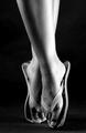
| 08/31/2005 12:13:30 PM |
DANCING SHOES?!by lieslComment: I'm going to rate this very highly. The lighting on the legs and feet makes a strong form, and the contrast and black background creates a very powerful and sensual shape. I guess she was dangling from the back of a couple of chairs or something? That's how I would have done it. Which brings me to the 1 point I'll be marking down. The magical effect of the leading foot floating with the flip flop supporting all the weight could have been followed through to the back foot as well. Excellent photo, 9. |
| Photographer found comment helpful. |
| 08/31/2005 12:06:52 PM |
My Baby's First Shoes & Lock of Hair 1998by figmentComment: The reflection seems to distract from the simple composition, perhaps a black surface/cloth would have worked better. I know the lock of hair probably has great emotional attachments for yourself, but it could have been left out here I feel. The dinky little trainers make a powerful image on their own. |
| 08/31/2005 12:02:13 PM |
Leading Linesby duncesComment: The nude model seems to be detracting from the theme. The punky grungy effect of just the monochrome trainers and bright pink pop socks would have been more powerful just by themselves. Less is more. |
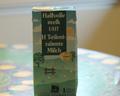
| 08/26/2005 11:31:25 AM |
Milkohalicby stamComment: Since uniformity is the goal here, I would have straightened the tops of the cartons so they all faced the same way. The focus seems ever so slightly off as well. And the whites in the picture could be whiter. Using a filler flash or something maybe. |
| 08/26/2005 11:24:57 AM |
|
| 08/26/2005 11:22:12 AM |
Milk - 1 Literby julesdvComment: looks like a snapshot, out of focus, The backlit technique here makes the carton too dark while the background is given plenty of light. And the composition is poor. There's nothing for the carton to be balanced with. Maybe a shot from above playing with the idea of the carton camoflaging itself amongst what (from this angle) seems to be a tablecloth with similar colours to the carton. |
| Photographer found comment helpful. |
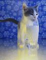
| 08/26/2005 11:16:49 AM |
A tall frosty oneby beafliesComment: Very witty, and the kitten looks adorable. I love all the elements you used to evoke a frosty impression. A sharper focus on the eyes and whiskers would have helped. |
| Photographer found comment helpful. |
Home -
Challenges -
Community -
League -
Photos -
Cameras -
Lenses -
Learn -
Help -
Terms of Use -
Privacy -
Top ^
DPChallenge, and website content and design, Copyright © 2001-2025 Challenging Technologies, LLC.
All digital photo copyrights belong to the photographers and may not be used without permission.
Current Server Time: 08/22/2025 09:28:38 AM EDT.