| Image |
Comment |
| 09/04/2005 11:53:38 PM |
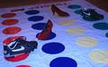
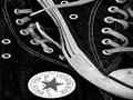
Right Spike Redby CoolsComment: Another of those houses where the shoes are coming to life, it's already down to a 3. Sorry! It's also poorly lit, and the choice of footwear is just bizarre. A nicely lit close up shot of some kids feet while actually placing twister would have been much much better, and the card with the pointer showing pictures of feet could have been incorporated to add to the farcical nature of the game. Perhaps showing the 'just about to collapse' moment while everyone struggles to try and get their left foot on the same yellow spot for example. 2 |
| 09/04/2005 11:46:57 PM |
|
 Photographer found comment helpful. Photographer found comment helpful. |
| 09/04/2005 11:45:45 PM |
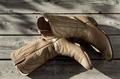
boardwalkby undieyatchComment: A more original approach, maybe trying to say something to us about those particular boots, would be better. composition-wise, the space above the boots is uneven, and you could maybe have included more (if not all) of therir shadows since the low angle of sunlight is dominant in the picture. |
| 09/04/2005 11:42:48 PM |
Ant's Nightmareby owenComment: Great idea, and brillant use of DOF, but I feel a fisheye lens would have been the correct lens to achieve this shots full potential, since the image is a little too reliant on the title for it's strength. 8 |
| Photographer found comment helpful. |
| 09/04/2005 11:30:46 PM |
Chuck Taylorsby ArpeggioAngelComment: I feel like I'm looking at a tv with the wrong aspect ratio setting here, and it's uncomfortable. If this was resolved I would really like this study. Its a good composition and use of the line of the sole. |
| Photographer found comment helpful. |
| 09/04/2005 11:27:57 PM |
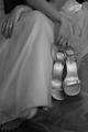
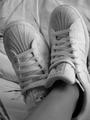
pimp shoesby amandalComment: A nicely composed shot. You could have forced the camera to overexpose the shot maybe one fstop to bring the white back to the brillance that the camera has lost. Cameras will always make predominantly white compositions slightly underexposed. The background could have been all white to add to this 'clean' effect, and I think you could have chosen a better title also, since 'pimp shoes' they clearly are not. |
| Photographer found comment helpful. |
| 09/04/2005 11:20:29 PM |
House Rule for 10 Yearsby davidus428Comment: Looks too much like a snapshot I'm afraid. the sign is old and tatty, and it would have been better to use a new one. the composition and cropping is poor taking attention away from the shoes and making the socks jostle for more attention than they should, and letting the viewers eyes wander without any resolution. And the kitchen details in the top right serve no purpose. |
| 09/04/2005 11:05:45 PM |
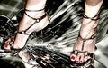
Stilettos (Too Sharp)by QartComment: I like the idea, but feel it would make a lot more sense for the heel to be placed over the centre of the break on the mirror. You could have adjusted the lighting to remove the strange shadows on the feet and legs also. |
| Photographer found comment helpful. |
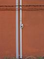
| 09/04/2005 11:01:05 PM |
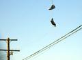
life's little remindersby ThroughTheLensComment: The focus on the shoes isn't sharp enough and the telegraph pole is distracting. A portrait shot would have accentuated the space below the shoes. I'd also like to see the point on the wire where the laces and wire meet included in shot. |
| Photographer found comment helpful. |
| 09/04/2005 10:58:45 PM |
Dirty Trickby TotemComment: The shoes should be sharper focused, and you could remove the wires and cables since this would pace the shoes up in a more comfortable position Think rule of thirds. Nicely spotted and chosen image though. |
Home -
Challenges -
Community -
League -
Photos -
Cameras -
Lenses -
Learn -
Help -
Terms of Use -
Privacy -
Top ^
DPChallenge, and website content and design, Copyright © 2001-2025 Challenging Technologies, LLC.
All digital photo copyrights belong to the photographers and may not be used without permission.
Current Server Time: 08/23/2025 05:31:19 PM EDT.