| Image |
Comment |
| 02/17/2006 05:44:09 AM |
Hay Play by librodoComment: Wonderful ambience! So much pure natural joy. :) My top pick for the blue. |
 Photographer found comment helpful. Photographer found comment helpful. |
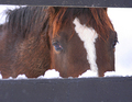
| 02/17/2006 05:41:40 AM |
feeding timeby farmer48Comment: Like the way the fence has been composed to frame the horse. I would just crop the bottom out more to balance off with the top. The other thing that doesn't help is the size of this image which diminishes the impact of his eyes even though they seem to be the main subject here. Go to the DPC tutorial to learn how to resize for this site. |
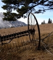
| 02/17/2006 05:38:03 AM |
Retiredby yantskiComment: Like the subject and composition. Would have worked better if it didn't look OOF and small. |
| 02/17/2006 05:35:58 AM |
morning IIby tcmartinComment: Love the simplicity of this but it looks like noise or grain was added which doesn't work for me on the eggs. It's also a wee bit flat on the colours. |
| Photographer found comment helpful. |
| 02/17/2006 05:31:18 AM |
|
| Photographer found comment helpful. |
| 02/17/2006 05:29:33 AM |
Planting Riceby davidus428Comment: This is one of those photos where size counts and here at DPC challenge, it's probably not placed at an advantage. Would have loved to see the details. As is, I can only vote based on what I can tell. 5. |
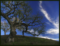
| 02/17/2006 05:26:38 AM |
Tree climbingby beafliesComment: Interesting composition. You've made the slope, the tree, clouds and sky work together quite effectively. Would have scored it higher if it weren't for the overall soft quality. Nothing really looks sharp here and apart from the blue of the sky, the other colours look dull. The double layer black and green border doesn't help either. |
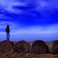
| 02/17/2006 05:03:37 AM |
Where there is always the silenceby Prime_TimeComment: Great comp! Love the vastness depicted in the sky, contrasted with the lone cowboy. And the haystacks add a cool dimension. But could it be that the magenta tones are a little too strong? |
| Photographer found comment helpful. |
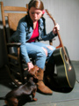
| 02/17/2006 04:58:10 AM |
Good to be Homeby fotomann_foreverComment: Overall pretty but the light looks artificial, like it's staged and she's under a spotlight or something. So the notion of "home" just doesn't cut it. |
| Photographer found comment helpful. |
| 02/17/2006 04:55:12 AM |
|
| Photographer found comment helpful. |
Home -
Challenges -
Community -
League -
Photos -
Cameras -
Lenses -
Learn -
Help -
Terms of Use -
Privacy -
Top ^
DPChallenge, and website content and design, Copyright © 2001-2025 Challenging Technologies, LLC.
All digital photo copyrights belong to the photographers and may not be used without permission.
Current Server Time: 08/08/2025 12:15:47 AM EDT.