| Image |
Comment |
| 09/11/2006 09:10:14 AM |
Brothersby cddogg13Comment: ** Critique Club **
As you pointed out, the horizon is titled. this can be fixed easily by rotating the picture and cropping. Which software do you use for edits ?
You have some great subjects in the picture, but you didn't capture them well. they occupy lesser area in frame and the viewer is distracted to ther other elements in the picture.
What to do: in this particular picture, you could have gone closer, taken a shot from lower angle to capture the guys with sky as background, you will be able to fill the frame with the boys and have a colorful background...
if you have any questions, feel free to pm me
thanks,
Gaurawa |
| 09/11/2006 09:06:26 AM |
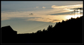
Power to heavenby DiablitoComment: ** Critique Club **
from your subject, looks like you want to have the power lines (with the poles may be) to be your subject, but they occupy really small area of the frame. Nearly 40% of the frame here is black with no fixed shape, trees, house etc and nothing particular that adds interest.
for a silhoutte challenge, I would expect a well defined subject in silhoutte and the subject should be what attracts the most attention.
if you have any questions, feel free to pm me
thanks,
Gaurawa |
| 09/11/2006 08:45:34 AM |
IMG_9290-01.jpgby dwterryComment: well composed and she looks very relaxed, natural pose. and as in other post, great lighting |
 Photographer found comment helpful. Photographer found comment helpful. |
| 09/11/2006 08:44:41 AM |
|
| Photographer found comment helpful. |
| 09/11/2006 08:43:55 AM |
|
| Photographer found comment helpful. |
| 09/11/2006 08:42:31 AM |
IMG_9293-01.jpgby dwterryComment: the hand positions makes it look a bit ackward. may be because she doesn't look that comfortable ? |
| Photographer found comment helpful. |
| 09/11/2006 08:33:19 AM |
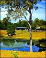
My Countryby sherpetComment: I would move the tree to the right futher as the branches extend to the the left and lead you to the picture. putting the tree at one third doesn't work as great here.
the right of the tree doesn't add much and is a distraction IMHO |
| Photographer found comment helpful. |
| 09/11/2006 08:31:09 AM |
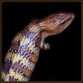
Blue Tongue Lizardby sherpetComment: Again this one has some noise, edges aren't very clean.... as in previous comment, do post exif to check what was the problem |
| Photographer found comment helpful. |
| 09/11/2006 08:29:54 AM |
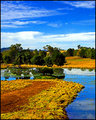
The Billabongby sherpetComment: the colors ( though a bit oversatured) are nice. the photo does lack clarity and details. Its noisy and smudged. Can you post the exif ? I feel it has to do with camera shake or high iso.
the center divide doesn't work for me. the top sky doesn't offer much. you would be better off with croppoing the top part just above the dense clouds... |
| Photographer found comment helpful. |
| 08/06/2006 02:40:47 PM |
Delicacyby DjabordjaborComment: ** Critique Club **
Greetings!
congrats on a excellent capture and great finish in the challenge.
I don't have much to add. I like the lighting, the water you added and the overall feel. I would have preferably cropped the top some, but that's just a nit pick.
looking forward to more work from you.
cheers,
Gaurawa |
| Photographer found comment helpful. |
Home -
Challenges -
Community -
League -
Photos -
Cameras -
Lenses -
Learn -
Help -
Terms of Use -
Privacy -
Top ^
DPChallenge, and website content and design, Copyright © 2001-2025 Challenging Technologies, LLC.
All digital photo copyrights belong to the photographers and may not be used without permission.
Current Server Time: 07/18/2025 04:11:06 PM EDT.