| Image |
Comment |
| 12/03/2002 08:36:00 PM |
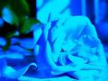
Roses are Blueby amonteforteComment: violets are red? my only problem with the picture is that blue of the rose is too close to the blue of the background, and so it's looking relatively flat, even with teh shallow dof. the green would work beautifully with the blue, if the background were a different color. compositionally, it's a beautiful shot. 8 |
| 12/03/2002 12:50:00 AM |
A Gift For You!by SonifoComment: revenge of the rule of thirds! lol. nice contrast of form and void. points for simplicity. and birthdays/holidays can be the bluest of all. 10 |
 Photographer found comment helpful. Photographer found comment helpful. |
| 12/03/2002 08:31:00 PM |
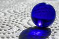
Blue Sphereby LanSnakeComment: the shallow depth of field was a good choice on this one. nice colors, and well used at that. really directs one's eye to and around the marble. 8 |
| Photographer found comment helpful. |
| 12/02/2002 11:45:00 PM |
Ice Coldby spillerComment: another good use of shallow dof. hope the other voters appreciate it too. the line it forces your eye to follow makes this picture really interesting. 8 |
| Photographer found comment helpful. |
| 12/02/2002 01:47:00 AM |
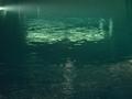
The Abyssby ozaibakComment: cropped differently, this could be a fantastic shot. the bright part of the water in the upper center needs to touch the edges. it's too disjoint otherwise. i would have cropped it vertically, in the 427x640 format, and hoped the enlarging did not mess up the quality. |
| 12/03/2002 04:42:00 AM |
Primarily Blueby jimmythefishComment: i would have submitted the other one. but hopefully you get higher for this one. the colors are interesting, not quite compliments, which works well. the curves work well together. the straight lines work well too. it doesn't scream "blue!" like so many other entries this time. i might have desaturated the red of the parking meter sticker though. it's not bright enough to make this a primary colors picture, and as is is just a little distracting. anyhow. overall, it's still a very well composed picture, and definitally worth an 8. - arach. |
| Photographer found comment helpful. |
| 12/03/2002 12:36:00 AM |
Caught In A Whirlpoolby jimmspComment: a little more off center would have been better compositionally, i think. not sure. the off white in the lower left hand corner is too... distracting, i guess. the lines are beautiful, and the color distrubution fantastic. abstract things rule. it's not perfect, but i like it enough to give it a ten anyways. |
| Photographer found comment helpful. |
| 12/02/2002 11:56:00 PM |
Bottleby gandersComment: interesting composition. points for simplicity. 6 |
| Photographer found comment helpful. |
| 12/03/2002 12:41:00 AM |
Star longing for Karin...by shachar_dComment: the desaturation of all but the blue works, but the blue jeans in the upper right are distracting from the sad eyes of the dog. 7 |
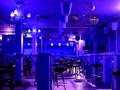
| 12/03/2002 04:32:00 AM |
Blues Barby mariomelComment: pretty decent photo. the blues and the purples work well. was this the actual lighting condition of the bar or was this altered slightly? something about the composition seems a little cluttered to me. but i think it's worth a 7 |
Home -
Challenges -
Community -
League -
Photos -
Cameras -
Lenses -
Learn -
Help -
Terms of Use -
Privacy -
Top ^
DPChallenge, and website content and design, Copyright © 2001-2025 Challenging Technologies, LLC.
All digital photo copyrights belong to the photographers and may not be used without permission.
Current Server Time: 08/17/2025 08:51:29 PM EDT.