| Image |
Comment |
| 09/26/2005 09:57:02 PM |
|
 Photographer found comment helpful. Photographer found comment helpful. |
| 09/26/2005 09:54:13 PM |
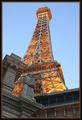
This way, to the Towerby javamooseComment: *Critique Club*
Wow the title is great, "This way, to the Tower" has to grab the viewer to look at the image. Great finish in such a large group, I am sure you picture was appealing while voters were thumbing throughout the many pages in this challenge. I was be very happy with your finish. This really is an excellent perspective that you were able to capture. Vegas has to be one the most magical places in the west for adults, especially some of the images that be captured. The coloring is great, especially with the time of day your were able to capture the shot. I am very glad you included all of the tower I think it helps completely the image. I would be curious to see the shot just about 15-30 minutes later when the sky is just a little darker to enhance the lights, but then the statue may not have a visible as you were able to capture this. You did an excellent capturing an expressive perspective. Congrats on a great photo. |
| 09/26/2005 09:36:20 PM |
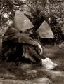
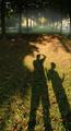
Underground Aliensby DvosdonComment: *Critique Club*
This is an amazingly cool shot. I think the impact would have been ten times greater with just one shadow, but thats jst my opinion. The lighting in this is absolute amazing from the foreground to the background that looks like fog on such a beautiful surrounding. The backdrop really is a great include i the photo. The trees are so cool, did you try the shot from one side or the other like a slant on the head on perspective. The coloring is great as well as the composition. I think it would have probably scored higher with one shadow, or at least I should say I probably would have scored it higher. I read the comments other had left. Macpapas said cool jokes about the aliens, what an idea that would be. Overall you did an awesome job and great out of the box thinking for the challenge. God job! |
| Photographer found comment helpful. |
| 09/26/2005 09:17:58 PM |
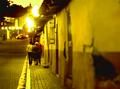
Santa Rosa Streetsby Luifer_9d9Comment: *Critique Club*
This is a very different perspective. The image does grab our attention right of the bat. The yellow is the strongest presence. The lights are a overblown. I don't know if you captured the photo this way or decided to edit it and bring the lights and yellow out in the image. I like the perspective of being next to the wall and using the laws of thirds the keep the image on line is great. Also I am not sure, is the focus supposed to be on the people? I could see that being your focus, but I really can't tell what it is supposed to be. I like the length that use used to elongate the building and then the length of the sidewalk. Looking at the shot again, I would have liked to maybe see the focus on the people. The trees in the background are perfect with the sunset or sunrise. Good idea for the perspective, it defiantly fits in the challenge. |
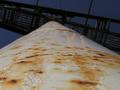
| 09/26/2005 09:08:46 PM |
It's a long wayby TotemComment: *Critique Club*
This is defiantly a very defined perspective. I think you hit the nail on the head in this subject. The subject itself is interesting but probably not grabbing as much as some when voters are thumbing through the thumbnail. I like the rust spots on the post, it really gives it some character. I wish it was in focus from the base, especially on the left bottom. The top backdrop is very nice, it is what draws me into the image the most, the blue sky is great. It is kind of hard to pin point the subject, I understand it is a post. But it makes you wonder what is at the top of the post. Maybe if it was something a person could stand on that would really grab the viewer. Just my ideas. Very good job on the subject! |
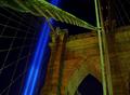
| 09/26/2005 08:59:46 PM |
Focus on Strengthby Bus352Comment: *Critique Club*
Wow, what an image. The neon is amazing and I loved the way you were able to capture this photo. I think most people probably did not take the time to see what the picture was taken of and when. The angle is my favorite part, Which makes make think this is one of the strongest perspective pieces in the challenge. The colors are a little strong, maybe its the contrast. I think the bridge looks a little green but that is probably in the contrast to the make the blue that strong. The composure is excellent. There are just some small pats that have blurred pixels, like around the upper right on the rope. I really feel if people understood what the image was the score would have moved up. Excellent capture, this will be a great time piece to keep in your collection. |
| Photographer found comment helpful. |
| 09/26/2005 01:34:00 PM |
|
| Photographer found comment helpful. |
| 09/25/2005 12:46:29 AM |
|
| Photographer found comment helpful. |
| 09/25/2005 12:45:27 AM |
|
| Photographer found comment helpful. |
| 09/25/2005 12:41:38 AM |
|
| Photographer found comment helpful. |
Home -
Challenges -
Community -
League -
Photos -
Cameras -
Lenses -
Learn -
Help -
Terms of Use -
Privacy -
Top ^
DPChallenge, and website content and design, Copyright © 2001-2025 Challenging Technologies, LLC.
All digital photo copyrights belong to the photographers and may not be used without permission.
Current Server Time: 06/23/2025 06:30:11 PM EDT.