| Image |
Comment |
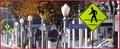
| 01/20/2003 01:10:06 AM |
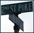
Redundancyby ClubJuggleComment: The focus really seems to be the 2nd st. pike here; I think the picture would've been more effective if it was more obviously the "street rd" part that was the focal point. |
 Photographer found comment helpful. Photographer found comment helpful. |
| 01/20/2003 01:09:05 AM |
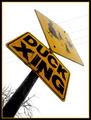
Duck's Eye Viewby jodiecostonComment: Nice concept, and photograph. I wish the top of the sign hadn't been quite as bright, but this is still a very good shot. |
| Photographer found comment helpful. |
| 01/20/2003 01:08:30 AM |
|
| Photographer found comment helpful. |
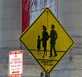
| 01/20/2003 01:07:53 AM |
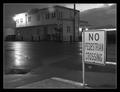
No Pedestrian Crossingby bdshortComment: Well composed as night shots go, but I can't find any significance in the actual street sign besides its being there in the night shot. |
| 01/20/2003 01:06:30 AM |
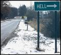
A cold day in Hell.by HBunchComment: I don't know if you found or made this sign, but it's pretty funny. As far as the picture goes, I would've liked a little more space on the upper and right edges of the signs. You might have given it a little more umph if you had had an angle more to the left, too - that way, we could see the "stop ahead" sign on the road away from "Hell" which would've been interesting to people who look for that kind of stuff. |
| Photographer found comment helpful. |
| 01/20/2003 01:04:58 AM |
|
| 01/20/2003 01:04:18 AM |
Kennedy Crossing Washington DCby 3boyzMomComment: The sign itself is very funny, but I can't say I completely agree with your composition - the sign is just off center, and the banner is distracting. |
| 01/18/2003 11:07:16 PM |
Living with Natureby BukiosComment: The colors are brilliant here, but the sky looks a bit grainy. I think you might have been well off with a little less of it, actually. |
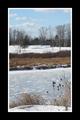
| 01/18/2003 11:05:30 PM |
Cold, Cold Welland Riverby calailleComment: I can see this hanging above a hotel bed. The water texture is nice, as are the plants in front; I can't say I care much for the naked trees in the back, but they're really hard to present well. Nice picture. |
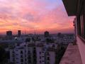
| 01/18/2003 11:03:54 PM |
Where I use to Chillby takethatComment: Nice sky, but the skyline detracts from it. Colors are good, but it feels too humanly cluttered (which may or may not have been what you intended), and it doesn't quite work for me. |
Home -
Challenges -
Community -
League -
Photos -
Cameras -
Lenses -
Learn -
Help -
Terms of Use -
Privacy -
Top ^
DPChallenge, and website content and design, Copyright © 2001-2025 Challenging Technologies, LLC.
All digital photo copyrights belong to the photographers and may not be used without permission.
Current Server Time: 08/04/2025 11:32:53 PM EDT.