| Image |
Comment |
| 04/30/2006 11:06:46 AM |
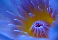
Greeting the Sunby wsteynComment: I like this photo, especially the DOF you used. It misses the mark on the challenge a little as I'm seeing blue and yellow on my calibrated monitor. |
 Photographer found comment helpful. Photographer found comment helpful. |
| 04/30/2006 10:54:55 AM |
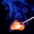
Ignition by kiwinessComment: Good work on this shot. Good Orange/Blue complement. Nicey composed. I don't think I'm a fan of the square crop on this. It feels to me this might have looked a little stronger in a portrait layout vs. the square. JMO. |
| Photographer found comment helpful. |
| 04/30/2006 10:52:22 AM |
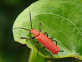
Nature`s Colourby abhraComment: Good work on this macro. Decent details on the bug. Colours work well in this challenge. I'm wondering if there would be a different way to crop or compose this that might improve the look a bit? JMO |
| 04/30/2006 10:50:47 AM |
Complementary Flowby NeilComment: I'm really curious to know how this photo is scoring. I personally like it very much. I'm a fan of this kind of a shot. The colours are nice and do fit into the challenge (although the red does seem to fade into orange a bit near the top of the flower. Well composed and executed. |
| Photographer found comment helpful. |
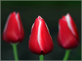
| 04/30/2006 10:47:32 AM |
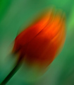
Complementary Colorsby MayaMComment: A nice photo, cool DOF and a really good composition in my opinion. For me, the green really doesn't come into play enough to really be considered a complementary colour. My attention is drawn to the the red and white of the tulips and the green almost disappears into the background. Not sure how this i scoring so far, but if I had to guess, it would be in the middle of the road somewhere, partly due to the overwhelming number of flower shots. This is a good photo and yoget points from me for that, but I feel that it misses a little on the Red/Green impact. JMO |
| Photographer found comment helpful. |
| 04/30/2006 10:43:25 AM |
Complementary Asymmetryby bubyComment: The colours definitely fir into the challenge. You've done a good job to keep the distortion at a minimum For me, it feels like something more needs to be in the image to keep my interet peaked. JMO |
| Photographer found comment helpful. |
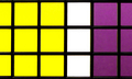
| 04/30/2006 10:40:28 AM |
Notesby JRalstonComment: Good colour choices on this image. Incredible shallow DOF is impressive. It would be interesting to see a shot with more of the note pads interlaced. This is missing a bit of the Wow factor for this to have scored higher with me. JMO. |
| Photographer found comment helpful. |
| 04/30/2006 10:32:31 AM |
Irisby smccComment: On first pass through, I think I was overwhelmed with how many flower phoos there were and didn't give this the credit it deserved. Looking at it again, this is a good photo. Nice lighting, very good composition, nice subtle blue and orange. This is is my favourite flower photo in the challenge. Bumping up. |
| Photographer found comment helpful. |
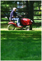
| 04/29/2006 07:48:59 PM |
Sunday Driveby Drummerjd356Comment: Goo composition and definitely a fit into the challenge. The harsh lighting is working against ou on this. JMO. |
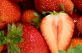
| 04/29/2006 07:48:00 PM |
Strawberriesby Kimberly75Comment: I think sharper focus is needed on this shot to really make it stand out. Also, I think you could have gotten away with a little more colour saturation. JMO |
| Photographer found comment helpful. |
Home -
Challenges -
Community -
League -
Photos -
Cameras -
Lenses -
Learn -
Help -
Terms of Use -
Privacy -
Top ^
DPChallenge, and website content and design, Copyright © 2001-2025 Challenging Technologies, LLC.
All digital photo copyrights belong to the photographers and may not be used without permission.
Current Server Time: 08/17/2025 03:04:06 PM EDT.