| Image |
Comment |
| 09/28/2005 10:07:33 PM |
Daiquirisby slightlyconfusedComment: The drastically shifiting scale of the masculine hand in the foreground vs. the delicate smaller hand in the middleground adds interest to this image that might have been mundane otherwise. Setting all in front of neutral gray background works well. |
 Photographer found comment helpful. Photographer found comment helpful. |
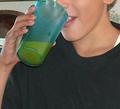
| 09/28/2005 09:50:17 PM |
Refreshing Orange Juiceby AkashaComment: This is a nice composition, but a bit grainy. Also, there is a bit of "background noise" (i.e. flora on wallpaper in left behind head) that competes for attention from the viewer. |
| 09/28/2005 09:43:34 PM |
|
| Photographer found comment helpful. |
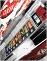
| 09/28/2005 09:41:31 PM |
The great kiwi Iconby kiwinickComment: While "beverage" is clearly suggested with the familiar repetitive labels, the darkness of the overall image looses essential definition that might have made a bolder statement of the theme. Yet, this might have rendered your image "typical." Such is the joy...and the quandry...of aesthetic choice. |
| Photographer found comment helpful. |
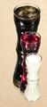
| 09/28/2005 09:37:38 PM |
Dry martini?by hroiComment: Perfect background for this "clean" image. The sole color of the olive among variations of soft gray scale acromatics does not overwhelm the concept or theme. Rather, the refraction at the liquid's surface and the reflection counter to its placement say "BEVERAGE" more boldly than "OLIVE." Good job. |
| Photographer found comment helpful. |
| 09/28/2005 09:30:49 PM |
A Tasty Brewby mariomelComment: The near perfect symmetry is "clear" with the dissolved back rim of the bottom of the glass, etc. The distance that fades is nearly mirror image. Had it been perfect mirror, this image would not have been as intriguing. It is the slight difference that makes the difference. Good job. |
| Photographer found comment helpful. |
| 09/28/2005 09:23:28 PM |
|
| Photographer found comment helpful. |
| 09/28/2005 09:21:52 PM |
|
| Photographer found comment helpful. |
| 08/21/2005 06:32:44 PM |
Serena Maneeshby turbulensComment: Nice image. I think the blue light above her head is an unfortunate distraction. |
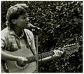
| 08/21/2005 06:25:20 PM |
The Preacher and his Guitarby chik0325Comment: Nice asymetrical design with good variety of texture. The monochromatic scheme works well with the content. Unfortunately, just a bit dark. Otherwise, very good job. |
| Photographer found comment helpful. |
Home -
Challenges -
Community -
League -
Photos -
Cameras -
Lenses -
Learn -
Help -
Terms of Use -
Privacy -
Top ^
DPChallenge, and website content and design, Copyright © 2001-2025 Challenging Technologies, LLC.
All digital photo copyrights belong to the photographers and may not be used without permission.
Current Server Time: 08/14/2025 02:06:24 AM EDT.