| Image |
Comment |
| 07/22/2005 05:24:10 PM |
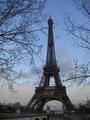
Eifel Towerby wrampevoComment: I don't really see any textures here, although the framing of the tower is nice. You should brighten it up more, though, that will reveal more detail. Also, you have some serious processing or compression artefacts around the branches. |
| 07/22/2005 05:22:40 PM |
|
 Photographer found comment helpful. Photographer found comment helpful. |
| 07/22/2005 05:22:26 PM |
|
| Photographer found comment helpful. |
| 07/22/2005 05:21:42 PM |
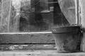
Face in the Windowby willg133Comment: nice setup and the photo is very good. It needs a bit more contrast to make some of the elements stand out (f.ex. the peeled paint, or the flowerpot). I would darken the shadows, the pic feels a little too bright overall. I'm also a bit distracted by the stuff in the background. But nice picture! |
| Photographer found comment helpful. |
| 07/22/2005 05:18:26 PM |
|
| Photographer found comment helpful. |
| 07/22/2005 05:17:15 PM |
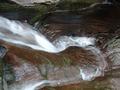
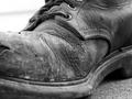
The Bootby jpetersComment: very good rendering of detail and texture. The blown out background in the upper left corner is a big distraction. You might also want to darken the shadows to get more contrast. Midtones are great, though. |
| Photographer found comment helpful. |
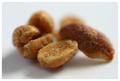
| 07/22/2005 05:15:19 PM |
Honey Roastedby HavokComment: nice, but it doesn´t look like anything is in focus here. you could have used your DOF better. |
| 07/22/2005 05:14:18 PM |
|
| 07/22/2005 05:13:11 PM |
Type Texturesby ding_213Comment: too ´straightforward´ for my taste. But good exposure, maybe you need slightly more contrast |
| 07/22/2005 05:12:36 PM |
spikeby cherenceComment: the background is too studio-like for this subject |
| Photographer found comment helpful. |
Home -
Challenges -
Community -
League -
Photos -
Cameras -
Lenses -
Learn -
Help -
Terms of Use -
Privacy -
Top ^
DPChallenge, and website content and design, Copyright © 2001-2025 Challenging Technologies, LLC.
All digital photo copyrights belong to the photographers and may not be used without permission.
Current Server Time: 08/05/2025 05:52:03 PM EDT.