| Image |
Comment |
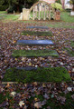
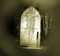
| 12/08/2006 11:55:39 AM |
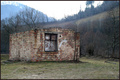
The old gravesby buzzyComment: maybe use a different PoV (from the ground forwards) to create a bit more interesting DoF. the colors are a bit flat and the subject isn't very interesting IMO. |
 Photographer found comment helpful. Photographer found comment helpful. |
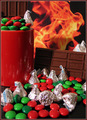
| 12/08/2006 11:54:33 AM |
Death by Chocolateby TammerComment: this is a bit too colorful for death :P
the idea with the fire-image is nice, but a bit obvious because of the shadow. you might wanna use not so much chocolate in front of it, it makes the photo a bit too messy. |
| Photographer found comment helpful. |
| 12/08/2006 11:51:31 AM |
|
| Photographer found comment helpful. |
| 12/08/2006 11:49:37 AM |
Life Cycleby bubeltrubelComment: flowers right in the bin...
the colors are a bit too saturated for my taste, maybe b/w would do this image better, but not sure if it's more interesting like that. |
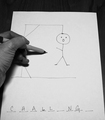
| 12/08/2006 11:48:36 AM |
Hangmanby jfwolpertComment: I know the word!! ;)
humouristic idea, but a bit of a boring execution (pun intended!) I wouldn't know how to improve this one actually, maybe create the hangman with sticks and rope? |
| Photographer found comment helpful. |
| 12/08/2006 11:47:02 AM |
Nothing Leftby oomphotoComment: looks a bit flat and the image isn't very interesting for me.. needs a bit more to do someting, a spark. |
| 12/08/2006 11:45:58 AM |
Hell Boundby ScubaComment: the photo is a bit too small to check the details good enough, but I can see it's a bit flat at the bottom part and the man. what's he doing there anyway? |
| 12/08/2006 11:44:57 AM |
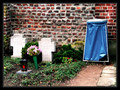
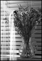
Remainsby rjksteschComment: hmm you have to give the flowers water, you know ;) I like the way the curtain touches the fowers but the b/w looks a bit flat and the setting is a bit messy with the blinds at the back. might be cool with a black background, but keep the curtains. |
| Photographer found comment helpful. |
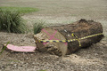
| 12/08/2006 11:42:18 AM |
Log Tied - such a cruel fate!by babysealComment: this is a bit too much of a snapshot for me. maybe better if you got a bit closer to the tree, shoot from the front part of the tree. colors are a bit flat, some contrast could work here. |
| Photographer found comment helpful. |
| 12/08/2006 11:41:05 AM |
|
| Photographer found comment helpful. |
Home -
Challenges -
Community -
League -
Photos -
Cameras -
Lenses -
Learn -
Help -
Terms of Use -
Privacy -
Top ^
DPChallenge, and website content and design, Copyright © 2001-2025 Challenging Technologies, LLC.
All digital photo copyrights belong to the photographers and may not be used without permission.
Current Server Time: 08/14/2025 10:32:25 AM EDT.