| Image |
Comment |
| 11/04/2005 03:34:17 PM |
Ice Creamby denlinkbarmannComment: good choice of subject. The dark upper corners don't appeal to me and the colours seem off in general. The whites are slightly blown and overpowering in the signs. |
| 11/04/2005 03:29:04 PM |
busy...yeah rightby 5red99Comment: cool concept! A slight rotation to the right to bring the frame of the doorway vertical may have mproved the shot, IMO |
 Photographer found comment helpful. Photographer found comment helpful. |
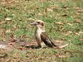
| 11/04/2005 03:26:38 PM |
Kookaburra Among Gum Leavesby BowerbirdComment: leaves are definitely busy. IMO, perhaps aligning the bird more to the right side instead of directly in the centre would help compositionally. Focus is too soft for my taste and colours are very muted. |
| 11/04/2005 03:22:44 PM |
talkingby tdeweyComment: nice composition. Focus is too soft for my taste and colours seem somewhat washed out. |
| Photographer found comment helpful. |
| 11/03/2005 01:42:07 AM |
|
| Photographer found comment helpful. |
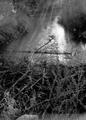
| 11/03/2005 01:39:34 AM |
Night Mareby RistyzComment: great carving job. I like the rays coming off the light too and the leaves in the foreground. The only thing I would change would have been to darken the grasses in the upper left. |
| Photographer found comment helpful. |
| 10/31/2005 12:54:40 AM |
Dam Noiseby PrismComment: Thank you so much for those of you who took the time to comment on my entry. I have revamped my photo to try and incorporate your suggestions. Any comments you might care to post on the new version would also be greatly appreciated. If you care to have a look it is posted at //www.dpchallenge.com/image.php?IMAGE_ID=251593 |
| 10/30/2005 09:30:06 PM |
Jordan Fall Portraitby ShannonComment: Again with this one, I love the composition and clarity of the shot but find the borders distracting. Perhaps if they weren't cutting so deeply into the picture on the sides... |
| 10/30/2005 09:26:36 PM |
Jordan with Scarecrowby ShannonComment: I like the composition of the shot with the positioning of your son and the scarecrow. I find the buttonizing borders to be distracting though and think overall, it would be better without the added effect, IMO. |
| Photographer found comment helpful. |
| 10/26/2005 03:25:38 PM |
Bridge Under Troubled Waterby AzrifelComment: I can definitely tell that this is a reflected image. I like the subject, including the person on the bridge. IMO, cropping out the lamp and sign may have improved the composition by shifting the focus more to a "thirds" line while putting more emphasis on the ripples at the same time. Did you use a polarized filter on your lens at all? The upper right corner is very dark and has a "Polarized lens" look to me, which I find distracting. Some additional brightening with curves or levels may also have brought out the colours more. |
| Photographer found comment helpful. |
Home -
Challenges -
Community -
League -
Photos -
Cameras -
Lenses -
Learn -
Help -
Terms of Use -
Privacy -
Top ^
DPChallenge, and website content and design, Copyright © 2001-2025 Challenging Technologies, LLC.
All digital photo copyrights belong to the photographers and may not be used without permission.
Current Server Time: 09/02/2025 09:27:23 PM EDT.