| Image |
Comment |
| 08/03/2006 12:38:00 PM |
Another Baby Jacksonby SandyPComment: Great sense of contrast here, the whole image looks soft and like you said, stright from Heaven. The dodged-off framing is put to good use here. |
 Photographer found comment helpful. Photographer found comment helpful. |
| 08/03/2006 12:32:49 PM |
Judicial Branch - U.S. Supreme Courtby modurnComment: Masterful B&W image, with a great set of tonal grays. The only thing that bugs me is the motto on the top front - I can barely read it. A bit of PP there to make it pop would add to the whole image, IMO. |
| 08/03/2006 12:30:11 PM |
Green Eyesby modurnComment: That's an amazing set of greens. My only suggestion would be to maybe leave just a little color in the cat, instead of a total desat (set the slider in the -80s) and to tone down the greens just a little bit, to ward off an over-processed feel. Otherwise, very sharp, and I think the close crop was a good choice. |
| 08/03/2006 12:26:58 PM |
|
| 08/03/2006 12:24:26 PM |
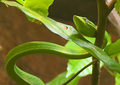
Do You Sssssee Me?by modurnComment: This is a great shot, and even with the 6+ score, I think you were robbed. The composition is interesting, especially with the contrast between the curves in the snake and the stright edges in the leaves. The lighting is a touch harsh in a few spots, but overall, it's a great capture. |
| Photographer found comment helpful. |
| 08/03/2006 12:21:05 PM |
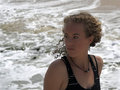
Brit-Beach2.jpgby -Bec-Comment: She has a great expression here, but her face is too dark. A pass with Contrast Masking can probably even the shadows out and really give it some pop. I'd probably have cropped closer to the top of her head, too. I like it, and with a little work, I think it could really be a great shot! |
| Photographer found comment helpful. |
| 08/03/2006 12:17:06 PM |
kaz&amy3.jpgby -Bec-Comment: I like this one the better of the two. Having the little gal's leg showing helps ground her in the scene moreso than hiding it. They look like they're having fun, and it makes the whole image more fun because of it :-) |
| Photographer found comment helpful. |
| 08/03/2006 12:15:36 PM |
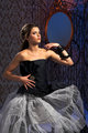
Emily2.jpgby -Bec-Comment: Yeah, definetly like the PPed version better - the lighting here is too bright for the gown IMO, and the model doesn't look comfortable/ready. |
| Photographer found comment helpful. |
| 08/03/2006 12:13:59 PM |
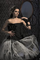
Emily-PP.jpgby -Bec-Comment: I like the PP you used, it compliments the old-fashioned style of the dress and setting. Also gives a flat feeling to the dress that lets it blend with the bg, and where her skin is showing, she really pops out from the bg. The sublte colors really focus on her, too. Very well done! |
| Photographer found comment helpful. |
| 08/03/2006 12:11:05 PM |
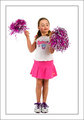
Cheerleader1.jpgby -Bec-Comment: This is cute. Her expression appears a bit distracted, but I think it works because of her age. |
| Photographer found comment helpful. |
Home -
Challenges -
Community -
League -
Photos -
Cameras -
Lenses -
Learn -
Help -
Terms of Use -
Privacy -
Top ^
DPChallenge, and website content and design, Copyright © 2001-2025 Challenging Technologies, LLC.
All digital photo copyrights belong to the photographers and may not be used without permission.
Current Server Time: 08/06/2025 12:46:27 AM EDT.