| Image |
Comment |
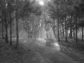
| 10/25/2005 11:35:11 AM |
sunraysby melodeeComment: This would look so much better if it was a larger image. |
 Photographer found comment helpful. Photographer found comment helpful. |
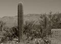
| 10/25/2005 11:29:00 AM |
The Old Southwestby AzCKellyComment: The stone wall doesn't add to the image and the tall cacti is still too close to the center of the image in that the area to the left feels like it is just hangin there. If you could frame the mountains with just teh two Saquaro's I think it would have worked very well. The grain is well done. |
| 10/25/2005 11:24:47 AM |
Missing Youby toddheadComment: Neet just a tad more to get the top of his head - otherwise a very good image. |
| Photographer found comment helpful. |
| 10/25/2005 11:22:59 AM |
|
| Photographer found comment helpful. |
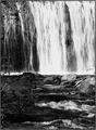
| 10/25/2005 07:01:22 AM |
cascadeby U622Comment: This does not work for me - the falls looks mroe like a series of overexposed lines than a cascade. I think to combination of the grain and fast shutter speed, plus the range of light in the image worked against you. |
| 10/24/2005 12:34:45 PM |
Downtownby ElaineComment: Unfortunatly the lights(?) on the tree are a real distraction to an otherwise very good image. |
| Photographer found comment helpful. |
| 10/24/2005 12:33:00 PM |
A Cast Awayby OlyuziComment: Looks like a classic. I would crop just a little of the sky - that woudl move the horizon more away from the center and accentuate the clouds more and also provide more focus on the fishermen. |
| Photographer found comment helpful. |
| 10/24/2005 12:26:10 PM |
|
| Photographer found comment helpful. |
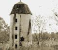
| 10/24/2005 12:25:04 PM |
All That Remainsby cheegirlComment: The structure seems truncated - I look for a bit, not much, of space both at the bottom and top of the structure. As it is shown it seems squeezed into the image. |
| 10/24/2005 12:23:43 PM |
|
| Photographer found comment helpful. |
Home -
Challenges -
Community -
League -
Photos -
Cameras -
Lenses -
Learn -
Help -
Terms of Use -
Privacy -
Top ^
DPChallenge, and website content and design, Copyright © 2001-2025 Challenging Technologies, LLC.
All digital photo copyrights belong to the photographers and may not be used without permission.
Current Server Time: 08/04/2025 08:05:22 PM EDT.