| Image |
Comment |
| 05/04/2003 06:40:05 PM |
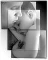
Narcissusby salparadiComment: I'm really not sure why there's all that black space at the bottom, but a tighter frame would definately help here. I like the middle shot, because the captured expression seems the most authentic, and it seems to be the most genuine representation of the person (who I'm guessing is you). Maybe instead of different expressions this could have been done with different zooms or angles instead. I do like the extreme contrast effect, and how you worked the background into it. The abstract result works well. 7 (mostly for the center frame) |
 Photographer found comment helpful. Photographer found comment helpful. |
| 05/04/2003 06:34:18 PM |
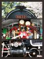
Joy, Comfort, and Loveby dacrazyrnComment: There's some interesting photoshop work here, but this still isn't a multi-image composition, it's just one image with some frames laid over it. However, I do like how each of the frames represents a different crop of the shot, each of which would be very effective (especially the top two). It's a good shot, but only by the farthest stretch of imagination does this fit the challenge. 4 Message edited by author 2003-05-05 09:00:25. |
| Photographer found comment helpful. |
| 05/04/2003 06:31:52 PM |
|
| Photographer found comment helpful. |
| 05/04/2003 06:26:42 PM |
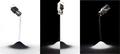
Salt & Pepperby severinComment: A great concept, and a beautiful study in patterns of black and white. I think this shot would be helped greatly if all three frames were more crisp, as the salt/pepper shakers all seem to have too much blur to them. Nice work. 8 |
| Photographer found comment helpful. |
| 05/04/2003 06:23:33 PM |
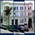
What color do you like?by Pep VentosaComment: This is a very cool idea, and it's executed well.The different colors are very effective. I like how the images are progressive, but also overlap a bit. Nice work. 8 |
| Photographer found comment helpful. |
| 05/04/2003 06:21:35 PM |
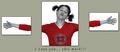
I Love you... this much!!!by kosmikkreeperComment: I like the creative idea with the arms cut out. I'm not sure why you desaturated everything but red though, as the color doesn't have any significant function here. Also, the facial expression doesn't do much for me. Good luck. 5 |
| 05/04/2003 03:24:11 AM |
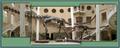
Pick On Someone Your Own Size!by whitetigerComment: The people (and staircases) provide a sense of scale that makes this shot immensely more effective. This shot made me think about how I can't even imagine a living one of those suckers. |
| Photographer found comment helpful. |
| 05/04/2003 03:21:57 AM |
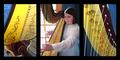
Jeni's Etudeby sagestudioComment: This was a good choice for a multi-image shot, because the right and left side shots are good shots, but without a context they would be hard to identify for someone not familar with the harp. However, the middle shot provides that context, and therefore makes the other shots more effective. Good work. 7 |
| Photographer found comment helpful. |
| 05/04/2003 03:18:53 AM |
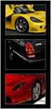
$peedVisionby RiderGalComment: I like the tight crops on these. I think the result is more compelling than if they had been more revealing shots of the cars. Lets see how my identification skills are, I'd guess top to bottom: Lamborghini (Diablo), Jag (not sure about that one), and Ferrari (F50). I guess I'll see how I did after the challenge. 8 |
| Photographer found comment helpful. |
| 05/04/2003 03:13:12 AM |
Day's Endby welcherComment: the top and bottom images strike me as so-so, but that center image is really excelent. Great angle for the panoramic shot you got. |
Home -
Challenges -
Community -
League -
Photos -
Cameras -
Lenses -
Learn -
Help -
Terms of Use -
Privacy -
Top ^
DPChallenge, and website content and design, Copyright © 2001-2025 Challenging Technologies, LLC.
All digital photo copyrights belong to the photographers and may not be used without permission.
Current Server Time: 08/27/2025 05:50:47 AM EDT.