| Image |
Comment |
| 01/16/2008 11:43:48 AM |
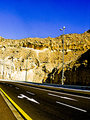
My wayby SaadComment: I like this shot quite a bit. I like the perspective - it gives the photo a real sense of movement and the boarder between the sky and the rocks adds a kind of cool surrealism. However, it looks like the image is either just slightly overexposed or the yellows on the rocks is over-saturated. Also, there is considerable noise in the sky.
All that said, I really do like this shot and would love to see you re-work it a little. |
| 01/10/2008 12:42:04 PM |
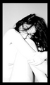
Blue and Greyby NobodyComment: While I'm not a huge fan of standard studio portraiture, this is a very well done shot. Technically it's nearly perfect. I just wish it showed more of your subjects character.
Still giving it a good score. |
 Photographer found comment helpful. Photographer found comment helpful. |
| 01/10/2008 12:40:07 PM |
eyes see youby hopperComment: There's a lot to like about this shot. The color is excellent, as is the exposure. You've focused on your models eyes which are lovely. However, it's cropped a bit tight for me. Both her chin and forehead are cropped out of the picture which makes it feel a bit constricted.
Still, a really nice shot. |
| Photographer found comment helpful. |
| 01/10/2008 12:34:56 PM |
Just spectaclesby bibuComment: I like this shot but your whites are a bit blown out and, with a frame around the image, it looks as if your model is trying to squeeze into a box. I'd love to see you do this shot again with better exposure and more room around your model in the final image. |
| Photographer found comment helpful. |
| 01/10/2008 10:52:19 AM |
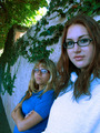
Off the Wallby chaitanyanComment: This isn't a bad shot but the white balance seems to be off. There's a pretty serious blue case to your subjects. Since the sunlit tree branches, above the wall, look fine, I'm guessing that you had your WB set to day light when your subjects are in shadow - causing a blue cast.
Mixed light sources are really tough. |
| Photographer found comment helpful. |
| 01/10/2008 10:47:40 AM |
F.Y.Eyeby LaMasComment: I like this shot but the blue, reflecting from the table(?) is a bit distracting (though it really does bring out the blue in your model's eyes). |
| Photographer found comment helpful. |
| 01/09/2008 11:48:53 AM |
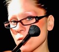
Make-upby nibblesComment: This is a nice shot but it looks like your highlights are blown out. |
| Photographer found comment helpful. |
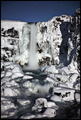
| 01/03/2008 11:48:18 AM |
As Cold As Iceby AlainComment: Nice shot! I like that you used a DOF that didn't completely blur your background. It gives your shot context. |
| Photographer found comment helpful. |
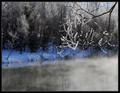
| 01/03/2008 11:46:31 AM |
Moonlight Sonata by LalliSigComment: I'm having a hard time with this shot. It's an excellent shot...outstanding really but but the snowy rocks look over-sharpened, especially next to the softness of the moving water. If you sharpened this shot, you may have overdone it by just a tad. If you didn't sharpen it, you might consider softening it just a tad.
Still, a really nice shot! |
| Photographer found comment helpful. |
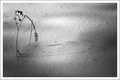
| 01/03/2008 11:43:49 AM |
Twigs in Winterby 2mccsComment: This has a very Japanese feel...in it's simplicity which I find very appealing. Great job in finding a very nice shot in an "ordinary" subject. |
| Photographer found comment helpful. |
Home -
Challenges -
Community -
League -
Photos -
Cameras -
Lenses -
Learn -
Help -
Terms of Use -
Privacy -
Top ^
DPChallenge, and website content and design, Copyright © 2001-2025 Challenging Technologies, LLC.
All digital photo copyrights belong to the photographers and may not be used without permission.
Current Server Time: 08/07/2025 02:45:02 AM EDT.