| Image |
Comment |
| 07/20/2007 07:40:31 AM |
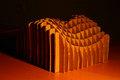
Origami Starby dfstevensonComment: Nice lighting. The curves seem to lack the deepest blacks though. Check the histogram. |
| 07/20/2007 07:40:13 AM |
Nonconformistby cheekymunkyComment: I like the lighting, and the small bit of floor at the front of the image helps. Maybe even a bit more would be good. Also, you've lined up all the breaks in the chains up the centre of the image. Maybe it would have been better to stagger them, or tape them together, so the image wouldn't be cut in half. |
 Photographer found comment helpful. Photographer found comment helpful. |
| 07/20/2007 07:32:01 AM |
|
| Photographer found comment helpful. |
| 07/20/2007 07:30:17 AM |
|
| 07/20/2007 07:27:27 AM |
Impossible Paper Triangleby PeterPicComment: Well done. I can't see how you did it. The colour balance is a little cool, and the vignette is a little plastic looking, but the balance of the whole shot is good. |
| Photographer found comment helpful. |
| 07/20/2007 07:27:21 AM |
|
| Photographer found comment helpful. |
| 07/20/2007 07:27:00 AM |
Do you really need me?by FocusPointComment: A closer-crop would still include everything important. You could take 30% off the right and the bottom, and a little off the left without losing anything. The focus is good on the pin. |
| Photographer found comment helpful. |
| 07/20/2007 07:23:19 AM |
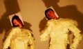
Peter Piper Pictured Proper Paper Post-it Peopleby RandomPlacesComment: Nice work. This must have taken ages to stick them on. I like the photo expressions. My main dislike is the colour, with it's very brown cast, and red-brown skin tones. Match the camera's white balance to the light, or fix it in software. |
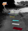
| 07/20/2007 07:21:11 AM |
on the beachby EstimatedEyesComment: The first thing I notice is the centred composition, so you can't see much of the nice beach, but I guess that's the point. They are missing the scenery. I like that you just see the top of their head, buried in the paper. It just lacks a little punch. A slight S-curve in the levels would help to pop it out, or whatever editing methods you are comfortable with. |
| Photographer found comment helpful. |
| 07/20/2007 07:18:22 AM |
wireframeby np22saComment: Interesting shape, but I don't much like the colour. |
| Photographer found comment helpful. |
Home -
Challenges -
Community -
League -
Photos -
Cameras -
Lenses -
Learn -
Help -
Terms of Use -
Privacy -
Top ^
DPChallenge, and website content and design, Copyright © 2001-2025 Challenging Technologies, LLC.
All digital photo copyrights belong to the photographers and may not be used without permission.
Current Server Time: 08/13/2025 08:59:19 AM EDT.