| Image |
Comment |
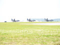
| 04/19/2007 08:55:41 AM |
P4195475f22.jpgby sabphotoComment: I'd say that sky is pretty much toast. if you can recover the planes, you can cut them out and paste a nice sky, but you're gonna have to just cut the sky and paste in another one. It will be a bit of work to match the sky against the adjusted planes, but there's no easy way.
Bummer dude.
|
 Photographer found comment helpful. Photographer found comment helpful. |
| 04/18/2007 08:20:29 PM |
Follow the Yellow Brick Roadby scalvertComment: Don't worry about the blue socks. That was only in the movie. I think the REAL dorothy's socks were just like this. Oh, and for the record, the REAL toto was an Afghan Bloodhound, but this just didn't work for the movie director. |
| Photographer found comment helpful. |
| 04/14/2007 08:07:18 PM |
Scott-9364.jpgby NVPhotoComment: On this image, I would crop out the bottom sill of the window, and either crop or clone to remove the bit sticking out of the top of his head. I think the edge on the right helps to add context that it's not just a white studio background, so I'd leave that. I'd like to see more detail in his face, and a deeper black in his suit and hair, but this will require some tricky levels adjustments to achieve a good result.
|
| 04/14/2007 07:46:28 PM |
B-w-Dad-9483-8x12.jpgby NVPhotoComment: Quite a difficult scene to shoot. I dont mind the overall effect with the bright windows, as it gives an etherial look. It would be nice to have a little more detail in the dress and veil. |
| 04/14/2007 07:41:36 PM |
B-9289-8x12-bw.jpgby NVPhotoComment: Nice pose. I would work on lighting - use a reflector or a fill-in flash to help bring out the shadow areas on her face. Also be careful in the processing not to blow out the highlights. Filling in the shadows will help this too, because you won't have to bring the shadows up so high. |
| 04/11/2007 02:05:39 AM |
|
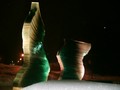
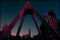
| 04/11/2007 02:04:34 AM |
ALTER TO THE STARSby WeefanComment: Nice idea. Needs some noise reduction, and the colours don't work for me, but the composition is nice. |
| Photographer found comment helpful. |
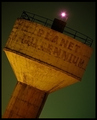
| 04/11/2007 02:03:06 AM |
Millennium Planet – Adieu Pluto !by ashishkushwahaComment: I like the angle, and the colours are nicely balanced. Unfortunately the chroma noise reduction has bled some yellow into the green, and there's still some luminance noise - the green would look even better if the background was silky smooth. But overall, it's still one my top picks. |
| Photographer found comment helpful. |
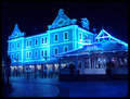
| 04/11/2007 01:59:03 AM |
Down by the Waterfrontby craigesterComment: Hmm, the blue tone is interesting, but I think it's too much. It would be fine if elsewhere in the image had some other colours to balance it, but it just looks like the WB is wrong. |
| Photographer found comment helpful. |
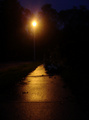
| 04/11/2007 01:57:26 AM |
Illuminationby TheImageryComment: There's actually nothing interesting in this photo. It needs a point of focus - something to look at. |
| Photographer found comment helpful. |
Home -
Challenges -
Community -
League -
Photos -
Cameras -
Lenses -
Learn -
Help -
Terms of Use -
Privacy -
Top ^
DPChallenge, and website content and design, Copyright © 2001-2025 Challenging Technologies, LLC.
All digital photo copyrights belong to the photographers and may not be used without permission.
Current Server Time: 08/05/2025 04:13:57 AM EDT.