| Image |
Comment |
| 05/04/2007 11:02:18 AM |
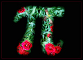
Pi is everywhere,life is a circle.by onarComment: I don't like the border on this - i think it would be better without. It looks like there is white balance problems in the background, as the green leaves look a little blue and cold. |
 Photographer found comment helpful. Photographer found comment helpful. |
| 05/04/2007 11:00:30 AM |
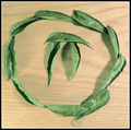
Ancient Mathby sudhiComment: Nice idea, but the colour of the wood really doesn't work for me. |
| Photographer found comment helpful. |
| 05/04/2007 10:59:34 AM |
He is the Chosen Oneby meyersComment: A bit more saturation and some sharpening would really bring this image up. It would also help if he was looking intently at the camera, radiating power and a stronger connection with the viewer. I like the toussled hair! |
| Photographer found comment helpful. |
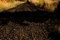
| 05/04/2007 10:57:32 AM |
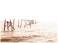
Transcendental Piby haydawlinComment: Nice find! I don't like the super-high-key processing though. Might be improved with less sky in the crop. |
| 05/04/2007 10:56:05 AM |
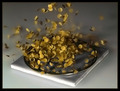
Monte Carlo Approximation of Piby tcmartinComment: Well, so far, Montecarlo says Pi = 4, cause there ain't no spots on the tile. Apart from that, this is a good image. Nice lighting. The biggest technical problem is colour bleeding, possibly from using chroma noise reduction? An off-board flash should get this effect without having to push the ISO too high, and a lower ISO won't need so much NR. Focus is a little soft, probably from NR again. Highlight on front of tile is also distracting. Despite all this, it's a nice image, and I'm scoring it well. :) |
| Photographer found comment helpful. |
| 05/04/2007 10:52:19 AM |
3.14159265............... and on foreverby nutsahoyComment: Hmm, stretching the challenge a little, but I just told someone else to think outside the box, so we can't have everything. The dark shadow is odd, particularly being right in the middle of the image. It might have been better to take a few steps forward and either use the shadow to darken the fg, or get rid of it altogether. |
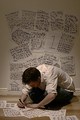
| 05/04/2007 10:50:30 AM |
Almost Doneby cian_m_hayesComment: I think I can see a mistake! Nice lighting, although it would look even better with more contrast. |
| Photographer found comment helpful. |
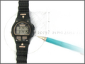
| 05/04/2007 10:48:47 AM |
"pi o'clock"by ashishkushwahaComment: I really like the 'drawing' effect - even the pencil looks drawn. The lighting is a little flat on the paper, and that contrasts with the 'snapshot' lighting on the watch, but the overall result is nice. |
| Photographer found comment helpful. |
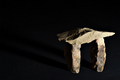
| 05/04/2007 10:44:50 AM |
Pre-Historic Piby SherwinJamesComment: I like this. You've used lighting really well. The floor is a little dark, but I'll give you the benefit of the doubt and assume it's my monitor. |
| Photographer found comment helpful. |
| 05/04/2007 10:42:19 AM |
|
| Photographer found comment helpful. |
Home -
Challenges -
Community -
League -
Photos -
Cameras -
Lenses -
Learn -
Help -
Terms of Use -
Privacy -
Top ^
DPChallenge, and website content and design, Copyright © 2001-2025 Challenging Technologies, LLC.
All digital photo copyrights belong to the photographers and may not be used without permission.
Current Server Time: 08/05/2025 04:58:14 PM EDT.