|
|
|
Showing 101 - 110 of ~1521 |
| Image |
Comment |
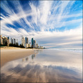
| 08/08/2008 12:36:00 AM | Where else, but Queensland?by SinkyComment: Hey, what are you doing up here in Queensland, taking all our great photos. :) Well done, and good to see you in the freestudy lineup, right next to your fellow melbournian,  hotpasta hotpasta. |  Photographer found comment helpful. Photographer found comment helpful. |
| 08/08/2008 12:32:43 AM | Screaming Bald Eagleby AlainComment: Hi Alain, not quite a ribbon, but very close! Good to know we can rely on your for an amazing shot each month. :) | | Photographer found comment helpful. |
| 08/08/2008 12:31:57 AM | Gazeby lovethelightComment: Great portrait, Claire. This has just the right level of sharpness in just the right places, and the brown colour tinting is perfect. | | Photographer found comment helpful. |
| 08/06/2008 05:05:31 AM | Show Down by Tap10Comment: Ha ha, very funny. :) Great idea, and certainly worth it for your first ribbon. Nicely done. | | Photographer found comment helpful. |
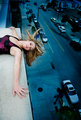
| 08/01/2008 09:30:22 AM | Edge of Reasonby CutterComment: You'd never get me to model for this shot! But hey, you wouldn't want me anyway when she's available. :) Great shot. Love the hair. Might be improved by the golden rule of photography - GET CLOSER! (or you could crop your way in) |
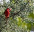
| 07/09/2008 10:16:04 AM | Happy June Cardinalby KelliComment: Hi Kelli,
I was actually one of the higher voters on this shot. I like the spot of colour in the frame. I wasn't keen on the border though. I prefer simple borders if any - nothing fancy. One area that this image falls down is composition lines. Most of the frame is filled with the detail of the leaves. The stick is a line, but not really in the right place to make the composition. Cropping in a little closer might help that - take a little of the top and right, and little more off the bottom - but not too much, because the image has a nice open feel that would be a shame to lose. A slight vignette might also help focus the image in just a little. | | Photographer found comment helpful. |
| 07/08/2008 08:57:25 PM | Her Smileby jegerComment: This is quite a good image. The purple and the green sit nicely with the skin tones and tree bark. The composition is good, but the shot is really about her eyes, so I feel the image needs to be more focussed. The flowers and her hands are distracting from her face. You could easily crop the shot in closer, and maybe darken her hands in photoshop. I would also lighten and sharpen her eyes a little. I would also title it "Her eyes" rather than her smile, because you can't really see her smile. The lighting is good, and nice use of the reflector with the catchlights in her eyes. | | Photographer found comment helpful. |
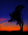
| 07/08/2008 08:52:06 PM | One Foot In The Graveby kleskiComment: This is not a bad image, and many people have voted the striking colours well. For me, the colours are just a little too super-saturated neon, and they lose the natural feel. I'm also not a fan of high contrast, and prefer to see more visible detail in the subject. However, you have done well with your sillhouettes in the past, and I guess for very specific shots, they work well. I guess the difference here is that with the dark sky, the tree is not so visible against the background. Also, a tree as a subject never grabs a viewer like a human silhouette.
As mentioned in other comments, the title is a little odd for this image, and rather than adding a new dimension to a sunset image, it is a mental twist to make the image and the title fit together.
| | Photographer found comment helpful. |
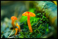
| 07/08/2008 08:28:55 PM | New Life on the Forest Floorby QuigleyComment: Wow, nice fluorescent image. :) The focus here is slightly in front of your subject. For such macro shots, you should be using spot focus and a little tripod or beanbag, but I'm guessing at 1/6s, you were using something already. Manual focus would be even better if you are good at it (but my eye tends to focus worse than auto-focus, so I never use manual). The other focus trick for macro work is to set the focus roughly, and then move the camera forward and backward. You could also easily get away with closing the aperture a little to widen the depth of field. For editing with an image like this on DPC, I would tend to mute the saturation a little, so it's not quite so over the top, and maybe shift the colour balance a little away from the greens. | | Photographer found comment helpful. |
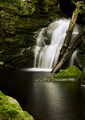
| 07/08/2008 08:22:08 PM | Tranquil Fallby arron_christensenComment: This is a great waterfall shot. You've captured the flowing water nicely, and the ripples in the pool look positively silky. The water is not too blown out, and there is still detail in the rocks, which is perfect. Some photoshop editing could help to enhance the detail by carefully dodging some areas in the rocks. The composition needs a little work - as it is, it's all very 2 dimensional as the falls, trees and rock are all very close to the same plane, and the incidental foreground rock is almost a distration. But, that's the bad part of having a shoot cut short. You need time to really explore the location, and look at the scene from different focal lengths. I love wide angle lenses for shots like this too, because they enhance the depth in the photo, so give your 18mm a try too and really explore different angles. Give your wife the car keys and make your own way home. :) These falls are certainly worth a revisit next time you have a cloudy day out. | | Photographer found comment helpful. |
|
Showing 101 - 110 of ~1521 |
Home -
Challenges -
Community -
League -
Photos -
Cameras -
Lenses -
Learn -
Help -
Terms of Use -
Privacy -
Top ^
DPChallenge, and website content and design, Copyright © 2001-2025 Challenging Technologies, LLC.
All digital photo copyrights belong to the photographers and may not be used without permission.
Current Server Time: 07/31/2025 11:00:02 PM EDT.
|