| Image |
Comment |
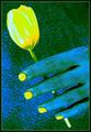
| 02/25/2003 09:43:43 AM |
Not A Happy Pictureby DrJOnesComment: Not really a nice story, but I like your shot. The lightning through the hidden window works great and is highlighting the subject. The models color and the lower saturation of the rest is well done too. The high camera position is IMO well deliberated. It brings some distance between the viewer and the sad scenario. Perhaps I would have cropped a little closer on the left side of your shot. IMHO there ist too much uninteresting space. The victory sign of her hand looks a little overstated, but that's only marginal. Great work! - 9 |
 Photographer found comment helpful. Photographer found comment helpful. |
| 02/24/2003 10:46:48 AM |
Colou(red)by ndsComment: Thanks a lot for the comments to all of you!
Personally I didn't expected a score above 5. According to my former experiences with abstract and miscolored shots I'm even surprised, that this one finished with a 4.8 because it's not everybodys taste. After one week I'm not sure about the post processing on this shot myself too. According to the good comment of ChrisW123 I decided to put a different version on my private homepage. You can have a look under //www.200bar.de/nds/show_pic.php?id=101 if you are interested in. Personally I like this version a little more. Maybe this one could have done better on DPC because it doesn't look so much as digital art.
Message edited by author 2003-02-25 07:21:42. |
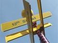
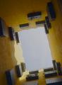
| 02/18/2003 01:28:06 PM |
On the Cornerby PHOTOCHlXComment: IMHO!! not that much interesting as you are hoping for. A cropping according to the rule of thirds and a higher saturation / contrast of the yellow sign and the blue sky could have been helpful here. But that's just me ;-) Nevertheless best of luck! (6) |
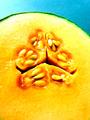
| 02/18/2003 01:17:34 PM |
SEEDYby BukiosComment: Nice colors and well done lightning! Here and there a little blown out and overexposed, but that's only marginal and doesn't disturb me that much. Perhaps I would have cropped a little different. IMHO this shot could be more impressive, if the core is not centered. In addition there ist too much uninteresting space on the bottom of your shot. But that's just me ;-). Nevertheless a unique and interesting submission! (9) |
| Photographer found comment helpful. |
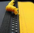
| 02/17/2003 03:43:12 PM |
Knot Yellowby boyte1Comment: Nice macro shot with an interesting perspective and perfect DOF. Personally I dislike the black edge on the top of this shot. Probably it would be better to open the zipper a little bit and then cut off the black part. In addition I would have positioned the yellow part of the zipper (dont know any english word for this pull strap) a little more to the left side. IMHO it would be helpful, if it doesn't disrupt the line of interesting texture of the zipper. |
| 02/17/2003 03:23:22 PM |
It wasn't me!by kiwinessComment: Funny idea! IMHO it could be better with a non black line. Perhaps white, or yellow too. The cheese slices are looking a little bit like hovering in the air :-) |
| Photographer found comment helpful. |
| 02/17/2003 03:16:07 PM |
A yellow way to heavenby bcncrazyComment: Interesting perspective, i like your shot. It was the right decision, that you turned your camera a few degrees. But IMHO a little more contrast and saturation of colors could have been helpful here. Where is it? |
| 02/17/2003 03:09:55 PM |
Abstract Yellow Bugby DCThiessenComment: Nice abstract and well done cropping. Very clear and tidy use of lines. Could have been a picture in a illustrated advertising catalogue. I like it! Just an idea: Did you tried one with switched on lamps, or would it be too much distracting? |
| Photographer found comment helpful. |
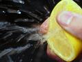
| 02/17/2003 01:32:04 PM |
A dozen lemons laterby snsComment: Wow, how many shots did you needed? I think now you will never be afflicted with vitamin deficiency :-) Could have been brought into a sharper focus. But I know, that this is very hard to realise under this conditions. Interesting shot! |
| 02/17/2003 01:25:55 PM |
Panning for goldby GordonComment: Nice action shot, the sharpness of the cab is perfect! The background could be a little less distracting, perhaps a little longer exposure time would have been helpful here. But doing so, it would have been much more difficult to get the subject in such a crisp focus... Well done, good luck! |
Home -
Challenges -
Community -
League -
Photos -
Cameras -
Lenses -
Learn -
Help -
Terms of Use -
Privacy -
Top ^
DPChallenge, and website content and design, Copyright © 2001-2025 Challenging Technologies, LLC.
All digital photo copyrights belong to the photographers and may not be used without permission.
Current Server Time: 08/23/2025 01:57:10 PM EDT.