|
|
| Image |
Comment |
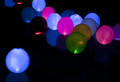
| 09/04/2014 09:33:07 PM | ~night lights~by KMcCComment: Critique Club Review:
Color Saturation and Hue: colors are within normal limits, and well saturated.
Brightness and Contrast: highlight areas, especially in the red balloon in the center, are burned out. Detail is being lost in the darker areas. (too much contrast, as the scene appears to be a little on the dark side.)
Focus and Depth of field: focus appears to be a little soft, depth of field is a little too deep for me. The image appears to be a little too sharpened in post processing. The edges of the balloons have a sort of halo going, which is an indication of this.
Subjective: the balloons that are dimly lit detract, more than add, to the image. The bright spots in the green and especially the red balloons on the left, fight for attention and distract the eye. The negative space of the black areas works, but then the lone blue balloon competes with the others.
Overall I like the image and would like to see it done again with a sharp balloon or two in the foreground at a wide aperture that makes the background balloons nice soft orbs. That, and eliminate the harsh bright areas. |  Photographer found comment helpful. Photographer found comment helpful. |
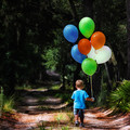
| 09/04/2014 09:15:39 PM | The Adventureby Ja-9Comment: Critique Club Review:
Color Saturation and Hue: colors are nicely saturated. The hues seem to border on a slight green ting, at least on my monitor. The white balloons seem to have a faint greenish cast, but could be a reflection, or again, my monitor.
Brightness and Contrast: highlights have been held well, avoiding burnout. However details sem to have been lost in the darker shadows. The white balloons could also be brighter. As this is an advanced challenge there was room for these adjustments.
Focus and Depth of Field: the subject is rendered sharply, as is fitting. The background is soft as would be warranted to keep the attention on the subject. If anything, even a bit softer in the background could be a plus.
Subjective: how does one suggest improvements to an image that already finished in the top five? About the only thing I see here is that the darkness of the path ahead, gives me a bit of a negative feeling, like the child is headed for something not as pleasant as where he is. That, and the bright foliage over the path distracts a tiny bit. Both of these are very minor nit picks. As this is an overall excellent image. Congratulations on your top five finish. | | Photographer found comment helpful. |
| 08/25/2014 07:41:33 PM | Industriousby Dr.ConfuserComment: Critique Club Review:
Color Saturation and Hue - Not applicable
Brightness and Contrast - highlights and shadows are both well controlled to preserve detail.
Focus and Depth of Field - focus is sharp and depth of field is excellent, but processing gives the impression that the image is a little soft.
Lighting - scene is well lit, and lighting angle brings out the shapes well.
Subjective - I think a couple of things may have hurt your score.
1. HDR is a risk these days. When it was new, it scored highly. Now, the voters are used to seeing it, and it can make an image look "artificial" as noted below, or odd.
2. There does not seem to be a place for the eye to come to rest. I love to explore an image, but those with an end point seem to do better. What are you trying to show me? A shallow depth of field, would have helped focus on the foreground machinery. If you wanted to show me everything, you did, but at the cost of putting some of yourself into the message.
Summary - I like the image. It is a little above average. so the score is in the ball park for me. I would like to see this redone where the background is a soft blur of shapes. Force my attention to the one full piece of equipment, with the glorious pipes and must and bolts, and I'm sold! | | Photographer found comment helpful. |
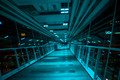
| 08/24/2014 11:36:48 AM | Lighted Sky Bridge to Nowhereby jgirl57Comment: Critique Club Review:
Color Saturation and Hue - colors are done with an overall blue hue. Looking at the details outside of the walkway, it appears the the lighting gives this effect, as opposed to manipulation by the photographer.
Brightness and Contrast - lighting is well done. A bit of burnout on some of the overhead lights, which distracts a tiny bit.
Focus and Depth of Field - Nice sharp focus, and a deep depth of field. Both work well in this image.
Subjective - as mentioned the Wells Fargo, and eBank signs distract. Since this is advanced editing, the distractions on the outside could have been darkened to the point they no longer commanded attention. The camera angle seem a bit tilted, or an least not square to the subject, so that the image seems to be off level.
Summary - I like the image a lot. Cloning out the bright dot, at the end of the bridge would have left the four blue lights more pronounced. They would look even more mysterious and ominous than they do now. | | Photographer found comment helpful. |
| 08/24/2014 11:13:44 AM | ~escaping~by KMcCComment: Critique Club Review
Color Saturation and Hue - colors are brilliant, realistic, and well saturated, while staying within believable ranges.
Brightness and Contrast - a nice bright image, and good control of the lighting, so that the highlights are not blown out.
Foes is and depth of field - good depth of field, focus is sharp overall.
Subjective - the image looks a bit over processed to me. The clouds in the sky are just starting to pixilate in the thin areas of the clouds. The vegetation also seems to have suffered a bit. The boardwalk makes a great set of leading lines, but to what? There does not seem to be a true vanishing point. The end of the walk sys to me, more cut off than vanished.
Summary - overall I like the image, throw in a sailboat in the right spot, and you have a killer leading lines image. A little further back so the hand rails almost meet, and I think it would have scored better, as well. | | Photographer found comment helpful. |
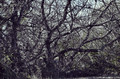
| 08/24/2014 10:52:06 AM | Hylophobia. How will I ever escape these woods?by Jules1xComment: Critique Club Member Review:
Color Saturation and Hue - colors are normal and accurate
Brightness and Contrast - both are within normal ranges.
Focus and Depth of Field - focus is sharp with a deep depth of field. Perhaps a shallower depth of field would have eliminated some background distraction.
Subjective - everything is in focus, but my eye is drawn deeper into the image, which gives the illusion that the foreground is a bit soft. That is until I focus on the nearest branches, which are then sharp. But it is a struggle to keep the focus there. I believe the lighting hurt you as well. The angle does not give enough definition to the trees. Later or earlier in the day might have helped. I would really like to see a night shot of this.
Summary - I like the image, it has good bones. If you could find a spot where there was something desirable beyond the tangle of trees, it could really work. As is, I feel safer on this side, as opposed to being trapped. | | Photographer found comment helpful. |
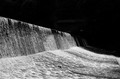
| 08/23/2014 11:22:45 PM | into darknessby posthumousComment: Critique Club Review:
Color Saturation and Hue - Not applicable.
Brightness and contrast - I'm a pushover for inky velvet blacks... Sold!
Focus and depth of field - Tack sharp, and great depth of field.
Subjective - The bright specks above and beyond the waterfall distract my eye a bit.i really like the angle of the lighting. The flow of the water leads the eye out of the image, which could be a metaphorical vanishing. However the title makes me wonder why the flow of the image does not take me into the darkness.
Overall - another opportunity to seem clueless in front of a master. I'm in love with the backs and the contrasting water. | | Photographer found comment helpful. |
| 08/23/2014 11:08:41 PM | webwoodby posthumousComment: Critique Club Review:
Color Saturation & Hue - Not Applicable.
Brightness and contrast - the lighting seems a bit off to me. I'm a big fan of inky velvet black, but their power doesn't quite gather here. Perhaps more than one light might have helped. As is there are bright spots that fight with the piral for the eye's attention. I'm left wondering if the light following the spiral might have worked.
Focus and depth of field - excellent. The image is tack sharp.
Subjective - I like the image, but find the lighting vs the shape a bit jarring. A bit different lighting could have made this ominous, or another angle might have made it mysterious.
Overall, very daunting to try to critique an acknowledged master... | | Photographer found comment helpful. |
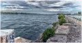
| 08/01/2014 11:38:15 PM | Water Frontby PixlmakerComment: Your bridge image is much stronger than this one. Again processing seems a bit much, the halo above the tree line on the far shore is an indication. The right side of the horizon looks a bit lower than the left. Could be lens distortion, or optical illusion.
I like the leading line of the shore, but they do not seem to lead the eye to a final subject/resting point. The block with fear tries to be a subject but the koine lines pull the eye away. Yet the. I dance of the word shore and box yank the eye back, in a never ending battle. I probably would have votes 5 or 6.
Edited to fix really bad spelling. Auto-correct can be a ruthless taskmaster.Message edited by author 2014-08-02 17:13:31. | | Photographer found comment helpful. |
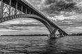
| 08/01/2014 11:31:40 PM | Peace Bridge / Rough Watersby PixlmakerComment: Overall I like the image, I am partial towards B&W images. I like the detail of the bridge against the smoother water. I would have taken off a point or two because it appears a bit over processed. If you look at the upper edge of the bridge, and under the nearest arch, there is a halo that looks much like a bit too heavy of an application of Topaz Adjust. I probably would have given this a 7 or 8. | | Photographer found comment helpful. |
Home -
Challenges -
Community -
League -
Photos -
Cameras -
Lenses -
Learn -
Help -
Terms of Use -
Privacy -
Top ^
DPChallenge, and website content and design, Copyright © 2001-2025 Challenging Technologies, LLC.
All digital photo copyrights belong to the photographers and may not be used without permission.
Current Server Time: 09/03/2025 05:19:37 AM EDT.
|