| Image |
Comment |
| 11/01/2006 10:30:00 AM |
Rooftopby redmoonComment: Photo looks a bit fuzzy, and lacks a strong point of interest. |
 Photographer found comment helpful. Photographer found comment helpful. |
| 11/01/2006 10:29:06 AM |
|
| Photographer found comment helpful. |
| 11/01/2006 10:28:27 AM |
ubiquitousby ursulaComment: Very nice use of a b/w photo. Nice job on the conversion and on the subject choice. Excellent work. |
| Photographer found comment helpful. |
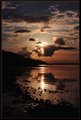
| 11/01/2006 10:27:52 AM |
Reflectionsby sfarrell23Comment: Very nice use of leading lines on this photograph. The colors are so nice and saturated, especially in the reflection. However, the clouds are a bit blown out in the sky. I've been reading about the use of graduated ND filters. I've personally never used one, but this would be a scene that I could see where they would come in real handy. |
| Photographer found comment helpful. |
| 10/16/2006 10:21:58 PM |
OOB attemptby srdanzComment: I don't think it looks bad at all. In fact, it is awesome. Would you mind sharing with the rest of us how you achieved such an effect? |
| Photographer found comment helpful. |
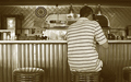
| 10/09/2006 03:08:46 PM |
At the Dinerby dfstevensonComment: Fit Challenge Criteria: 1/2 - You are definitely not showing a face here, but I really don't feel the "the essence" of this person is revealed through this photograph
Contrast/Color: 0/2 - The photo has an overall muddy appearance to it. The whites are not very bright and the detail is lacking throughout the tonal range
Composition: 1/2 - I like the angle but I think the partial inclusion of the third stool on the right should have been cropped out.
Photo Quality: 0/2 - The photo is not very sharp or clear
My Subjective Affinity: 0/2 |
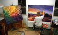
| 10/09/2006 03:05:05 PM |
Painterby ZoomdakComment: Fit Challenge Criteria: 2/2 - I think this does a great job of showing us the essence of this person without showing the face. Nice work.
Contrast/Color: 2/2 - The photo is artificially lit, and you did a nice job at preventing harsh shadows because of the lighting.
Composition: 1/2 - The inclusion of many items in the art room seems useful, but it also makes the photo very busy. In addition, the angle seems too high and unnatural IMHO. I think it would look better at a lower angle.
Photo Quality: 2/2 - The picture is sharp, shadows maintain detail. Nice job.
My Subjective Affinity: 1/2 |
| Photographer found comment helpful. |
| 10/09/2006 03:00:40 PM |
Nothing Better To Enterby ragamuffingirlComment: Fit Challenge Criteria: 1/2 - The title says it all
Contrast/Color: 1/2 - The lighting seems really flat. Maybe a levels or curves adjustment could've helped out
Composition: 1/2 - I don't notice anything technically wrong with it, but it just doesn't help the photo "pop" out to me, the viewer
Photo Quality: 1/2 - The range of tones could have been expanded more to give the overall photo better highlights. The crop is a bit close also.
My Subjective Affinity: 0/2 |
| 10/08/2006 10:56:49 PM |
|
| Photographer found comment helpful. |
| 10/07/2006 01:10:42 AM |
|
| Photographer found comment helpful. |
Home -
Challenges -
Community -
League -
Photos -
Cameras -
Lenses -
Learn -
Help -
Terms of Use -
Privacy -
Top ^
DPChallenge, and website content and design, Copyright © 2001-2025 Challenging Technologies, LLC.
All digital photo copyrights belong to the photographers and may not be used without permission.
Current Server Time: 08/24/2025 05:02:08 PM EDT.