| Image |
Comment |
| 06/05/2007 08:22:19 PM |
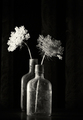
Nonchalanceby RKTComment: Fit Challenge Criteria: 2/2
Contrast/Color: 1/2
Composition: 1/2
Photo Quality: 1/2
My Subjective Affinity: 0/2
I really like how the bottles are slightly reflected on the surface, and wish I could see more of that. I also think it would look better with a bit more of the second bottle showing. The placement of the twigs pointing in different directions helps the photo out, but the lighting is a bit too harsh. |
 Photographer found comment helpful. Photographer found comment helpful. |
| 06/05/2007 08:20:33 PM |
Canon Digitalby shankswareComment: Fit Challenge Criteria: 2/2
Contrast/Color: 1/2
Composition: 1/2
Photo Quality: 2/2
My Subjective Affinity: 1/2
I like your idea here. I wish the cameras had a bit beter lighting on them. |
| Photographer found comment helpful. |
| 06/05/2007 12:54:45 PM |
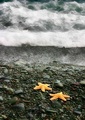
Return to the Seaby KarenNfldComment: Fit Challenge Criteria: 2/2
Contrast/Color: 2/2
Composition: 2/2
Photo Quality: 2/2
My Subjective Affinity: 1/2
I can't really think of much else to say except nice job. I really like how the starfish are so bright compared to the rest of the image. Nice work. |
| Photographer found comment helpful. |
| 06/05/2007 12:11:20 PM |
Clown Fishby cloudsmeComment: Fit Challenge Criteria: 2/2
Contrast/Color: 1/2
Composition: 2/2
Photo Quality: 1/2
My Subjective Affinity: 0/2
The lighting across the main clown fish is not very even. I feel this would also be a stronger image if both fish were in focus. Your composition is excellent. The out-of-focus subjects in the lower right and left of the comp are extremely distracting. |
| Photographer found comment helpful. |
| 06/05/2007 12:09:24 PM |
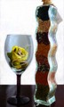
The Many uses of Glassby dcb300Comment: Fit Challenge Criteria: 2/2
Contrast/Color: 0/2
Composition: 0/2
Photo Quality: 0/2
My Subjective Affinity: 0/2
The lighting is way off on this shot. The camera angle is too high for the subject and the focus is also not on. |
| 06/05/2007 11:49:24 AM |
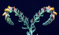
Two Sides Liveby landcameraComment: Fit Challenge Criteria: 1/2
Contrast/Color: 2/2
Composition: 2/2
Photo Quality: 2/2
My Subjective Affinity: 1/2
Although the subject branches off in two separate directions, I voted it a 1 on challenge criteria because to me it is still technically one subject. Your controlled lighting is exquisite. I love how you've made use of the full spectrum without losing detail in highlights or shadows. Nice work. The symmetrical composition also really works well with this shot. |
| Photographer found comment helpful. |
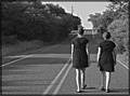
| 06/05/2007 11:46:14 AM |
Mother & Daughterby kellyrc01Comment: Fit Challenge Criteria: 2/2
Contrast/Color: 1/2
Composition: 1/2
Photo Quality: 0/2
My Subjective Affinity: 0/2
The idea and composition are well executed. The bland sky presents a major problem. It is also very apparent that you tried to darken it as there is a large halo separating the sky and trees across the photo. The people are too contrasty, while the road does not have enough contrast. With this being an advanced editing challenge, you could have made separate adjustments to both areas individually. Also, subjects walking away from the camera are so hard to capture well. The shots that I have viewed that work the best generally include some interaction between the two subjects. |
| Photographer found comment helpful. |
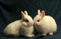
| 06/05/2007 11:41:20 AM |
Warm & Fuzzyby Millere81979Comment: Fit Challenge Criteria: 2/2
Contrast/Color: 1/2
Composition: 2/2
Photo Quality: 1/2
My Subjective Affinity: 0/2
I really like the idea of this shot. I have seen great shots similar to this that would also work well for stock sites. With a little work this shot could be there also. First, the lighting is too harsh. The rabbit on the right has some really bright spots, and the rabbit on the left has some shadows that are too big and dark. The focus is very soft overall also. I'm sure you had to have a lot of patience shooting this one, and I commend you for that. Your subject placement is really good. |
| Photographer found comment helpful. |
| 06/05/2007 11:38:35 AM |
Oldiesby silverhawkComment: Fit Challenge Criteria: 2/2
Contrast/Color: 0/2
Composition: 1/2
Photo Quality: 1/2
My Subjective Affinity: 0/2
The whole picture doesn't feel right. Nothing is really out of focus, but nothing really seems in focus too well either. Your subjects do not stand out from the background. The tops of them blend too well with the trees. The photo also seems to have an odd reddish/yellow tint to it. |
| Photographer found comment helpful. |
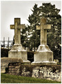
| 06/05/2007 11:36:00 AM |
John and Catherine Noonanby sherComment: Fit Challenge Criteria: 2/2
Contrast/Color: 1/2
Composition: 1/2
Photo Quality: 1/2
My Subjective Affinity: 0/2
Graveyard shots can turn out so cool, but they are so difficult. I think the composition in this shot is too plain and ordinary. A different view could create a better impact, especially with they sky being a very dull grey. The limited DOF would be nice, but needs to be more pronounced, and I would have cut off the foreground grass that is out of focus. |
| Photographer found comment helpful. |
Home -
Challenges -
Community -
League -
Photos -
Cameras -
Lenses -
Learn -
Help -
Terms of Use -
Privacy -
Top ^
DPChallenge, and website content and design, Copyright © 2001-2025 Challenging Technologies, LLC.
All digital photo copyrights belong to the photographers and may not be used without permission.
Current Server Time: 08/21/2025 06:00:37 AM EDT.