| Image |
Comment |
| 06/22/2007 03:55:15 PM |
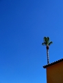
Strange Palm in Infinite Spaceby AliciaComment: Fit Challenge Criteria: 2/2
Contast/Color: 1/2
Composotion: 2/2
Photo Quality: 2/2
My Personal Affinity: 0/2
The negative space and composotion really work good for this photo. I think the shadows lose a bit too much detail. Other than that, the photo itself is rather plain. |
 Photographer found comment helpful. Photographer found comment helpful. |
| 06/22/2007 03:54:10 PM |
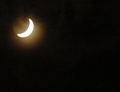
sliverby outafocusComment: Fit Challenge Criteria: 2/2
Contast/Color: 0/2
Composotion: 1/2
Photo Quality: 0/2
My Personal Affinity: 0/2
An overexposed moon is not intereting, no matter what the shape of it. Some stars would have been helpful, and also a better exposure of the moon. |
| Photographer found comment helpful. |
| 06/22/2007 03:53:00 PM |
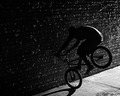
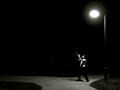
Night Rider.by Dan_CottleComment: Fit Challenge Criteria: 1/2
Contast/Color: 1/2
Composotion: 1/2
Photo Quality: 1/2
My Personal Affinity: 0/2
The negative space does not contain anything that I fell really supports the main subject, not does it contain anything so interesting that I am "wowed" by it. The photo is a bit too contrasty IMHO. The biker is placed well in the frame, but the exclusion of anything else to really tell the story makes this shot miss something. I think moving back and including an empty street, maybe the lightpost, and the long shadow of the bike would have helped out significantly. |
| 06/22/2007 03:50:42 PM |
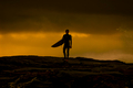
Days Endby FirstyComment: Fit Challenge Criteria: 2/2
Contast/Color: 2/2
Composotion: 1/2
Photo Quality: 2/2
My Personal Affinity: 2/2
This shot works really well. The only thing I could suggest, don't center the surfer next time. |
| Photographer found comment helpful. |
| 06/22/2007 03:49:59 PM |
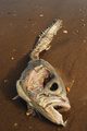
Negative Fishby 4trtoneComment: Fit Challenge Criteria: 0/2
Contast/Color: 1/2
Composotion: 0/2
Photo Quality: 2/2
My Personal Affinity: 0/2
The negative space in so way complements the rotten fish, nor does it "wow" me in any way whatsoever. The shadows have good detail, but the fish colors are very flat and uninteresting. The photo is sharp, and the softer focus on the top of the photo draws my attention to the nasty fish head, but overall it is a repulsive shot of a nasty, rotten, ugly fish. |
| Photographer found comment helpful. |
| 06/22/2007 03:47:30 PM |
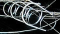
Fender holdersby snafflesComment: Fit Challenge Criteria: 1/2
Contast/Color: 2/2
Composotion: 1/2
Photo Quality: 2/2
My Personal Affinity: 0/2
I think this would have done better in the puzzle macro challenge. The black emptiness makes your subject stand out better, but that's it. Your lighting, exposure, and contrast on the subject are all presented very well. However, I'm still left in the end with a puzzled look on my face, wondering what I am really looking out. The repeating circles ar good, but it is a bit too cluttered to really focus on those either. |
| Photographer found comment helpful. |
| 06/22/2007 03:45:12 PM |
Sunset and flowersby dobilvr77Comment: Fit Challenge Criteria: 1/2
Contast/Color: 2/2
Composotion: 1/2
Photo Quality: 1/2
My Personal Affinity: 0/2
I think your main subject (the flowers) need to be just a bit more prominent. Without the title, most viewers would probably not notice them at all, and would consider the sunset the positive space and subject on this photo. The border really hurs this photo IMO also. |
| Photographer found comment helpful. |
| 06/22/2007 03:43:31 PM |
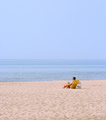
Chillin'by KenComment: Fit Challenge Criteria: 2/2
Contast/Color: 0/2
Composotion: 2/2
Photo Quality: 1/2
My Personal Affinity: 1/2
The idea is perfect. The colors seem way off. The sand is pink on my monitor. I think this photo could really benefit from both a color and a curves adjustment layer to really make it stand out. |
| Photographer found comment helpful. |
| 06/22/2007 03:42:23 PM |
midnight musician by Shadowi6Comment: Fit Challenge Criteria: 2/2
Contast/Color: 2/2
Composotion: 2/2
Photo Quality: 2/2
My Personal Affinity: 2/2
Excellent photo. I really like your composition. There's not really much to complain about at all. Everything works really well together. If anything were to be changed, I would say to have the light be not such a big bright blob, and somehow photograph it so you could see the light rays coming down on the trumpeter. Not that I know how exactly to do that, but just an idea. However, like I said before, excellent photo! |
| Photographer found comment helpful. |
| 06/22/2007 03:40:19 PM |
Go Fly a Kiteby sallyjo1Comment: Fit Challenge Criteria: 2/2
Contast/Color: 1/2
Composotion: 2/2
Photo Quality: 1/2
My Personal Affinity: 0/2
You've got the idea of negative space down perfectly. It definitely complements your kite. The colors are a bit dull. The whole photo seems a bit overexposed, leaving the blues in the sky really light, and the clouds without much detail. There also seems to be a fair amount of noise in the photograph. |
Home -
Challenges -
Community -
League -
Photos -
Cameras -
Lenses -
Learn -
Help -
Terms of Use -
Privacy -
Top ^
DPChallenge, and website content and design, Copyright © 2001-2025 Challenging Technologies, LLC.
All digital photo copyrights belong to the photographers and may not be used without permission.
Current Server Time: 08/21/2025 01:19:37 AM EDT.