| Image |
Comment |
| 01/02/2006 06:52:02 AM |
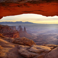
thecanyon4me by Brent_WardComment: awesome ! the perfect square crop is great addition to composition and whole photo
congratz. |
 Photographer found comment helpful. Photographer found comment helpful. |
| 12/16/2005 01:34:17 PM |
|
| Photographer found comment helpful. |
| 12/14/2005 03:09:50 AM |
|
| Photographer found comment helpful. |
| 12/14/2005 03:09:33 AM |
|
| Photographer found comment helpful. |
| 12/14/2005 03:08:45 AM |
|
| Photographer found comment helpful. |
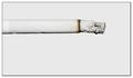
| 11/09/2005 03:20:38 AM |
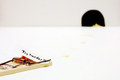
light(en) ?by gocComment: Originally posted by Alienyst:
Hello from the Critique Club!
I have studied your image and have the following to offer:
Composition/perspective - you really nailed this aspect of the shot. Application of rule of thirds is done quite nicely in two direction/focal planes. Your use of negative space is well done and there is not so much that your subject is lost. Not sure if you removed it through processing or it just didn't show but the lack of smoke is a big plus in my opinion. I also like how the cigarette is not perfect, but not too wrinkled either. The only thing I may have done here is to crop the left side to remove the filter paper portion so the subject had a uniform appearance from end to end..well except for the lit part of course.
Color - I don't expect much color in a light on white, and this holds true here. The grays and browns on the lit end offer a nice contrast to the rest of the image.
Lighting - lighting is well done. Not too bright to cause blown out areas or shadows, but bright enough to allow full detail of the cigarette to show through. I can clearly see all the mm band on the paper. Well done!
Challenge requirements - this meets the requirements of the challenge very well. The small band of dark brown on the lit end is not enough to have an impact at all. The gray ash also meets the requirements so no problem there. Well done!
Overall/my opinion - this is a very interesting idea and very well executed. Not sure why it didn't do better in the challenge. It is a well focused, clean, crisp image that demonstrates excellent control of lighting and composition. |
thanks a lot man :-) , it means a lot to me
goran |
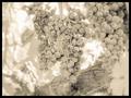
| 10/26/2005 07:23:11 AM |
Napa's Finestby twentyfivesComment: i think it's time to pick up this :-)
the ruined grape makes this photo very bad ... sorry |
| 10/14/2005 07:07:50 AM |
[green]by gocComment: Originally posted by Mrvile:
Hmm, I never thought to regard the theme in this aspect. Cool and creative. |
thanks a lot |
| 10/14/2005 07:07:13 AM |
[green]by gocComment: Originally posted by Bus352:
i guess this is an abstraction, not of object (strawberry) but of color--interesting but confusing. |
hi
i admit it's confusing but i wanted a different approach,
thanks |
| 10/14/2005 07:04:25 AM |
[ h o m e ]by gocComment: Originally posted by pasaro:
I can't understand such a low score for this. |
LOL, waht to say ? neither do i :-)
thanks |
Home -
Challenges -
Community -
League -
Photos -
Cameras -
Lenses -
Learn -
Help -
Terms of Use -
Privacy -
Top ^
DPChallenge, and website content and design, Copyright © 2001-2025 Challenging Technologies, LLC.
All digital photo copyrights belong to the photographers and may not be used without permission.
Current Server Time: 09/04/2025 06:51:23 AM EDT.


![[green]](https://images.dpchallenge.com/images_challenge/0-999/387/120/Copyrighted_Image_Reuse_Prohibited_238074.jpg)
![[ h o m e ]](https://images.dpchallenge.com/images_challenge/0-999/383/120/Copyrighted_Image_Reuse_Prohibited_236995.jpg)