| Image |
Comment |
| 03/28/2009 09:27:32 AM |
|
 Photographer found comment helpful. Photographer found comment helpful. |
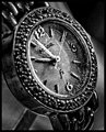
| 03/28/2009 09:25:00 AM |
Relicby colorcarnivalComment: I don't mind the grain, but there's way too much contrast. With a bit more light, you could have stopped down more and gotten the entire watch face in focus. |
| Photographer found comment helpful. |
| 03/28/2009 09:23:19 AM |
Coooooolby ankursomaniComment: At 1 second, every aspect of this lemon (?) should have been razor sharp. Maybe you're going for a sun rising in a blue sky motif? or a slow laid back lemonade type of day? Since I'm guessing, you can tell that I didn't get it. |
| Photographer found comment helpful. |
| 03/28/2009 09:19:45 AM |
|
| Photographer found comment helpful. |
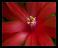
| 03/28/2009 09:18:44 AM |
Easter Cactusby EstimatedEyesComment: Very well done closeup. I find my eye distracted by the spot of green on the upper right edge, I would have burned that a bit to hide it. 8 |
| Photographer found comment helpful. |
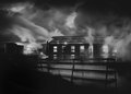
| 03/28/2009 09:17:04 AM |
On Fireby wildirisComment: Beautiful; I like the contrast between the serene flowing water above the fall and the crashing water down the fall, I just wish there was a bit more of that, it gets lost in the darkness. 8 |
| Photographer found comment helpful. |
| 03/28/2009 09:15:13 AM |
S P A Nby GIS_boyComment: I find the foreground to be a bit cluttered, cropping wouldn't help because you'd lose the comp. The only thing I can see is moving the camera a few feet closer to the edge? or zoom in if that's an option. Great shot otherwise - 8 |
| Photographer found comment helpful. |
| 02/01/2009 09:31:27 PM |
|
| Photographer found comment helpful. |
| 02/01/2009 09:29:33 PM |
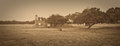
Oaklands Junction, Victoriaby vladoComment: Good use of sepia here. With both the horizon centered vertically and the building right in the middle, I think the composition loses something. |
| Photographer found comment helpful. |
| 02/01/2009 09:23:53 PM |
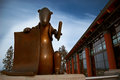
Sign Here.....by jhess77Comment: The building gives the impression that its leaning in. I realize that's because of the lens, maybe standing a bit more to the right would line it up better? or cropping off the furthest right column?
or, of course, if that's what you were going for, it worked perfectly!
Great colors especially the rich blue sky. |
| Photographer found comment helpful. |
Home -
Challenges -
Community -
League -
Photos -
Cameras -
Lenses -
Learn -
Help -
Terms of Use -
Privacy -
Top ^
DPChallenge, and website content and design, Copyright © 2001-2025 Challenging Technologies, LLC.
All digital photo copyrights belong to the photographers and may not be used without permission.
Current Server Time: 08/05/2025 12:02:00 AM EDT.