| Image |
Comment |
| 09/04/2006 06:44:17 PM |
|
 Photographer found comment helpful. Photographer found comment helpful. |
| 09/04/2006 06:42:10 PM |
|
| Photographer found comment helpful. |
| 09/04/2006 06:40:32 PM |
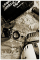
Had Almost Given Upby ericwooComment: I like the sepia tones and the whole idea of the photo. I think the kit is a bit large to be on the top of the photo. Maybe shooting this as a lateral photo would mitigate that aspect of the shot. |
| Photographer found comment helpful. |
| 09/04/2006 06:38:03 PM |
In Good Companyby ericwooComment: This is a fine image. The challenge itself is a weak one, so I can't fault the entrants. Your entry has good color and composition. |
| Photographer found comment helpful. |
| 09/04/2006 06:36:07 PM |
The Devil Speaksby ericwooComment: This photo has a wonderful clarity about it. Nothing blown out, rich colors, interesting pattern to the flames. ...and a good score by the voters. Well done. |
| Photographer found comment helpful. |
| 09/04/2006 06:33:39 PM |
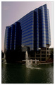
Fisheye Viewby ericwooComment: This is a fine photo. I think the only reason it did not score higher is because the frame of reference is fairly straight on. If you could have shot this image from somewhere closer to the building and looking up the drama would have increased. (I know, tough to do with a pond there.) It certainly merits a higher score IMHO. |
| Photographer found comment helpful. |
| 09/04/2006 06:29:44 PM |
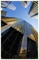
Towers of Gold, Feet of Clay by LouisComment: A well-deserved ribbon. This is one of the best of its kind IMHO. The fish-eye was a good choice of lens. The colors and composition are magnificent. |
| Photographer found comment helpful. |
| 09/04/2006 06:27:32 PM |
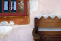
N/Aby MelethiaComment: I love the composition of this photo as well as the fine detail (especially the deteriorating stucco). I had trouble with this challenge, because other than an abstract nearly everything has a "subject" it seems to me. Your image manages to skirt the issue by placement of the bench and window and the central emphasis on the wall. Great score. |
| Photographer found comment helpful. |
| 09/04/2006 06:23:52 PM |
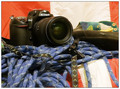
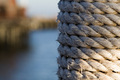
Neatly woundby MelethiaComment: Once again you have used DoF well. IMHO I think it would have been better if the line between the rope and background was not in the center of the image. I prefer 2/3 rope, 1/3 background. (But of course since I have a shot that is all "air" and little rope, there is no reason for me to talk or you to listen.) |
| Photographer found comment helpful. |
| 09/04/2006 06:19:49 PM |
Just out of the showerby MelethiaComment: I had to chuckle when I saw this. Cute photo. Can't say too much about a challenge called "camera self-portraits". I suppose you could have added water drops, but that is probably going too far. Lol. |
| Photographer found comment helpful. |
Home -
Challenges -
Community -
League -
Photos -
Cameras -
Lenses -
Learn -
Help -
Terms of Use -
Privacy -
Top ^
DPChallenge, and website content and design, Copyright © 2001-2025 Challenging Technologies, LLC.
All digital photo copyrights belong to the photographers and may not be used without permission.
Current Server Time: 08/07/2025 06:51:59 PM EDT.


![[ E I G H T ]](https://images.dpchallenge.com/images_challenge/0-999/542/120/Copyrighted_Image_Reuse_Prohibited_382508.jpg)