| Image |
Comment |
| 07/29/2005 08:22:53 PM |
|
| 07/28/2005 09:35:05 PM |
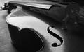
Celloby krystofaComment by Linden: The angle & the lighting highligh the flaws on the surface of this cello, which is a pity. Creative composition, though, & nice lining up of the strings with the top frame of the photo. |
| 07/27/2005 11:07:00 PM |
|
| 07/27/2005 05:34:34 PM |
|
| 07/27/2005 01:26:42 PM |
Celloby krystofaComment by tate: clarity/contrast/color: 1/2
composition,POV,DOF: 2/2
effort+originality: 1/2
theme appropriate: 1/2
aesthetic timelessness+emotion: 1/2 |
| 07/27/2005 10:00:14 AM |
Celloby krystofaComment by Jaimeson: You did a great job with the lighting and composition of this photo. Great job! |
| 07/11/2005 10:30:33 PM |
|
| 07/11/2005 12:48:46 AM |
|
| 07/10/2005 11:22:53 PM |
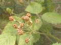
Come into my parlourby krystofaComment by cools98: Fit Challenge Criteria: 1/2
Contrast/Colors: 1/2
Photo Quality: 1/2
Composition: 1/2
My Subjective Affinity: 0/2
I think that your subject should stand out more from your background. There is not a lot of contrast between foreground/background. The web is neat looking, especially with the dew on it, but that is really the only thing that I like. |
| 07/09/2005 01:02:55 PM |
|
Home -
Challenges -
Community -
League -
Photos -
Cameras -
Lenses -
Learn -
Prints! -
Help -
Terms of Use -
Privacy -
Top ^
DPChallenge, and website content and design, Copyright © 2001-2024 Challenging Technologies, LLC.
All digital photo copyrights belong to the photographers and may not be used without permission.
Current Server Time: 04/30/2024 01:42:53 AM EDT.