| Image |
Comment |
| 07/06/2006 03:01:53 PM |
Sunset Indulgence by StrikeslipComment: Congrats on the ribbon slippie!!! Seriously though, only a 7.7? You can do better :). Message edited by author 2006-07-06 15:02:11. |
 Photographer found comment helpful. Photographer found comment helpful. |
| 09/13/2005 03:05:28 PM |
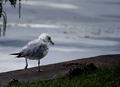
Depressed & Lonelyby cpickettComment: I was using a lens with 4.0 as the lowest, but I agree, the background could use more blurring, which I suppose I could have done in post-processing, and I could have even taken out the "bush" but I wasn't sure if that would break the rules (removing a major element).
It was shot in AV mode, I was having some problems getting anything to expose well, so I actually took three or four of these, and this one was the brightest, set at +2 exposure (as far as the light meter was concerened). I probably should have switched over to manual.
Thanks for the tip on the processing, I'll try sharpening less in more steps in the future. As to the haloing, I dodged the bird, and I think that is what gives that effect.
Thanks for the critique!
Slippy:
Thanks man, the poster above you is quite clearly insane as well :). |
| 07/27/2005 12:24:45 AM |
|
| Photographer found comment helpful. |
| 07/20/2005 12:08:46 AM |
|
| 07/20/2005 12:08:01 AM |
|
| 07/14/2005 02:30:26 PM |
|
| 07/14/2005 02:21:51 PM |
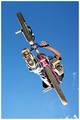
Shocking Pinkby CuriousComment: Look dangerous for you and the biker :)
Parts of it look ever exposed, and the image might be just a little too vertical. |
| Photographer found comment helpful. |
| 07/14/2005 02:19:27 PM |
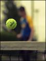
Great Shotby graphicfunkComment: Nice perspective... You might have used a faster shutter, so that you caught it more "in action", then a blur. |
| Photographer found comment helpful. |
| 07/12/2005 05:31:53 PM |
Paige.jpgby sheapodComment: Good tonal range, not overly dark or light, can't really find much wrong here.
Very nice picture (BTW) |
| Photographer found comment helpful. |
| 07/11/2005 12:04:17 AM |
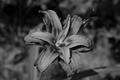
The 203rd Flowerby cpickettComment: It looks like everyone hated the B&W... I agree it could have been better with more contrast, and I actually worked with it a little after it was suggested, and it does look much nicer that way.
As far as why B&W, since I was expecting 200+ flowers (as my title sugggests), I decided to do something that I was confident no one else would do. |
Home -
Challenges -
Community -
League -
Photos -
Cameras -
Lenses -
Learn -
Help -
Terms of Use -
Privacy -
Top ^
DPChallenge, and website content and design, Copyright © 2001-2026 Challenging Technologies, LLC.
All digital photo copyrights belong to the photographers and may not be used without permission.
Current Server Time: 06/30/2026 06:10:35 AM EDT.